%20Cover.avif)

Company
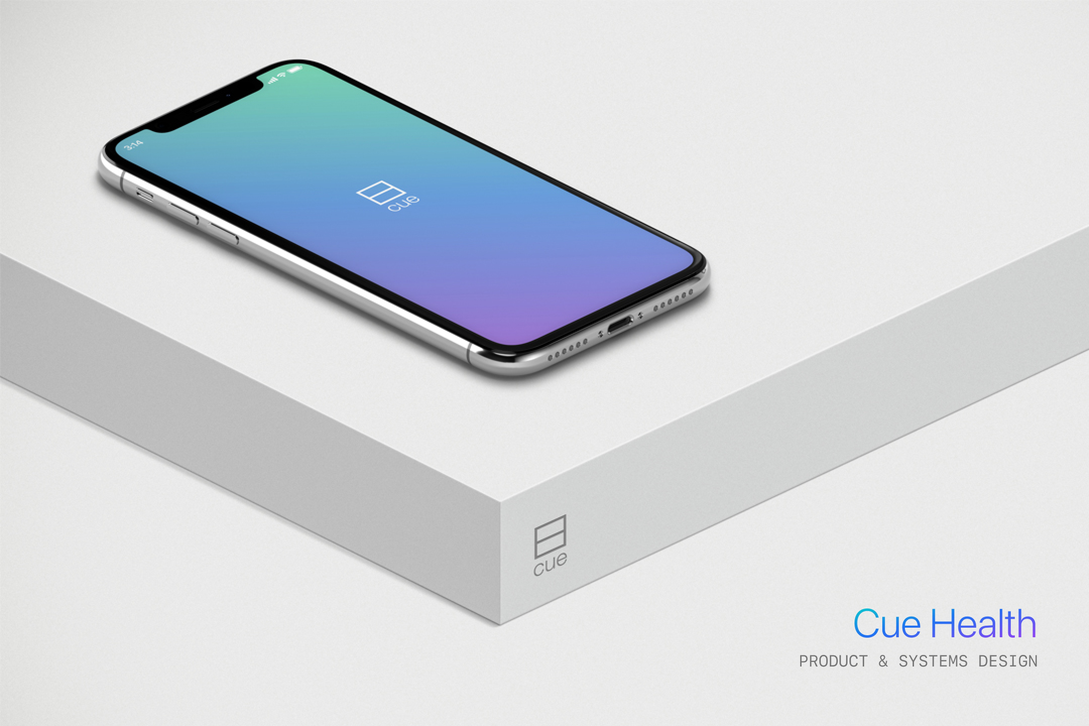
Cue Health
Project
Design System
Role
Principal Designer
Scope
Design system
Color system
Iconography
Interaction design
Product design
Year
2017
Overview
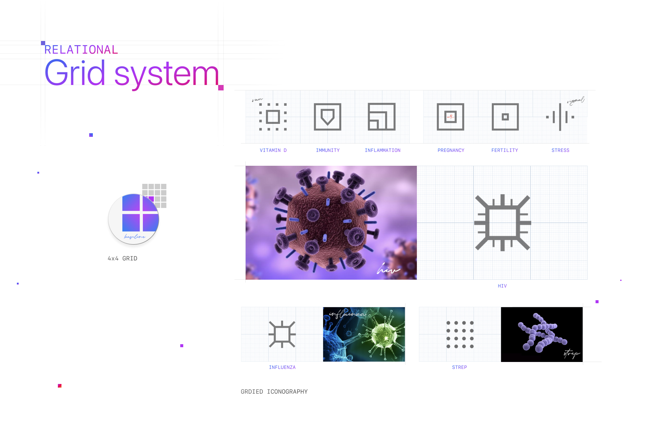
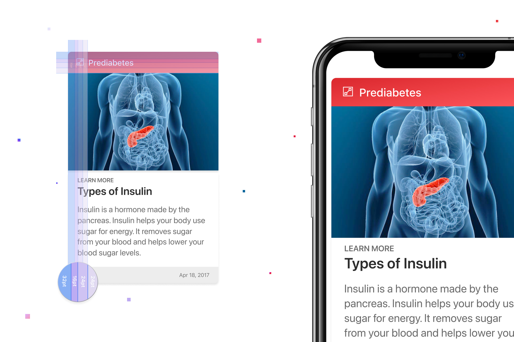
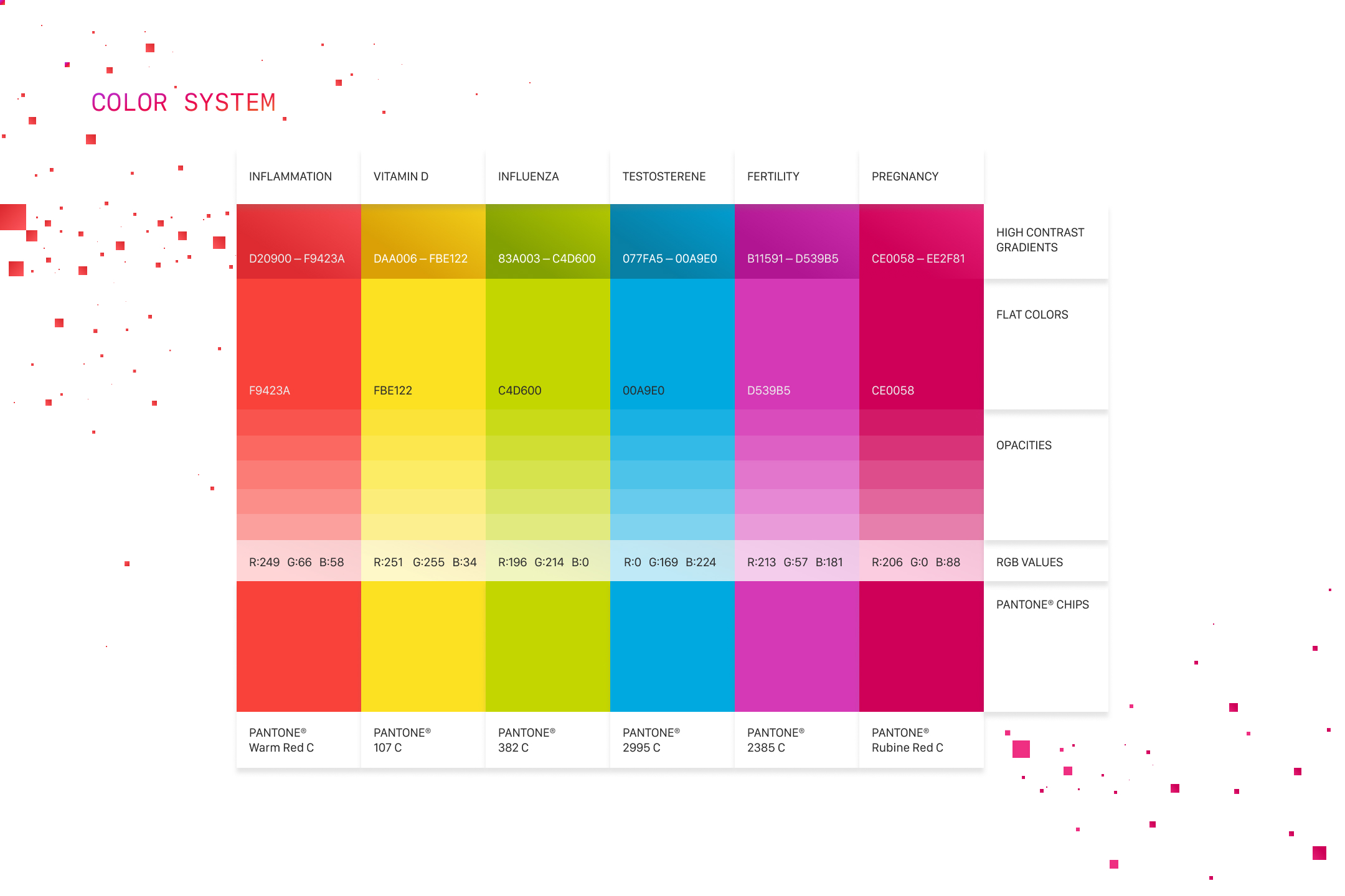
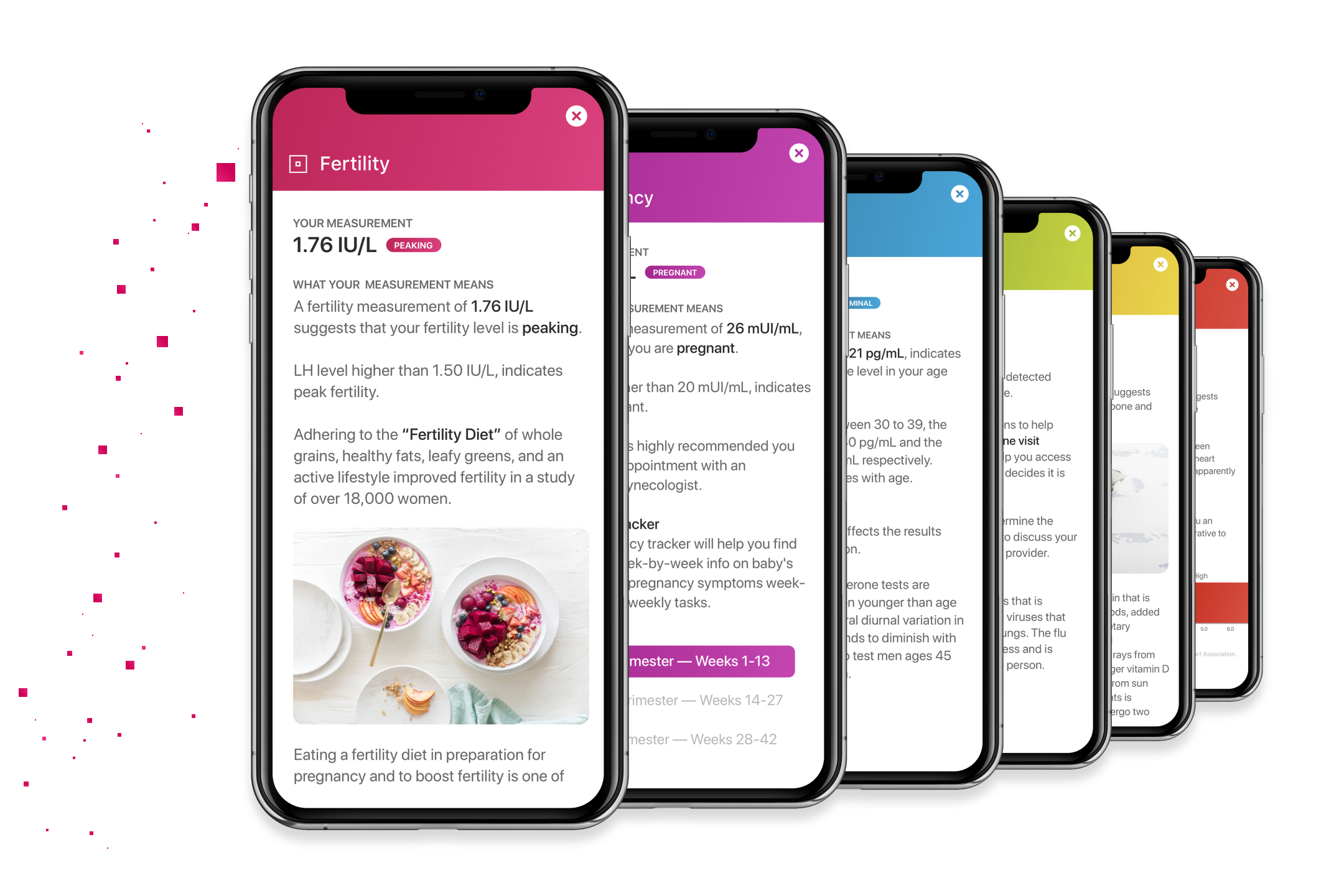
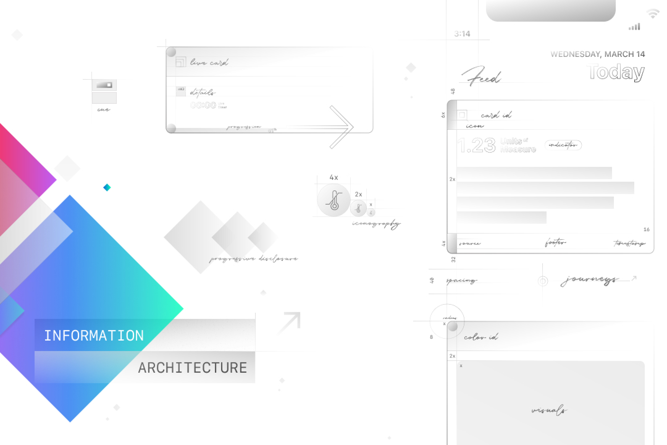
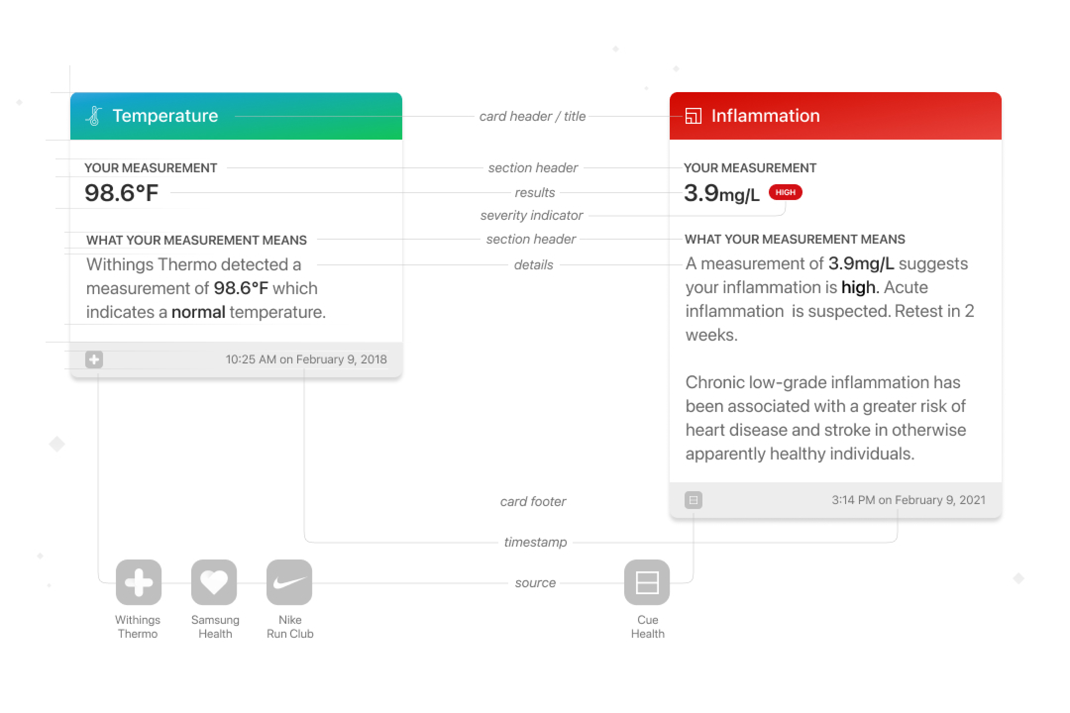
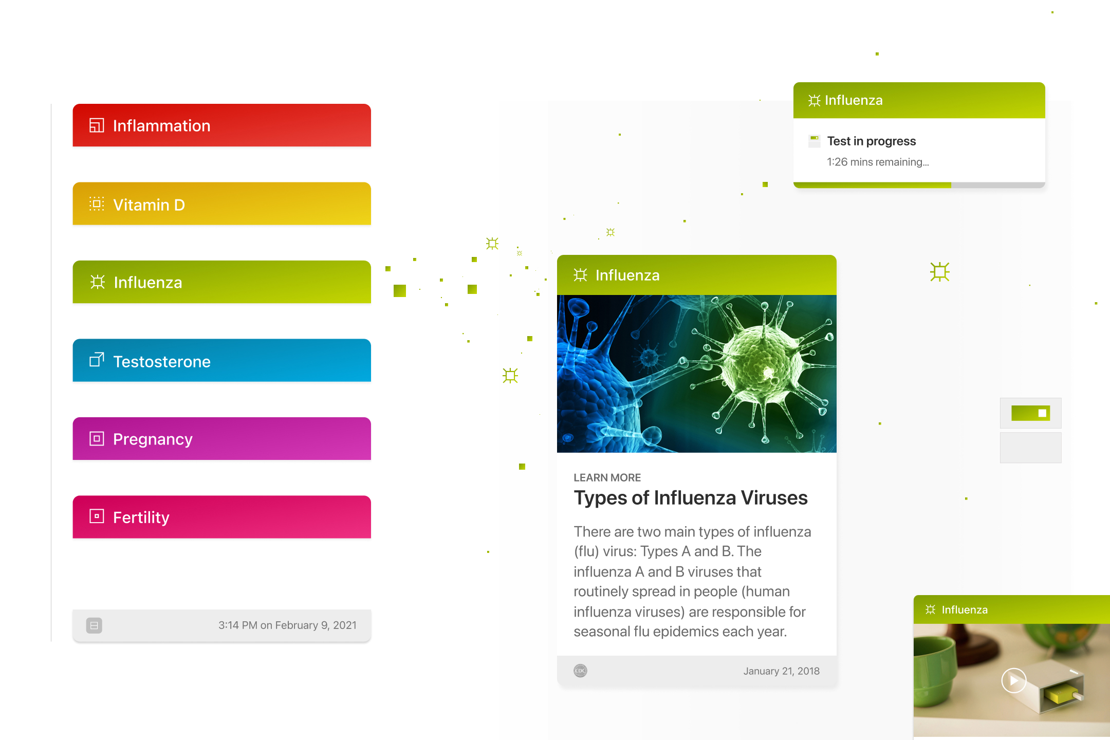
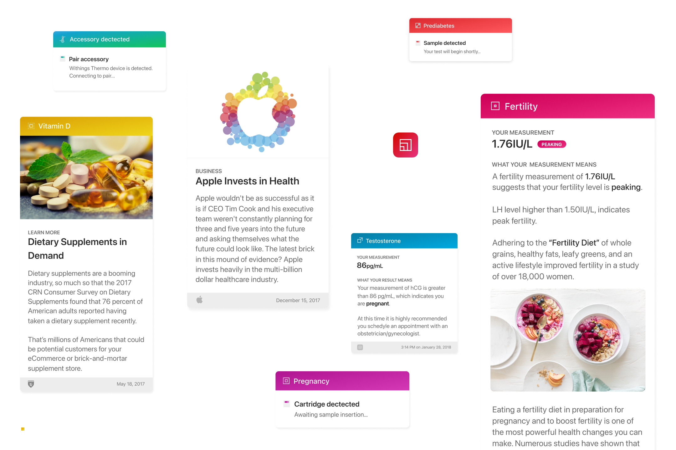
Cue's cartridges, reader and app each carried their own color, iconography and card logic. This system gives them one grid, one color spectrum carried from flat cartridge colors into high-contrast gradients in software, and one card anatomy shared by tests, results and news, so a clinical product reads as one thing from the box to the screen.
𝔊ET IN T𝔒UCH
TERMS OF USE
AMIT PATEL DESIGN𝔖®, CURIOU𝔖 𝔖PACE®, and MEDU𝔖A™ word marks and design marks, along with other names, logos, graphics, and materials displayed on the Site that function as trademarks (collectively, the "Marks"), are owned by or licensed to AMIT PATEL DESIGN𝔖® INℭ. These Marks are protected by copyright, trademark rights, and other intellectual property rights under United 𝔖tates and international law. Unauthorized use, reproduction, or distribution of these Marks is strictly prohibited.
Content on this site may not be used, reproduced, or otherwise exploited for purposes of training or developing artificial intelligence or machine learning technologies, nor for data mining, scraping, or crawling.