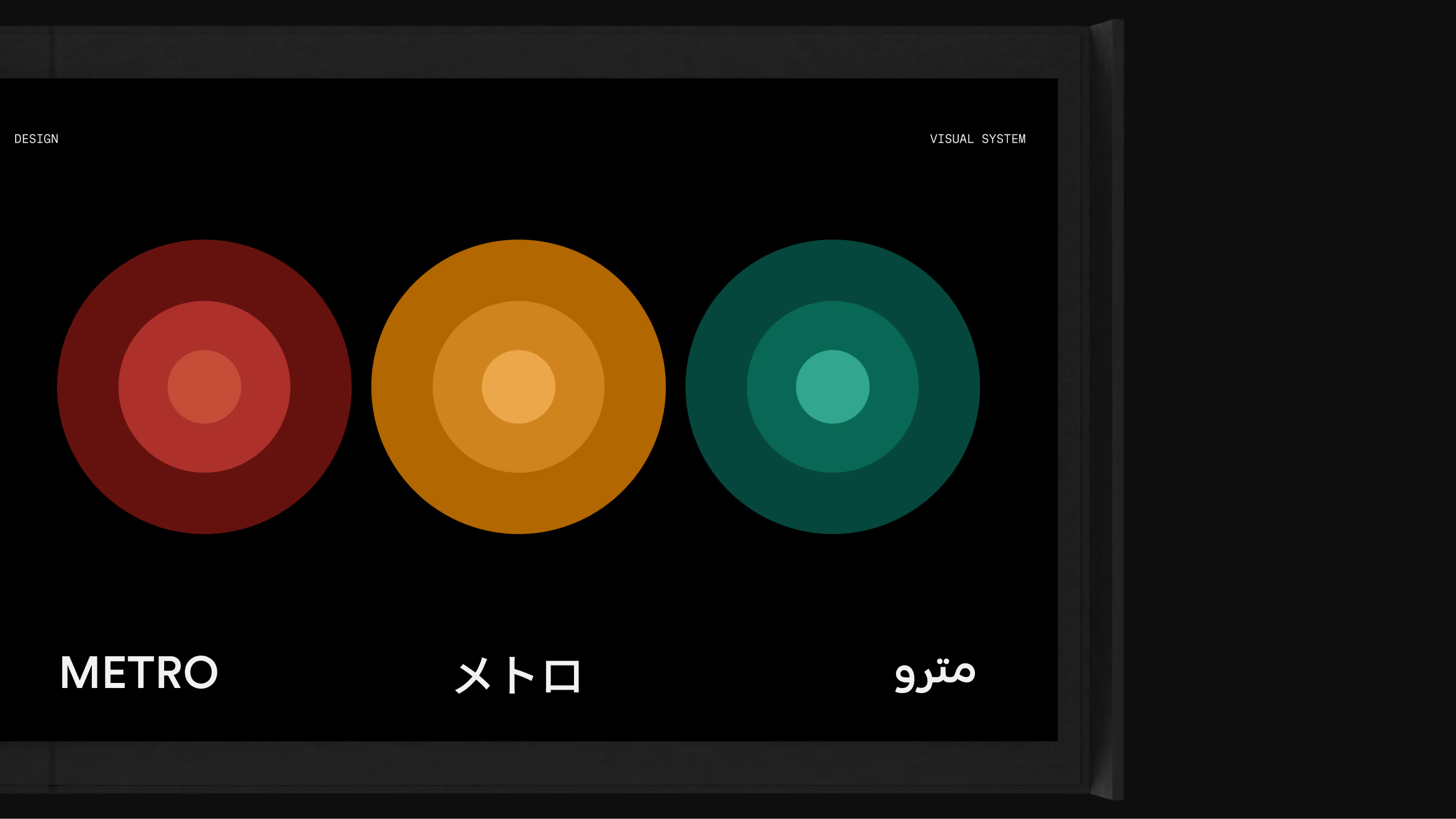
Metro Visual System cover — the wordmark set in Latin, Japanese, and Arabic beneath three line hues, each drawn as concentric rings stepping in lightness.
Company
Glydways
Project
Metro Visual System
Role
Principal Designer
Scope
Type System
Scripts
Pictograms
Signage & Wayfinding
Accessibility
Year
2025

Metro is the visual system for an autonomous transit network that has to work for someone who shares no language with the sign. Color, type, symbol and contrast are fixed before any screen exists, so the same rules hold on a platform totem, a printed map, and a phone.
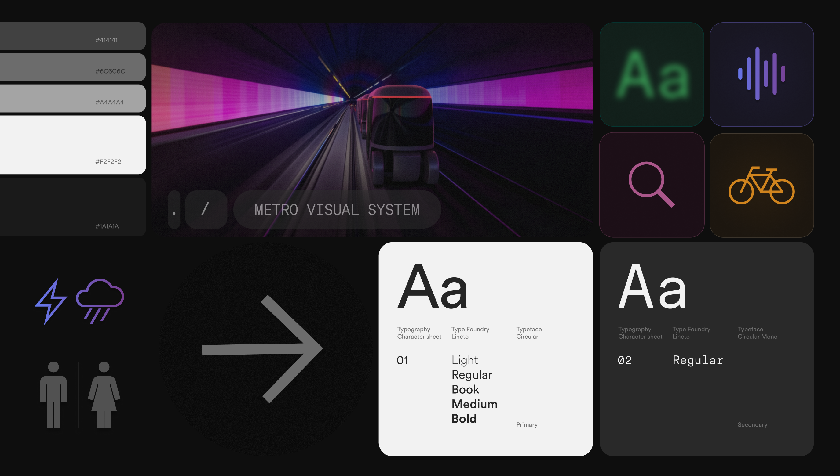
Metro Visual System — opener
Principles

Simplicity

Reduce cognitive load at every moment of use, from first glance to completion.

Flexibility

Adapt to diverse cities, agencies, infrastructures, and operational conditions without breaking the system.

Universality

Work across cultures, scripts, and physical abilities, with accessibility as a default.

Visual Framework

One geometry underneath everything. The mark, the typeface and the pictograms are built on the same grid — but where the mark and the type hold the arc, the pictograms cut it sharp. Information reads as information, not as more brand.
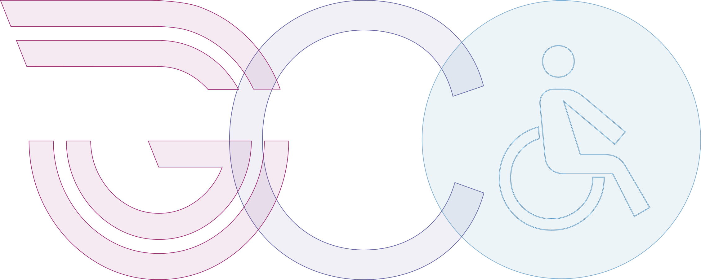
Construction — the mark, the typeface and the pictograms drawn from a shared geometry
Type System

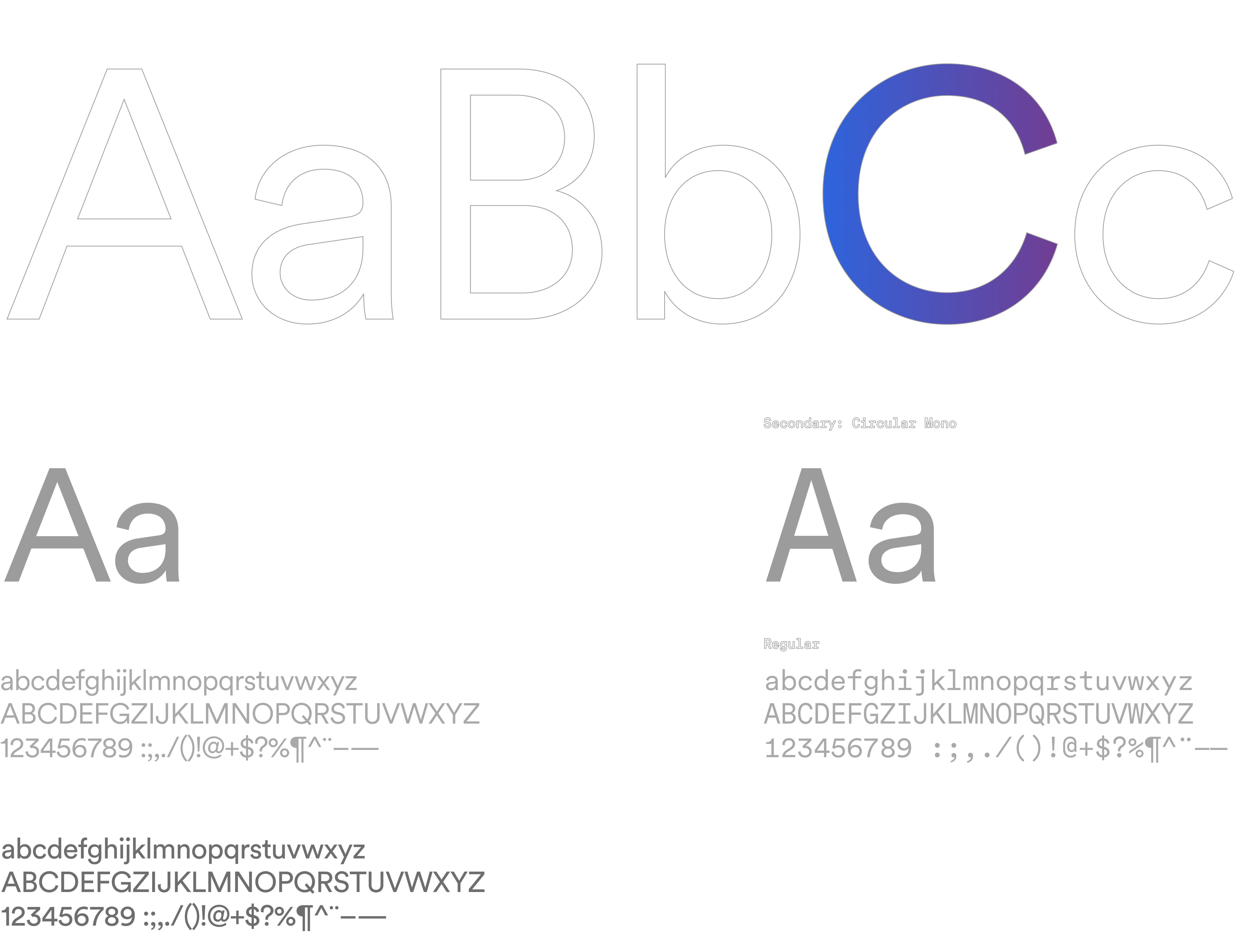
Circular is a distinctive, geometric typeface, which forms the foundation of our identity — pure, balanced, and in motion, seamlessly connecting with our brand mark and pictograms.[1][2]

Circular type specimen — the Metro typeface shown at display and text sizes with its numerals, tabular figures, and diacritics.
Scripts

Circular carries five writing systems on its own — Latin, Greek, Cyrillic, Hebrew and Arabic. Noto Sans picks up the rest: Chinese, Japanese, Korean, Thai and Devanagari. They are matched on stroke weight and apparent size at reading distance, the measures that hold across scripts.

أبوظبيתל אביבLondonΑθήναМосква
SpecimenScriptType FoundryTypefaceCharactersDirectionality
AaLatin + ExtendedU+0000–017FLinetoCircular / Mono384 / 321LTR
ΕλGreekU+0370–03FFLinetoCircular144LTR
КиCyrillicU+0400–04FFLinetoCircular256LTR
עבHebrewU+0590–05FFLinetoCircular112RTL
عرArabicU+0600–06FFLinetoCircular256RTL
中文ChineseU+4E00–9FFFAdobe / GoogleNoto Sans20,992LTR
日本語JapaneseU+3040–30FF · KanjiAdobe / GoogleNoto Sans192+ KanjiLTR
한국어KoreanU+AC00–D7A3Adobe / GoogleNoto Sans11,172LTR
ไทยThaiU+0E00–0E7FGoogleNoto Sans128LTR
देवDevanagariU+0900–097FGoogleNoto Sans128LTR

Characters are counted as Unicode block size — the range of character slots the system has to be able to receive, not the number of glyphs drawn. Japanese counts kana only; its Kanji are drawn from the same block as Chinese and are not counted twice. Circular carries 1,152 across 5 scripts; Circular Mono carries 321; Noto Sans carries 32,612 across 5.

Pictograms

The pictograms resemble the thing they name. A symbol that stands for something only by agreement has to be taught first, and a stranger on a platform has no time to be taught. They are the one part of the system that assumes nothing about the person in front of them — a rider who cannot read the sign, does not have the app, or cannot hear the announcement still knows what it means.
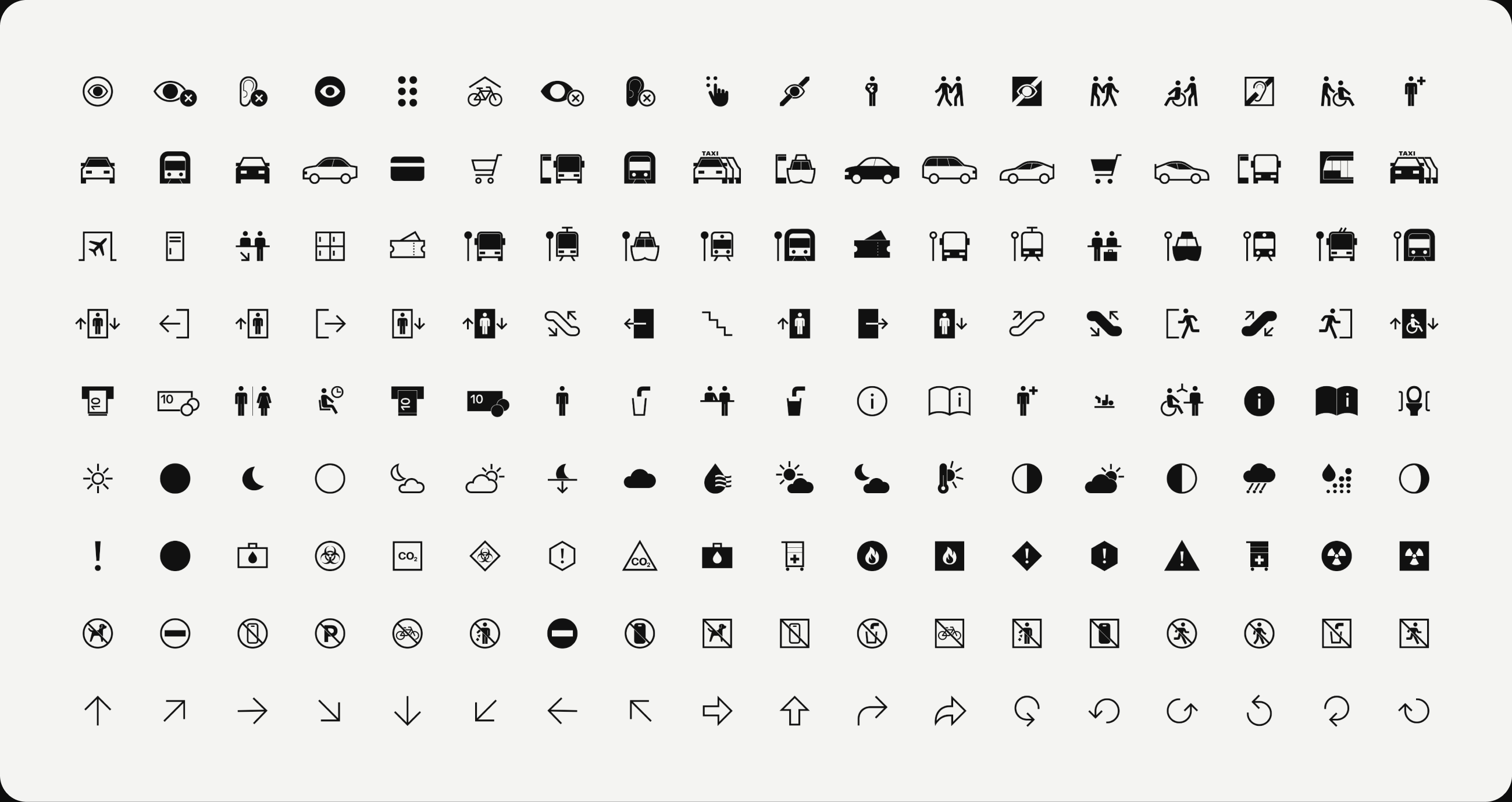
Pictogram set — accessibility, transit, wayfinding, amenity, weather, hazard, prohibition and directional rows
Color System

Color has one job in this system: it identifies a line. Every applied value keeps the hue and saturation of the core it derives from and moves only in lightness, and the shift is recorded rather than eyeballed — so a route holds its identity on a dark platform sign and on a printed white map without becoming a second color.
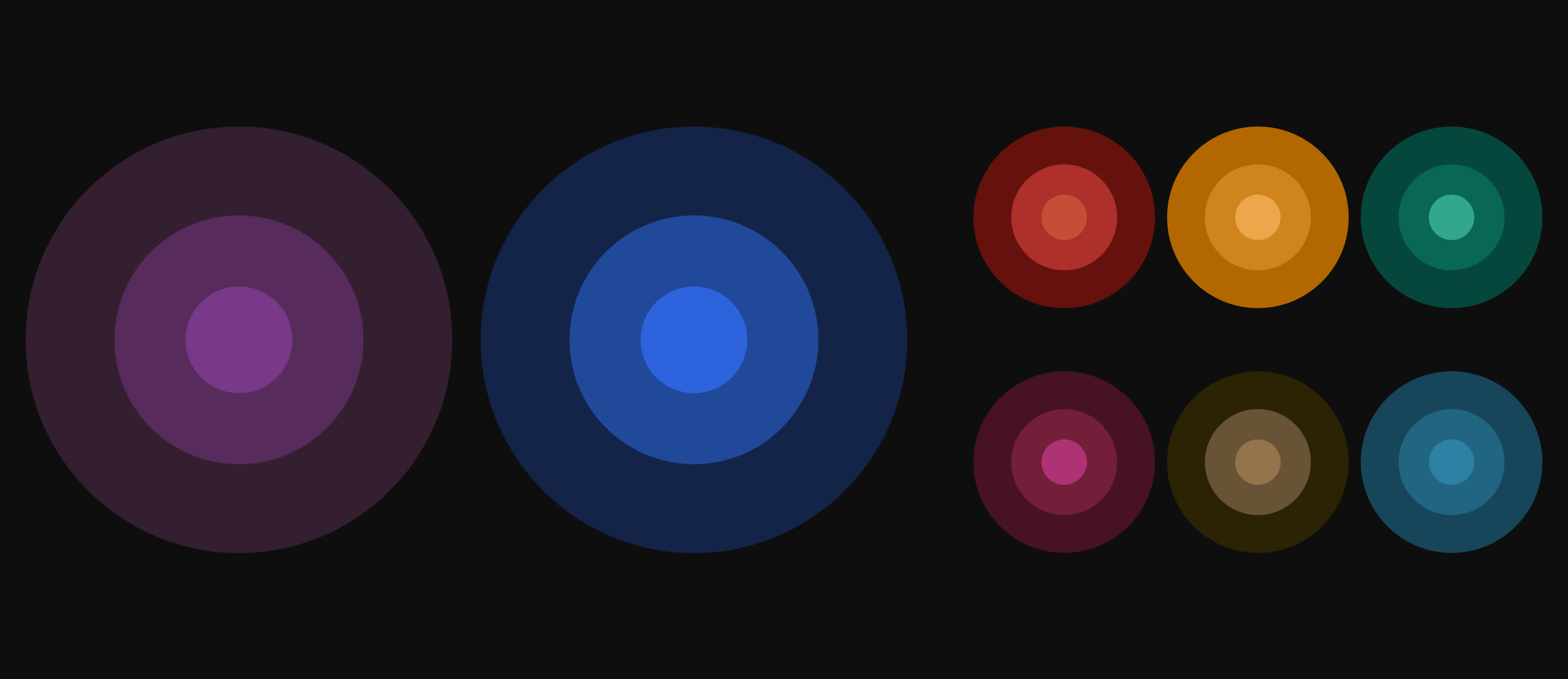
The Metro color system — eight line hues, each drawn as concentric rings stepping in lightness from the flat shade to the applied value.
Accessibility

Every text and control pair clears WCAG AA, measured rather than judged. What reads comfortably to a designer at a desk is too small and too low in contrast for a rider on a platform.

Text on #1A1A1A
Aa#F2F2F2hsl(0, 0%, 95%)15.55AA
Aa#A4A4A4hsl(0, 0%, 64%)6.98AA
Aa#828282hsl(0, 0%, 51%)Derived · L +94.53AA
Aa#507EE3hsl(221, 72%, 60%)Derived · L +84.50AA
Aa#AD66BFhsl(288, 41%, 57%)Derived · L +194.50AA
Text on #F2F2F2
Aa#1A1A1Ahsl(0, 0%, 10%)15.55AA
Aa#414141hsl(0, 0%, 25%)9.12AA
Aa#793989hsl(288, 41%, 38%)6.80AA
Aa#2D64DDhsl(221, 72%, 52%)4.71AA
Aa#6C6C6Chsl(0, 0%, 42%)4.69AA
Surface only — never text
#793989hsl(288, 41%, 38%)
#2D64DDhsl(221, 72%, 52%)
#A4A4A4hsl(0, 0%, 64%)
#6C6C6Chsl(0, 0%, 42%)
#414141hsl(0, 0%, 25%)

Ratios measured against WCAG 2.2. Success Criterion 1.4.3 requires 4.5:1 for text; SC 1.4.11 requires 3:1 for non-text. Derived tints move lightness only; hue and saturation are unchanged. Surface values carry no ratio because they are never set as text.

Applications

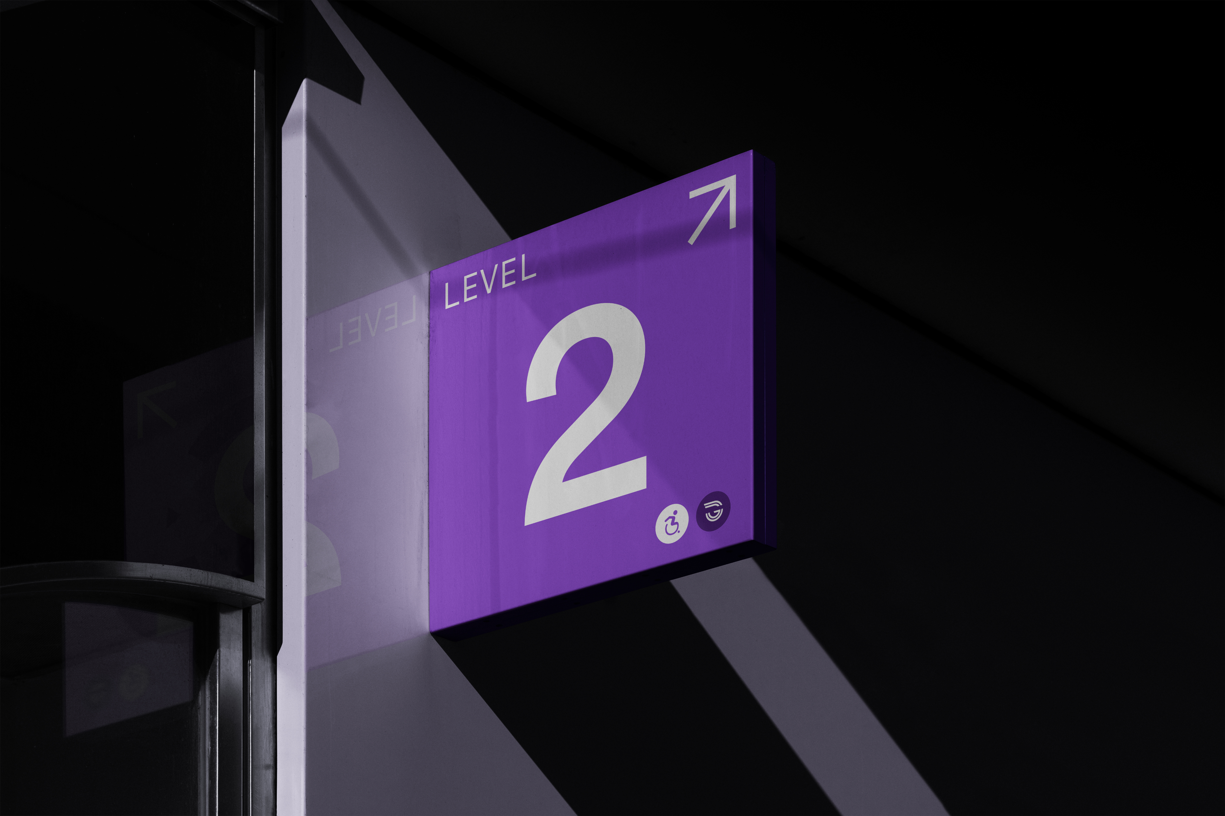
A signal keeps working only while it means one thing. Nova Purple identifies a line, light identifies a place, and the marks stay neutral so neither has to compete — on the platform that reads as a purple route, a halo canopy, and a level marker.
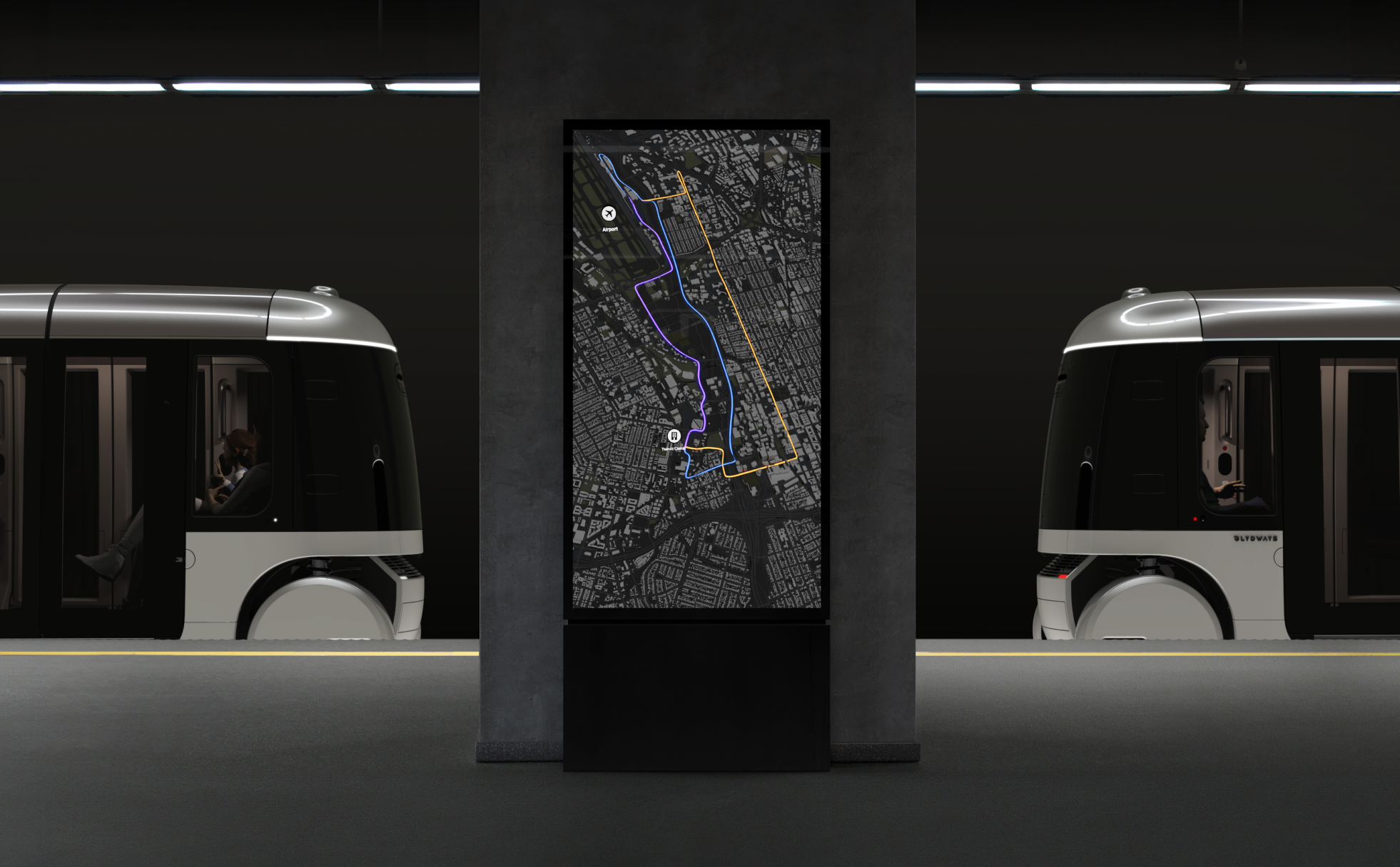
Station totem between two vehicles, the route shown as a purple line
Color identifies a line
Halo canopy lit above a platform at dusk
Light identifies a place
Level marker sign mounted overhead in a station
The mark stays neutral
The Outcome

One geometry, ten writing systems, one pictogram family, every color pair measured against AA. The stranger who arrives with none of the language still knows which way to go.
Related Work
Lumasis design system coverGlydways Brand Guidelines cover