Cue Health System

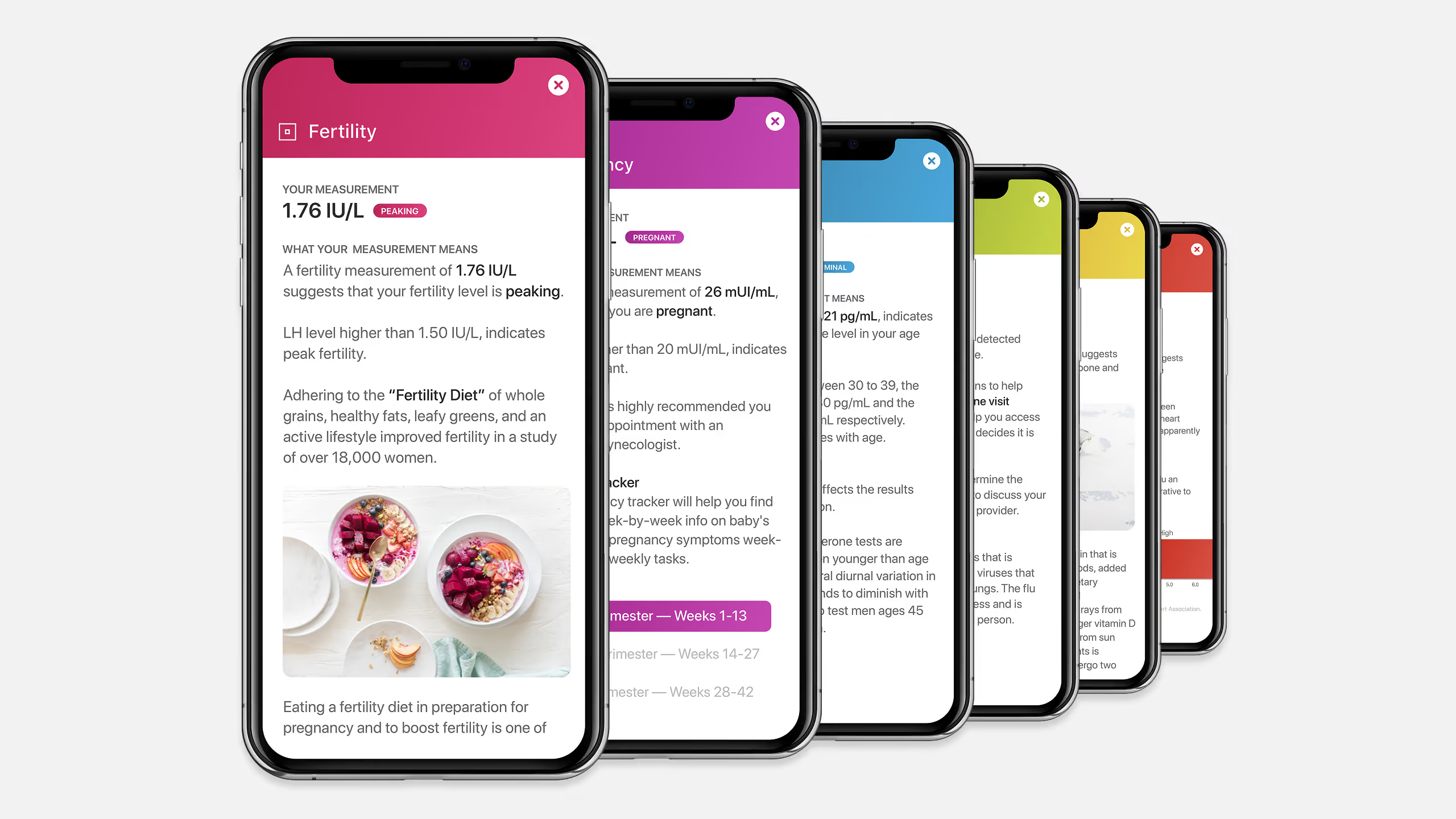
Cue Health System cover: six phones fanned out, each showing a test result screen in its own color.
Company
Cue Health
Project
Design System
Role
Principal Designer
Scope
Design system
Color system
Iconography
Interaction design
Product design
Year
2017
Overview
Cue built a connected diagnostic platform: single-use test cartridges, a reader and an app that returns lab results to a phone in minutes. The system gives all three one grid, one color logic and one card anatomy, so a clinical product reads as one thing from the box to the screen.

One color names the test.

The same hue on the cartridge, in the app and on the result.

The grid in numbers01
4 pxBase grid
80 ptIcon size
2 ptMinimum stroke
8 pxCard radius

One 4 px base sets the stroke, icon size, type, leading and image tiles, so every element scales in step from 25× to 400×.

One color per test02
TestCartridgeScreenGradient
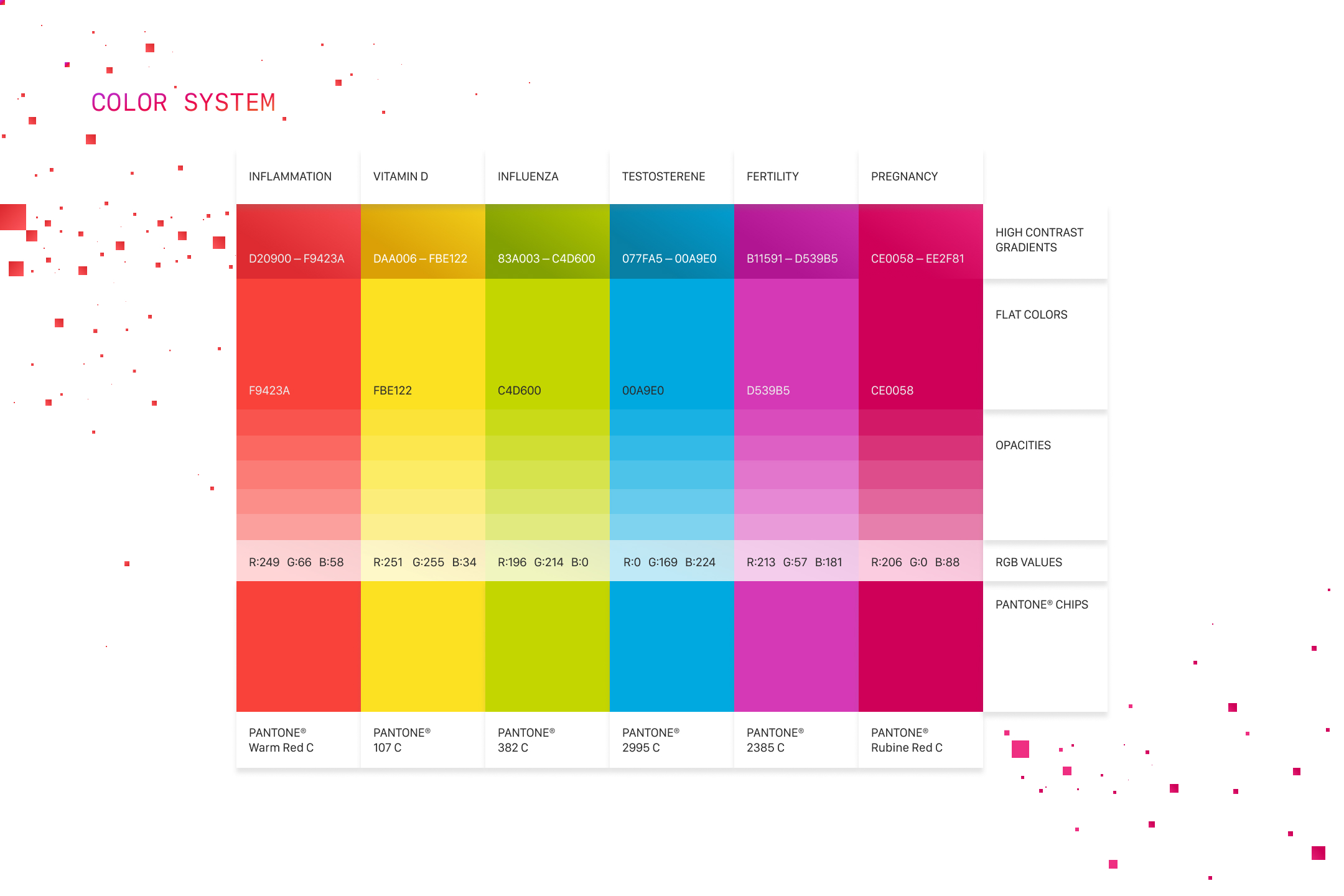
InflammationPantone Warm Red C#F9423A#D20900 → #F9423A
Vitamin DPantone 107 C#FBE122#DAA006 → #FBE122
InfluenzaPantone 382 C#C4D600#83A003 → #C4D600
TestosteronePantone 2995 C#00A9E0#077FA5 → #00A9E0
FertilityPantone 2385 C#D539B5#B11591 → #D539B5
PregnancyPantone Rubine Red C#CE0058#CE0058 → #EE2F81

Every housing stays Pantone Cool Gray 4 C and all pad printing stays Pantone 185 C, so the test color is the only thing that changes. Pantone chips are shown as their screen match.

Five card rules03
  1. 01One job

    One piece of content, one primary action and no more than two secondary actions.

  2. 02Done in place

    The primary action completes inside the card.

  3. 03Never a dead end

    Every card opens into a full detail view.

  4. 04Nothing hidden

    Cards never flip, fold or scroll. All of the content shows at once.

  5. 05Fixed width

    Content sets the height. The width never changes.

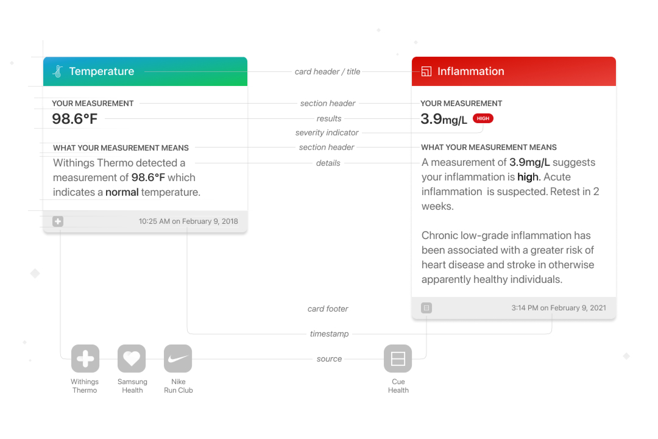
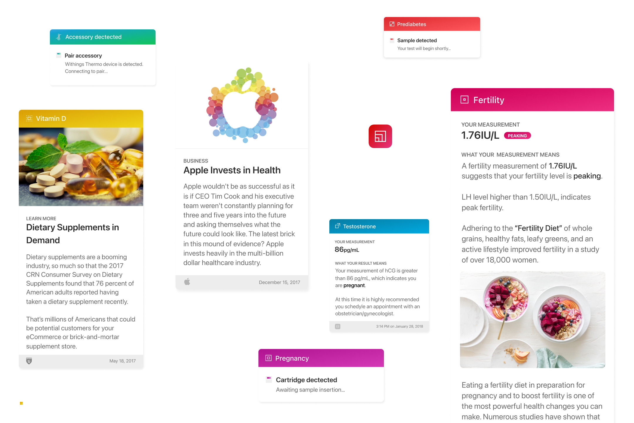
Results, news and third-party data share one card: header, result with a severity indicator, details, footer, a localized timestamp and a source.
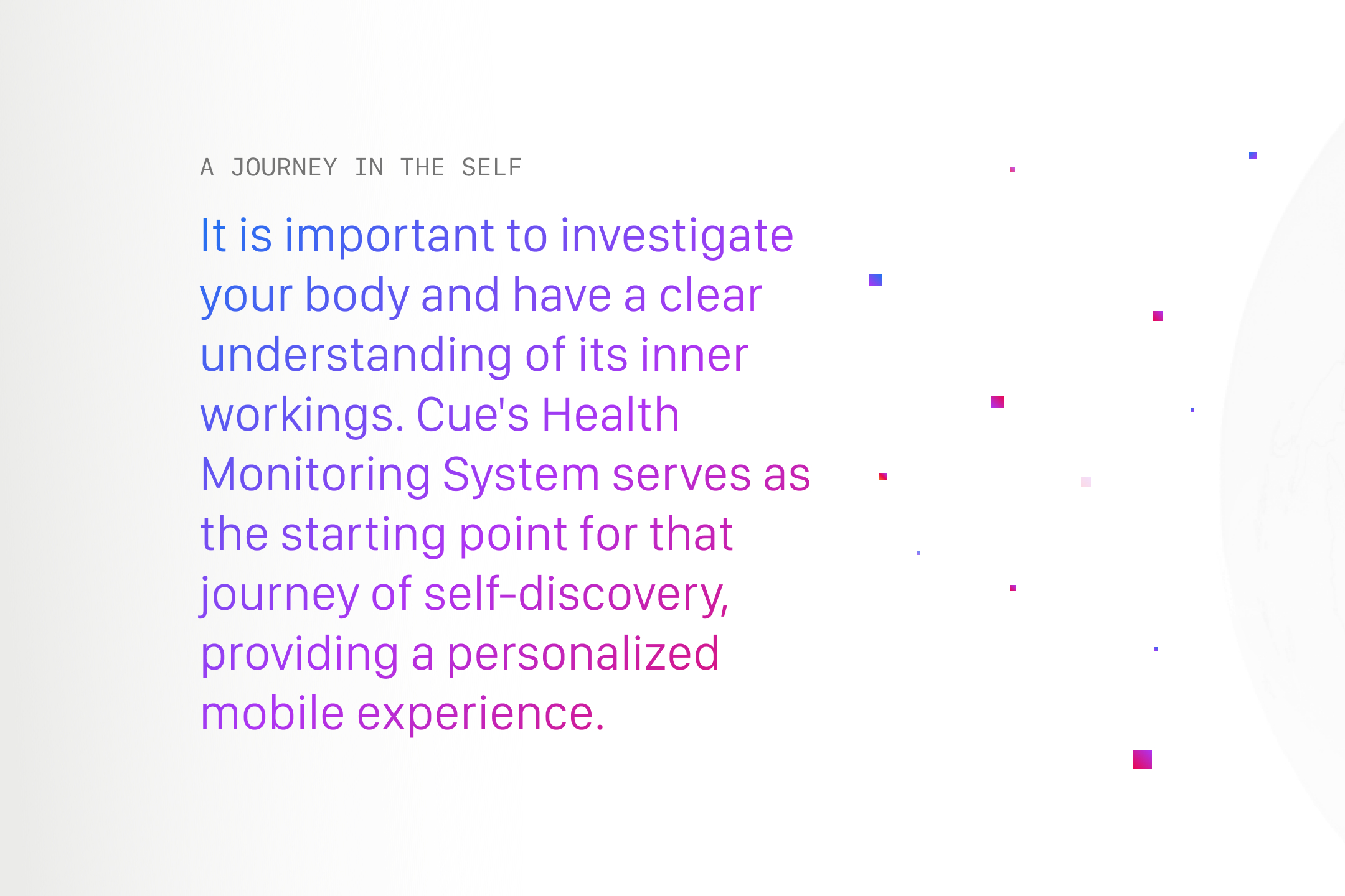

A Journey in the Self: Cue's health monitoring system framed as the starting point for a personalized mobile experience, set in a blue-to-magenta gradient.
One system, many experiences: a single, consistent experience unifying Cue's industrial product design and its software, set over a dotted globe.
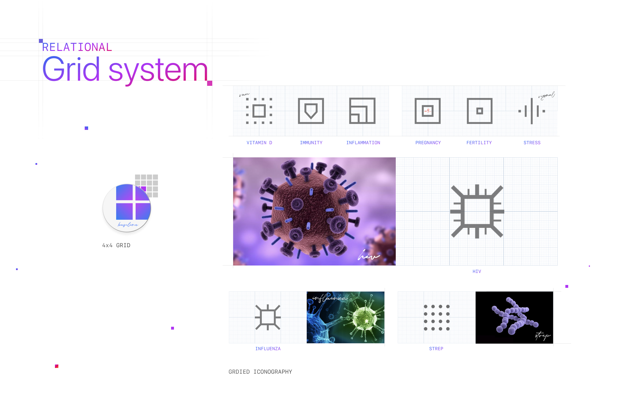
Relational grid system: a 4 × 4 grid behind the Cue app icon, and gridded icons for vitamin D, immunity, inflammation, pregnancy, fertility, stress, HIV, influenza and strep, each paired with its imagery.
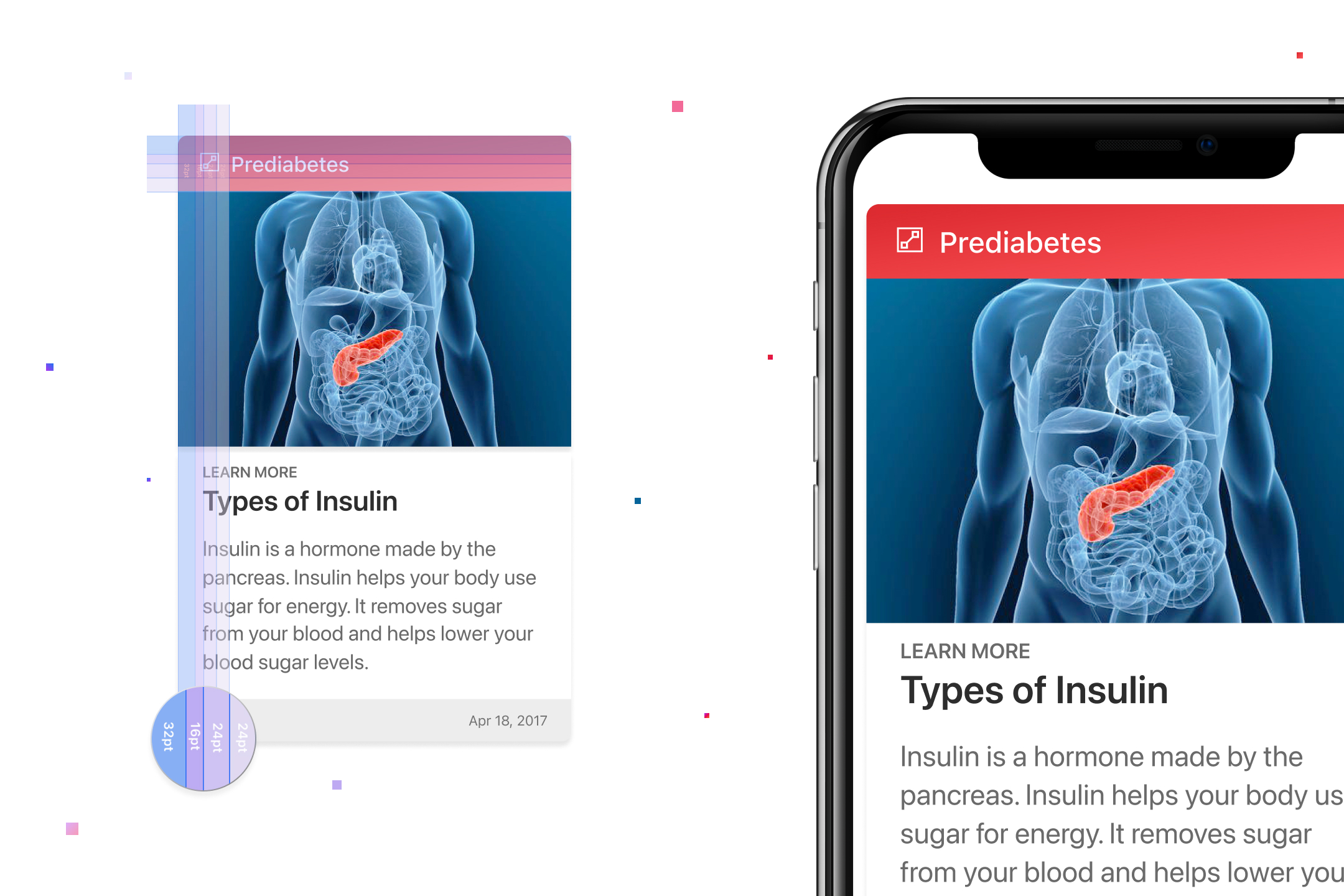
Card grid: a Prediabetes learn-more card on Types of Insulin with 32, 16 and 24 pt spacing overlaid, shown beside the same card on iPhone.
Color system: six test colors, inflammation, vitamin D, influenza, testosterone, fertility and pregnancy, each shown as a high-contrast gradient, a flat color, opacity steps, RGB values and a Pantone chip.
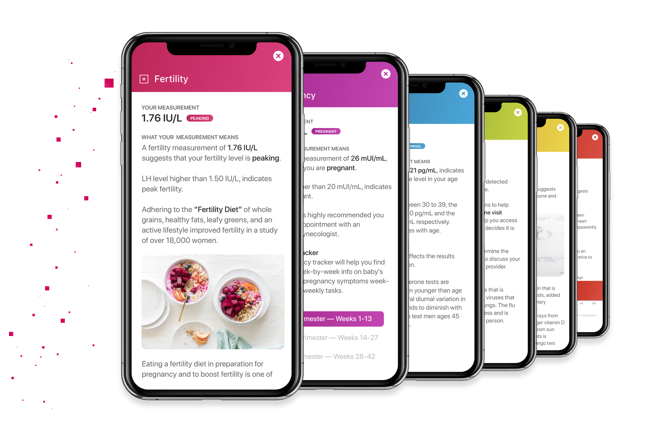
Result screens for fertility, pregnancy, testosterone, influenza, vitamin D and inflammation on six iPhones, each headed by its test color.
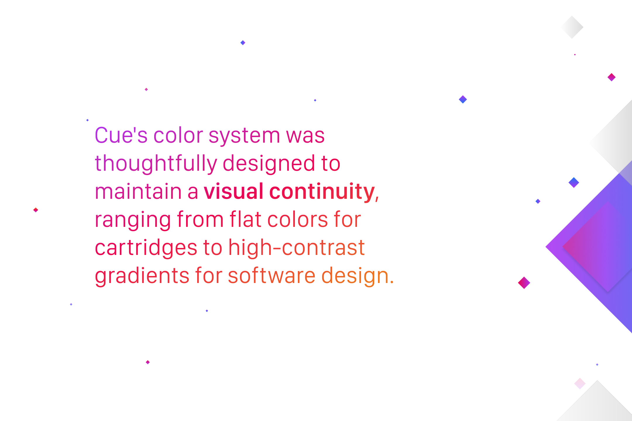
Cue's color system keeps visual continuity, from flat colors on cartridges to high-contrast gradients in software.
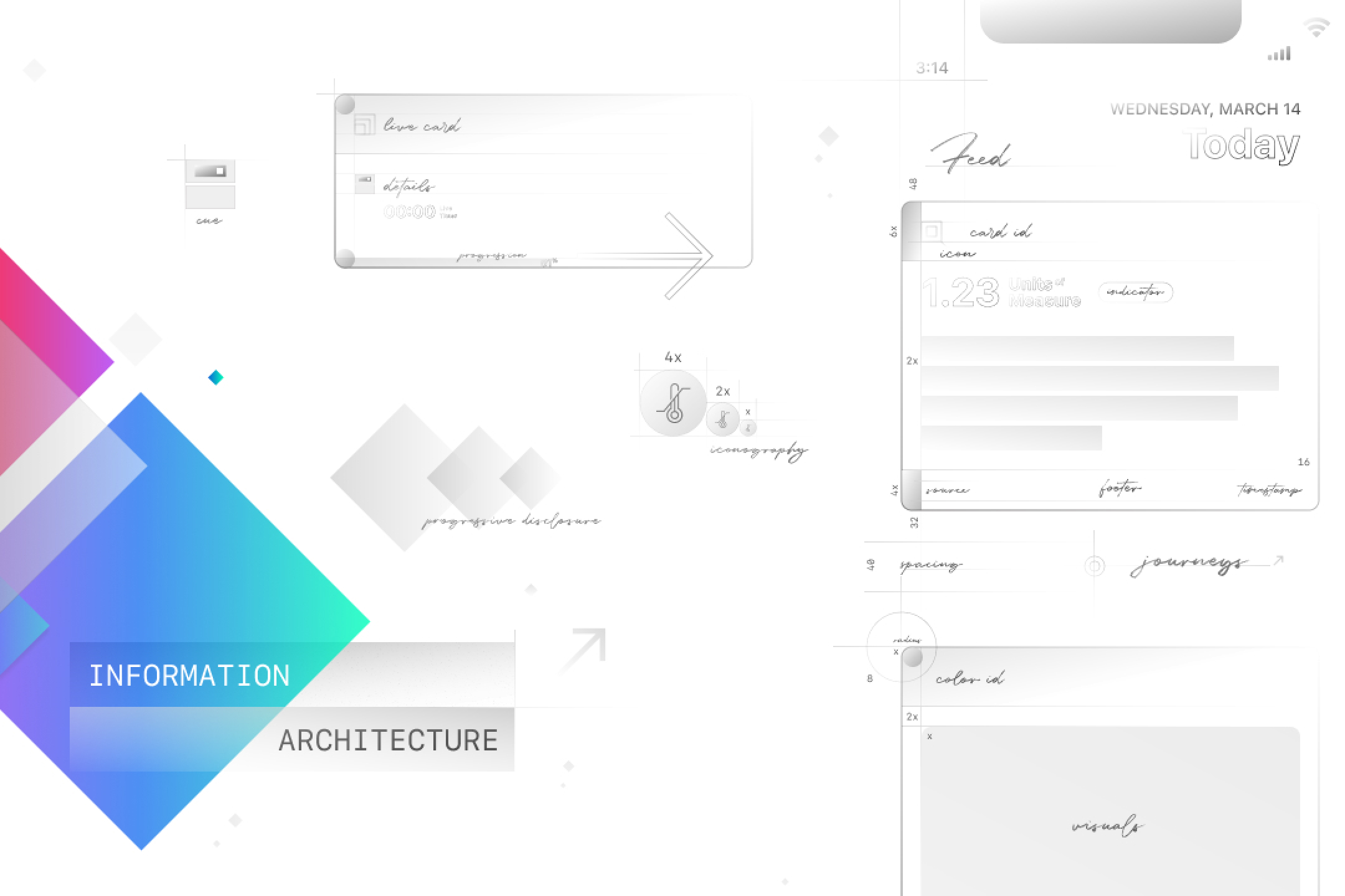
Information architecture: a wireframe of the Today feed with annotated card anatomy, card ID, icon, units, indicator, footer and timestamp, plus spacing, iconography scale, progressive disclosure and journeys.
Card anatomy: Temperature and Inflammation result cards annotated with card header, section header, result, severity indicator, details, footer, timestamp and source, drawing on Withings Thermo, Samsung Health, Nike Run Club and Cue Health.
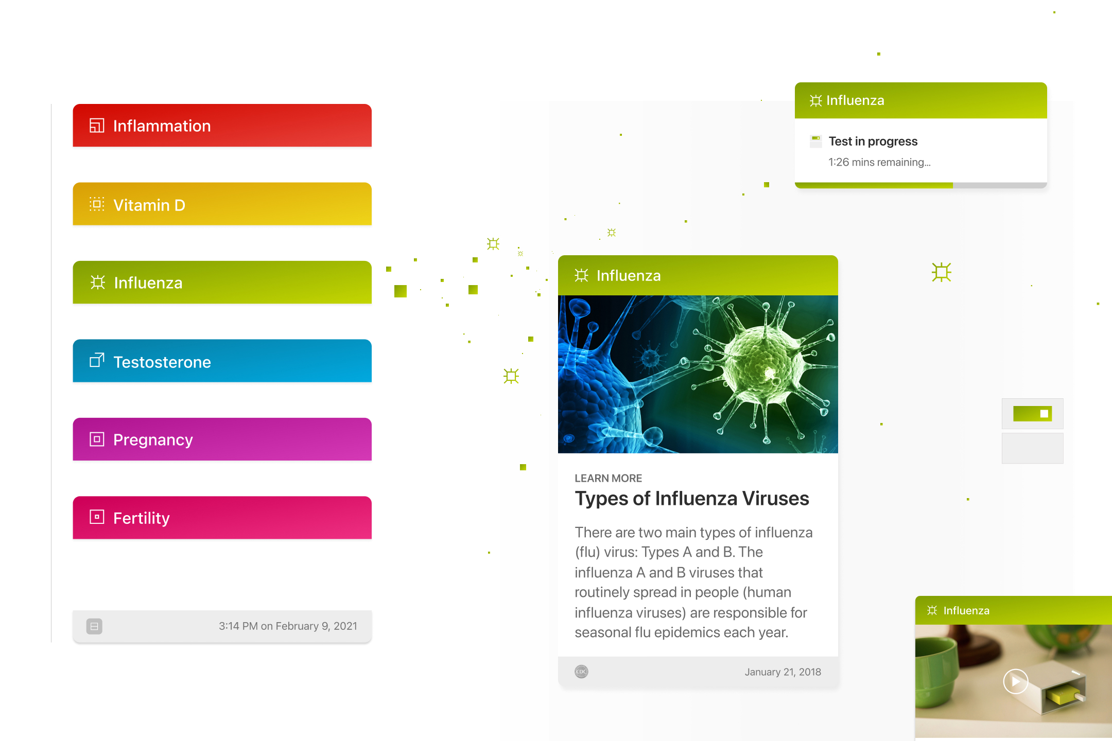
Card headers in six test colors, an Influenza learn-more card, a test-in-progress notice and a video card, all built on one card anatomy.
Feed cards on one anatomy: accessory and cartridge detection notices, a Vitamin D article, an Apple health news story, a Testosterone result and a Fertility result.

Brand mark · 80 × 80 pt · 4 pt grid

Brand MarkOrigin
Field 80 × 80 ptGrid 4 ptLive area 40 ptStroke 2 ptSubgrid 1 pt

Cue Health · Iconography

One square,
every icon.

Cue Health · Cartridge

Grid, gray, color.

  1. 01 Grid
  2. 02 Gray
  3. 03 Color

Plan view, schematic: housing and face set as two 80 pt squares. Icon lands white at 16 pt, bottom right of the face with 8 pt margins, as on the shells. Testosterone has no icon in the 2018 masters.

Lumasis design system coverGlydways Brand Guidelines cover