
%20Cover.avif)
Type Cast
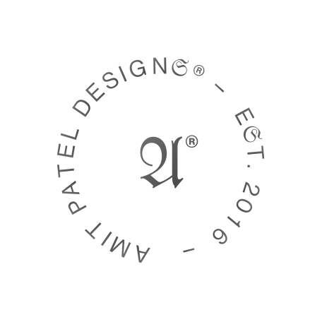
Every writing system carries a decision inside it before a single word gets set — who it was built to be read by, and what it assumed about them. That's why type and language show up together across this practice instead of as separate disciplines: a typeface is never neutral, and treating it as if it were is its own kind of choice. This monogram carries two of those decisions at once.
An ampersand is a fossil before it's a flourish. It began as the Latin et — “and” — written fast enough, by enough scribes, over enough centuries, that the e and the t fused into a single stroke; most ampersands still carry a ghost of that t as a crossbar, if you know where to look for it. The swash version here keeps the motion of a hand rather than the geometry of a tool, which is the whole point of the Garamond tradition: type built to still look like it was being written.
That kind of attention to where a letterform actually comes from isn't limited to one ampersand. It shows up in the four-script type ladder on Medusa, a visual system built around five core hues and letterforms drawn from four different writing traditions. The seal's fraktur A, though, comes from a much stranger, much shorter story than the ampersand does.
That story starts with Textura, the dense pointed blackletter Gutenberg printed with, and runs through the rounder Rotunda and the more cursive Schwabacher before settling into Fraktur proper in the early 1500s — Germany's working typeface for the next four hundred years, right up until 1941, when the Nazi regime banned it by decree, dismissing centuries of German printing as “Schwabacher Jewish letters” and replacing it overnight with Antiqua for international use. The fraktur A on this seal is standing in, whether it means to or not, for a typographic tradition that ended by government order rather than by drift.
Neither letterform carries a caption explaining any of this on the page itself, and it shouldn't have to: this site keeps citing type traditions the way Metro Visual System fixes its wayfinding scripts before a single screen exists — decided early, and held to, rather than picked for how they look in the moment.
None of that changes how the mark reads at a glance, and it shouldn't have to — a logo doesn't need its footnotes to do its job. But it's the kind of detail this site is generally built to reward: two type traditions, centuries and a government ban apart, sitting inside one small monogram because nobody thought to ask whether they belonged together. Typography might be the one design system old enough that its inconsistencies are actual history, not technical debt.
TERMS OF USE
AMIT PATEL DESIGN𝔖®, CURIOU𝔖 𝔖PACE®, and MEDU𝔖A™ word marks and design marks, along with other names, logos, graphics, and materials displayed on the Site that function as trademarks (collectively, the "Marks"), are owned by or licensed to AMIT PATEL DESIGN𝔖® INℭ. These Marks are protected by copyright, trademark rights, and other intellectual property rights under United 𝔖tates and international law. Unauthorized use, reproduction, or distribution of these Marks is strictly prohibited.
Content on this site may not be used, reproduced, or otherwise exploited for purposes of training or developing artificial intelligence or machine learning technologies, nor for data mining, scraping, or crawling.