Glydways Token Architecture
Brief

Built4 parameters
Color9 families · Ember to Magenta01
LightEach color through glass · 34%02
Glass4 materials · frosted to dark03
Depth5 steps · .05 to .4004
Outcome
Scalable frameworkOne token architecture · rider, operator, embedded, web
SystemizationFoundations · components · governance
AccessibilityWCAG AA · every primary text and control
Stack
Design & prototypingFigmaLottie
BuildClaudeCSS variablesJavaScriptJSON
Role

Principal DesignerHuman Interface & Design SystemsBuilt the token architecture from zero: four parameters, every token named from its own value, one set shipped across the rider app, the vehicle UI, station signs and kiosks, and the operator console.

Team
Software design2
Product & QA3
Engineering3
Program span
2025–2026

01

Token Architecture

Lumasis treats light as a flow. Color is the source, glass is what it passes through, light is the color that comes out the other side, and depth decides what comes forward. This page is the detail behind those four parameters: every token, how it is named, and how it holds up across surfaces.

Parameters

Type and pictograms come from Metro and stay fixed. Color is the one parameter built to adapt: with no driver on board, it says which line, what's next and what needs attention. Light, glass and depth follow from it. Read the stack from the bottom; every value is a shipped token.

  1. 04Depth
  2. 03Glass
  3. 02Light
  4. 01Color
Color
Glass
Depth

Read from the bottom. Color is the value Metro hands down; light is that color once the glass sits over it, which on a dark surface lands darker — hence the negative delta. Every parameter is picked rather than dragged: nine families, four grounds, five depths, and nothing in between any two of them. The grounds are ordered by density rather than by name — .045, .20, .30, .44 — so both material rows run the same direction and the surface gets heavier toward the right. Only Tinted takes its cast from the family; the other three are fixed materials, so stepping the color moves one ground and leaves the rest where they are. Every value shown is a shipped token.

Token Architecture

Token Architecture

The vehicles already speak in data, so the tokens had to as well. Every name is derived from its value — family from the HSL hue, step from the HSL lightness — so the token file reads the same to a designer, an engineer and a model. AI did the translation work: it turned the parameters into tokens and mapped them against ADA and WCAG requirements.
Color & Light

One family read at two levels. Color is the flat, brightest shade the Metro standard hands down; light is that same color through glass at 34% — subtractive, so on a dark surface it lands darker.

Rejected

A parallel palette for dark surfaces. Doubles the token count and lets the two drift apart.

Consequence

ΔL is the number the pair is checked on: 18 to 30 points in every family, which is also the band that clears AA.

Depth

Screens stack — a sheet over a panel over the ground — and something has to say which one is nearer. Here that is a single number: opacity, five steps, .05 → .40. The blur behind it never changes.

Rejected

A parallel blur ladder stepping down as priority rises. Two properties expressing one idea, disagreeing at the edges.

Consequence

Depth is a single number an engineer can read off a token, and blur became a function of velocity rather than a decoration.

Nomenclature

Token names come from the value itself — the family from where the hue sits, the step from the lightness. Two designers naming the same swatch independently arrive at --lum-blue-52.

Rejected

A curated semantic vocabulary. Readable on day one, contested by month three.

Consequence

Naming stops being a review topic. The token is checkable against its own value.

Token sheet9 families · 4 parameters · hover a row

ColorLightGlassDepth

Composed

Material : Glass

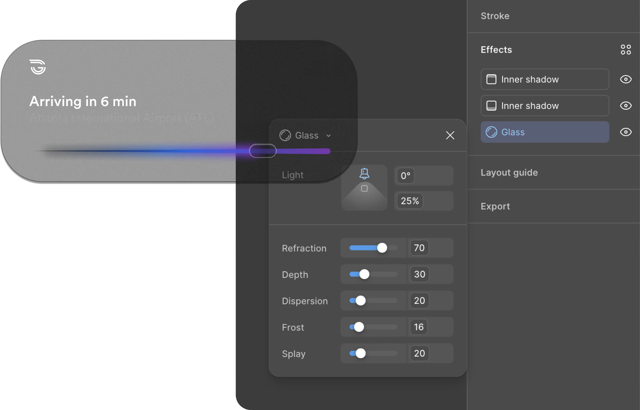
Glass is the one material Lumasis does not define on its own terms. It is authored as a Figma tool built on Apple’s Human Interface Guidelines[2], with refraction, depth, dispersion, frost and splay carried as named values rather than approximated by eye, so a designer specifies glass the way the platform specifies it. That is what lets the same pill render on the Dynamic Island and the Lock Screen without being rebuilt for either.

Pill token architecture

{
  "pill": {
    "bg": {
      "default":  { "value": "{color.surface.1}" },
      "hover":    { "value": "{color.surface.2}" },
      "pressed":  { "value": "rgba(255,255,255,0.08)" },
      "disabled": { "value": "rgba(255,255,255,0.03)" }
    },
    "text": {
      "default":  { "value": "{color.ink.primary}" },
      "disabled": { "value": "rgba(255,255,255,0.35)" }
    },
    "radius": { "value": "{radius.pill}" },
    "height": { "value": "{size.pillHeightMd}" },
    "stroke": {
      "width": { "value": "{stroke.hairline}" },
      "color": { "value": "rgba(255,255,255,0.14)" }
    },
    "glass": {
      "blur":                  { "value": "{blur.glassMd}" },
      "specularOpacity":       { "value": 0.55 },
      "innerHighlightOpacity": { "value": 0.18 },
      "chromaticShift":        { "value": "0.6px" }
    }
  }
}
The glass material authored as a Figma tool — refraction, depth, dispersion, frost, and splay carried as named values in the effects panel rather than approximated by eye.

Accessibility

With no staff on board, nobody is there to help a rider who can't read a screen, so accessibility has to live in the interface itself.

Contrast

A dark theme with glowing accents has to clear WCAG AA on every primary text and control; each applied value sits 18 to 30 points of lightness below its core.[1]

Glass

Frosted, Dark, Tinted and Prismatic all carry text at the same light values, so contrast doesn't reset depending on which surface a control lands on.
Contrast checkWCAG 2.x · computed live

Color
Glass

Text on the line color

Arriving in 6 min
4.71:1AA

Text on glass, over the canvas

Arriving in 6 min
12.35:1AA
Related Work
Lumasis design system coverGlydways Brand Guidelines cover