Glydways Surfaces
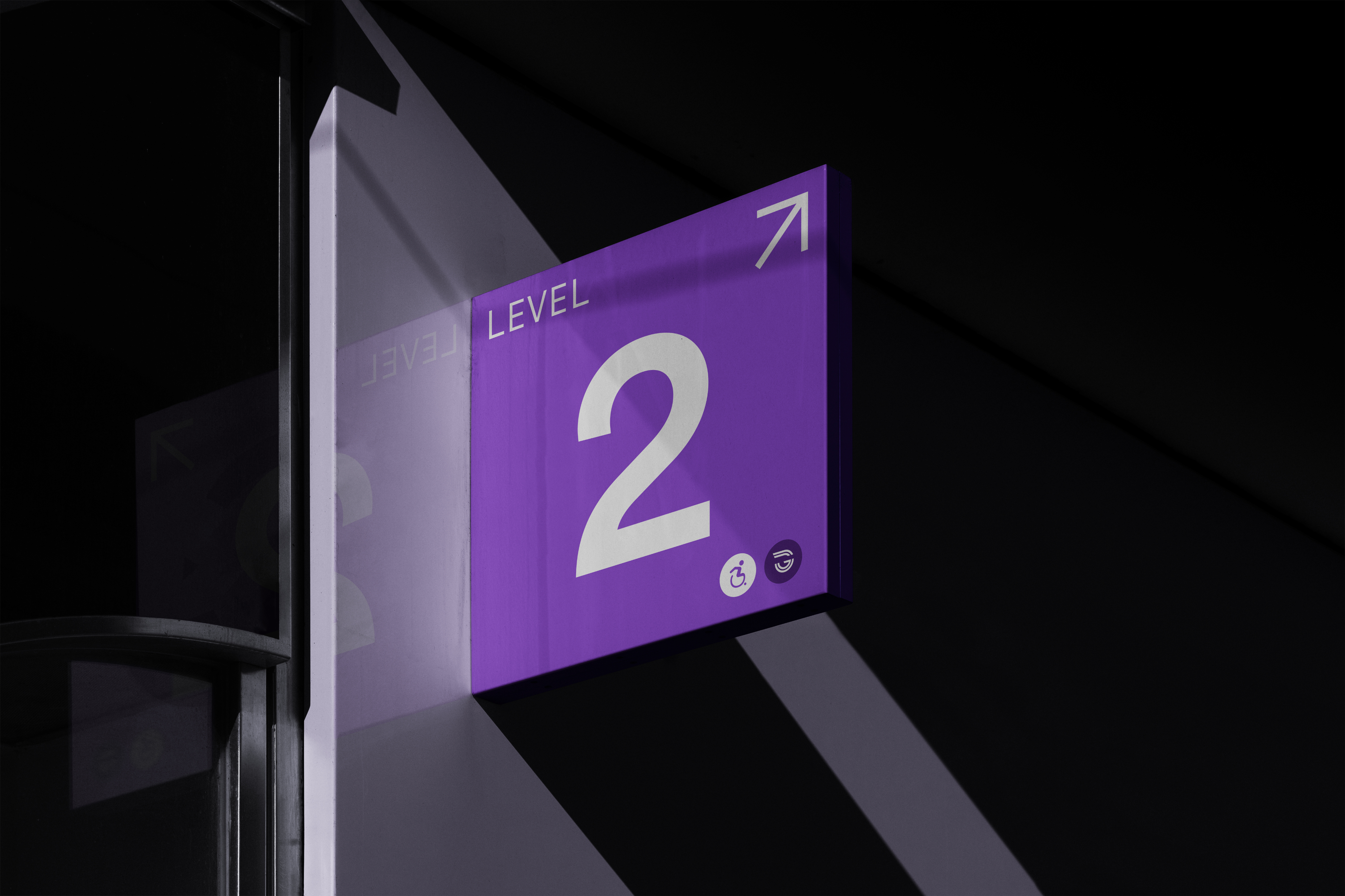
Level 2, overhead.
The level marker: one numeral, one pictogram, one colour. The marks stay neutral so the line colour can do its job.
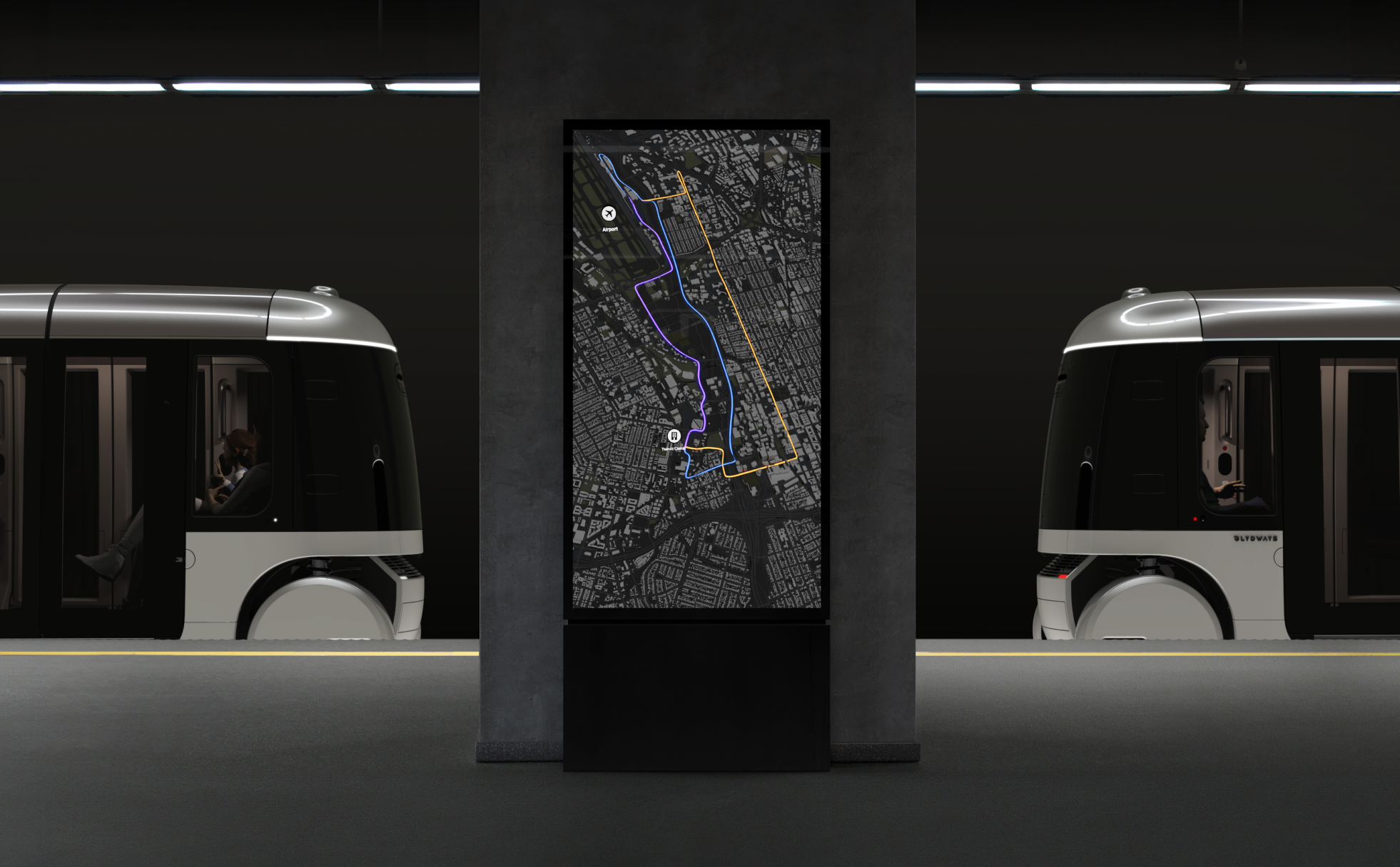
The line on the totem.
Colour identifies a line. The same route keeps its identity on a dark platform sign and a printed white map without becoming a second colour.
Light marks the place.
Colour marks the line, light marks the place. The halo canopy is the one element that says “here” without a word on it.
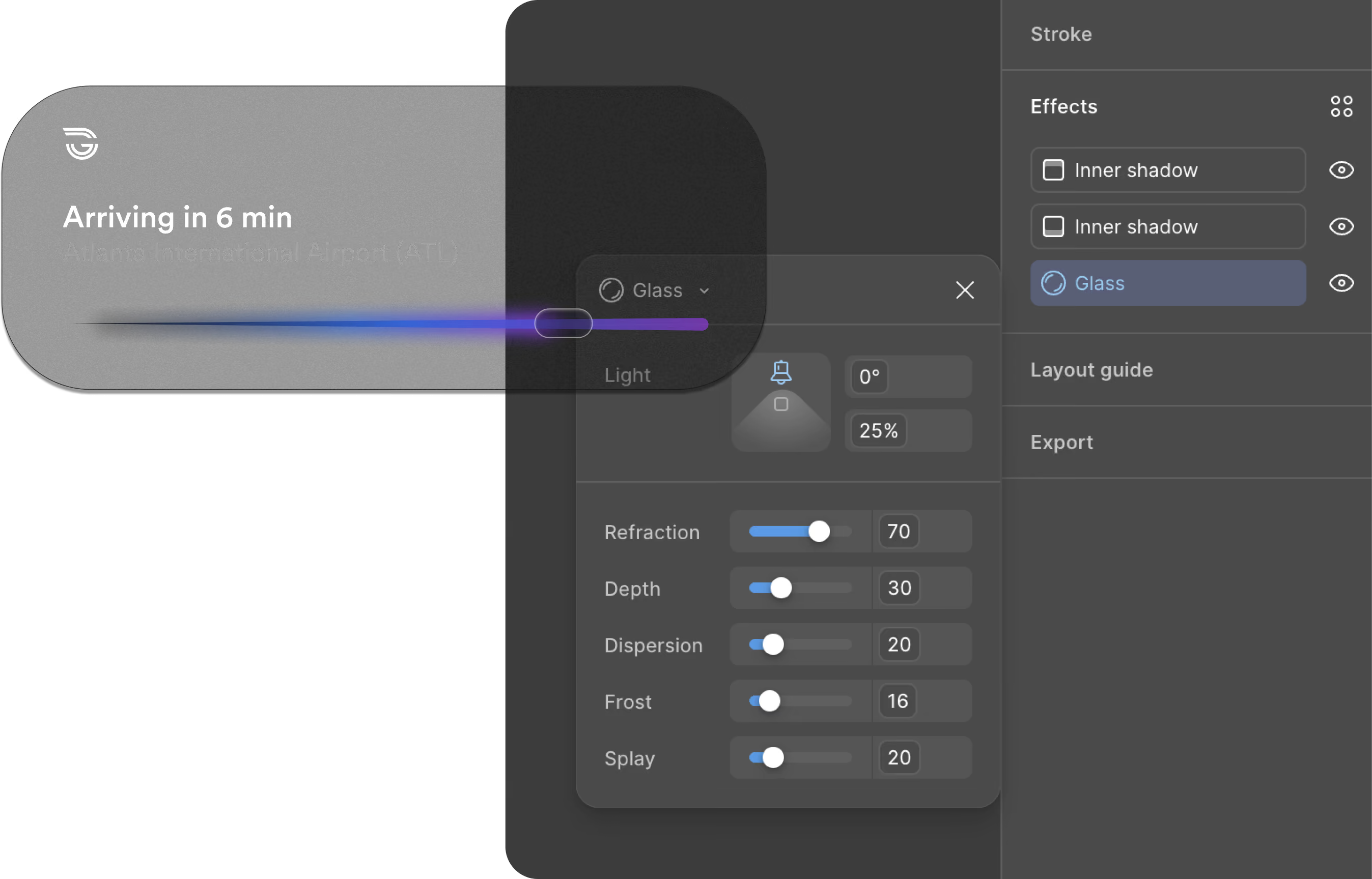
Glass over the line colour.
Every screen surface reads the line through glass. Frosted at .045, blurred 22, the family cast comes through.
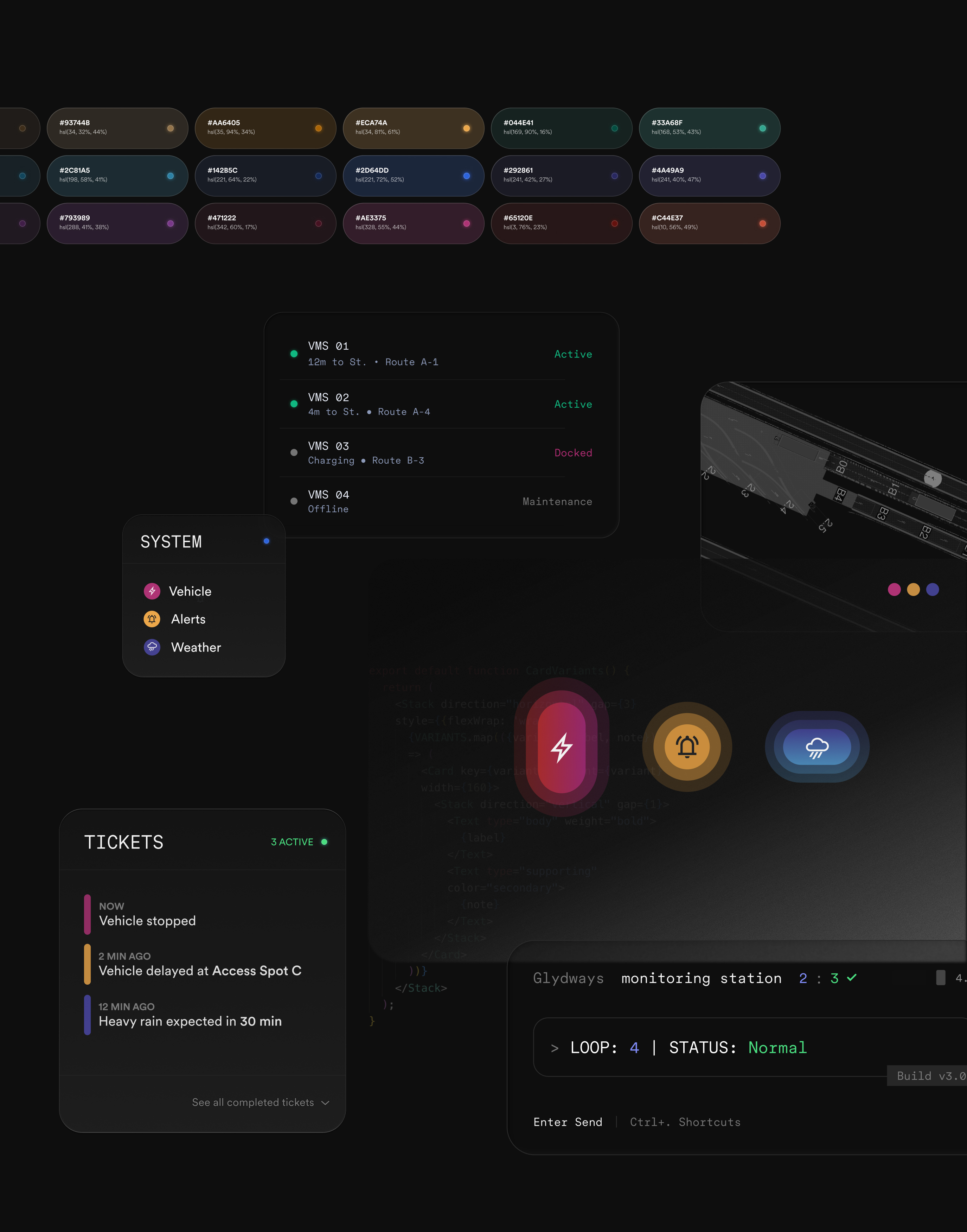
Operators read the same data the vehicle perceives.
The OCC components: token swatch row, vehicle status list, alerts, terminal. Same families, same glass, denser.
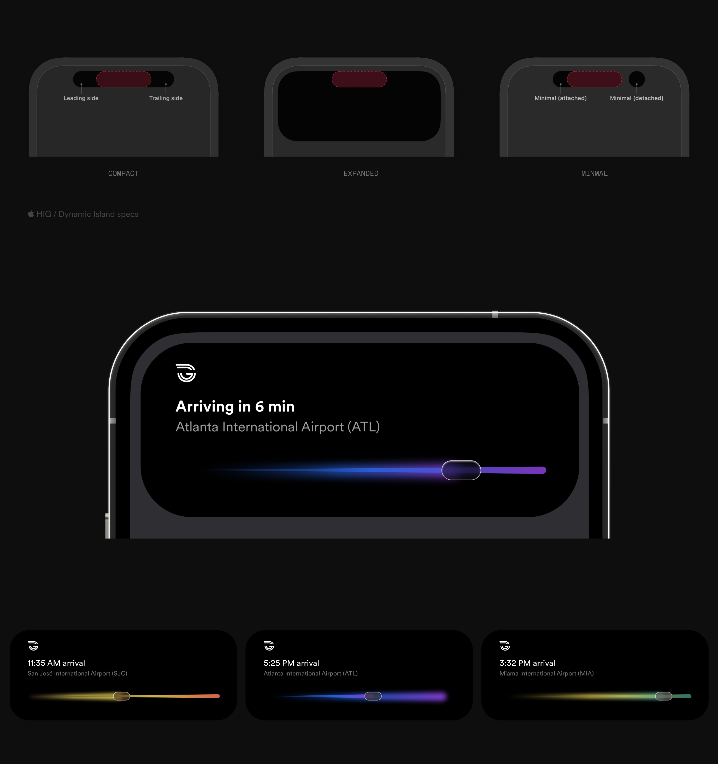
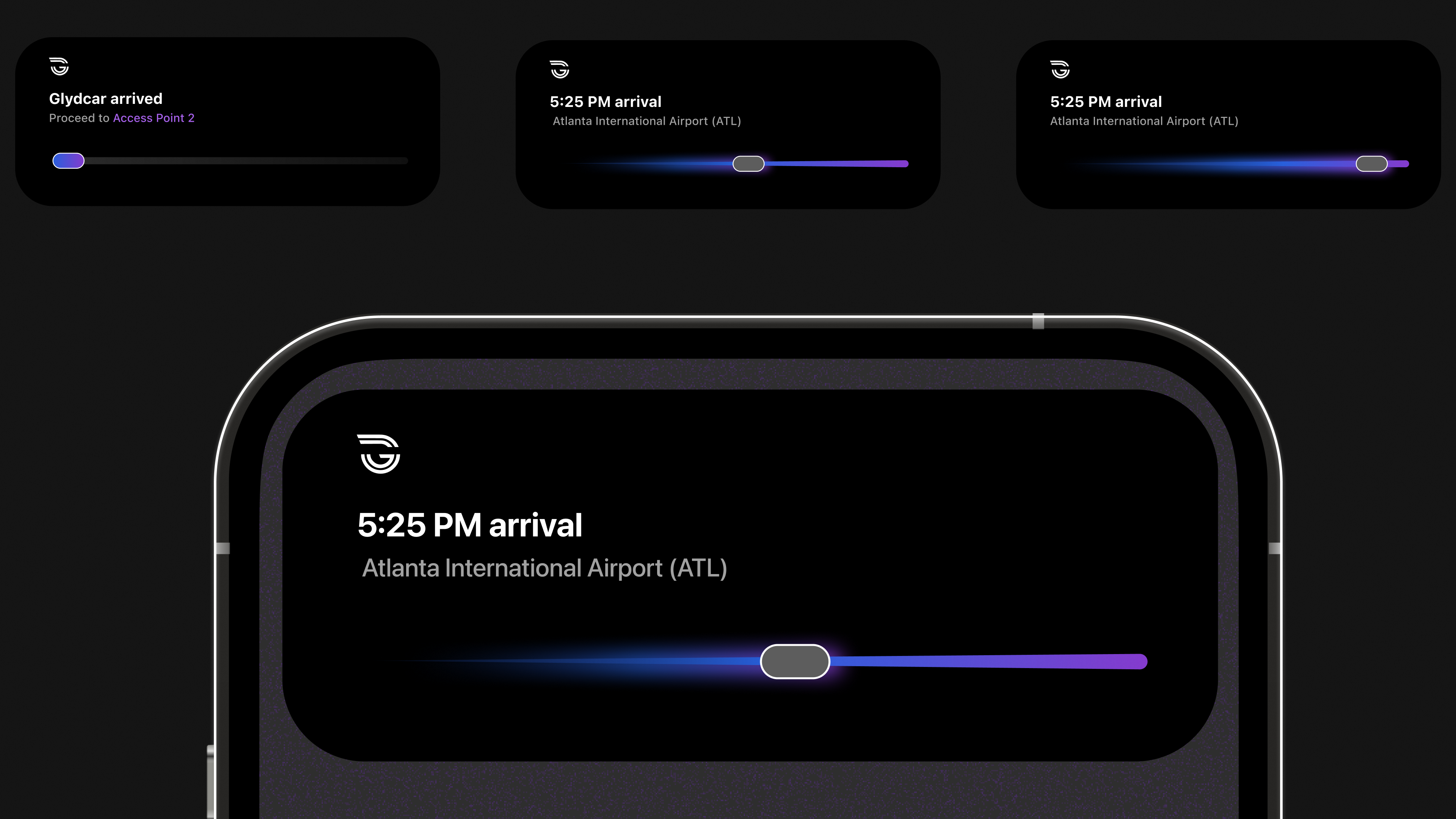
For the length of a trip, the Live Activity is the app.
One arrival that holds from a Dynamic Island pill to a full-screen Lock Screen presentation, each route in its own family.
Colour in. Light out.
One family, Magenta. The core value marks the line; read through glass at 34% it becomes the light value. Recorded, not eyeballed.
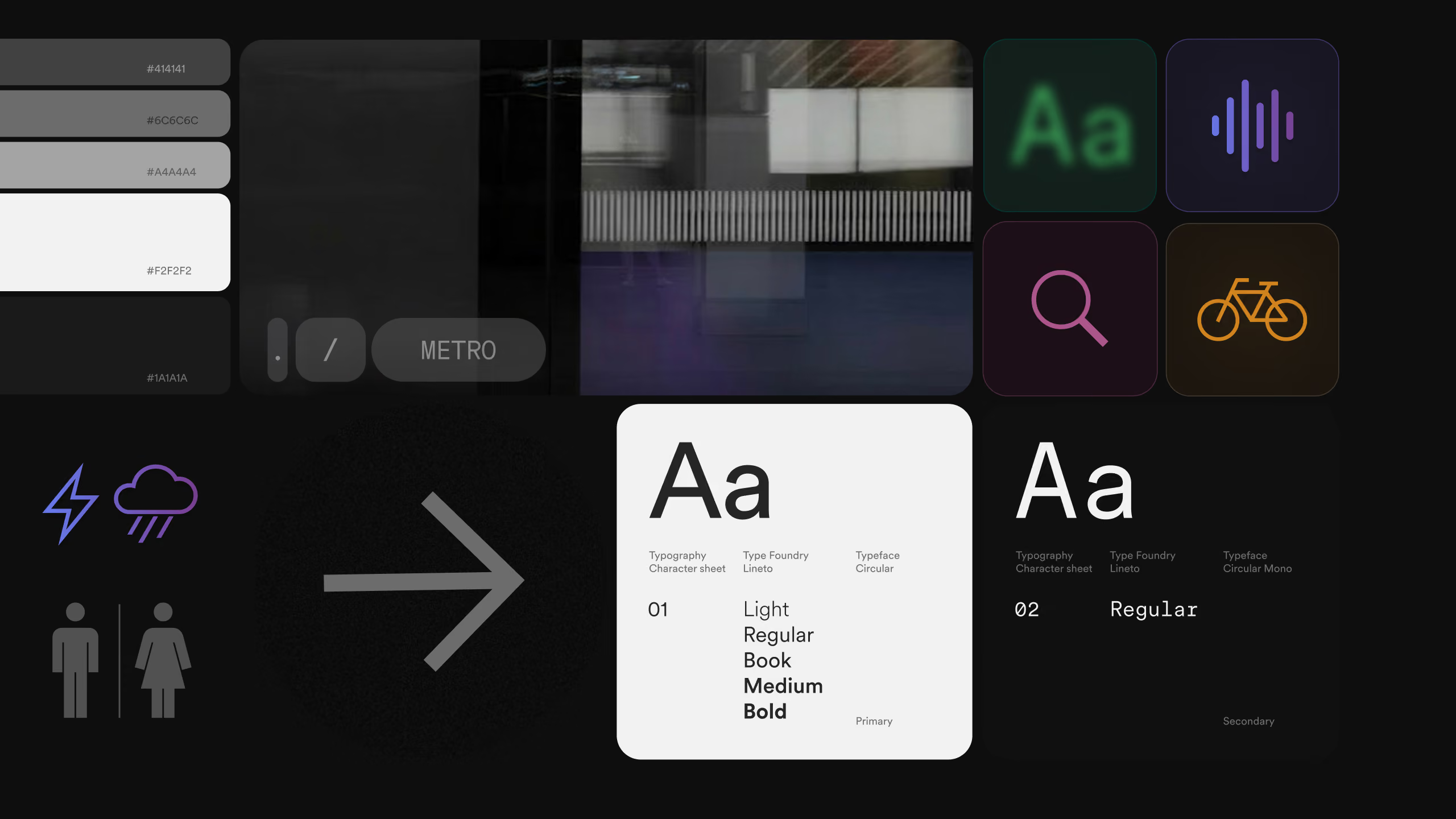
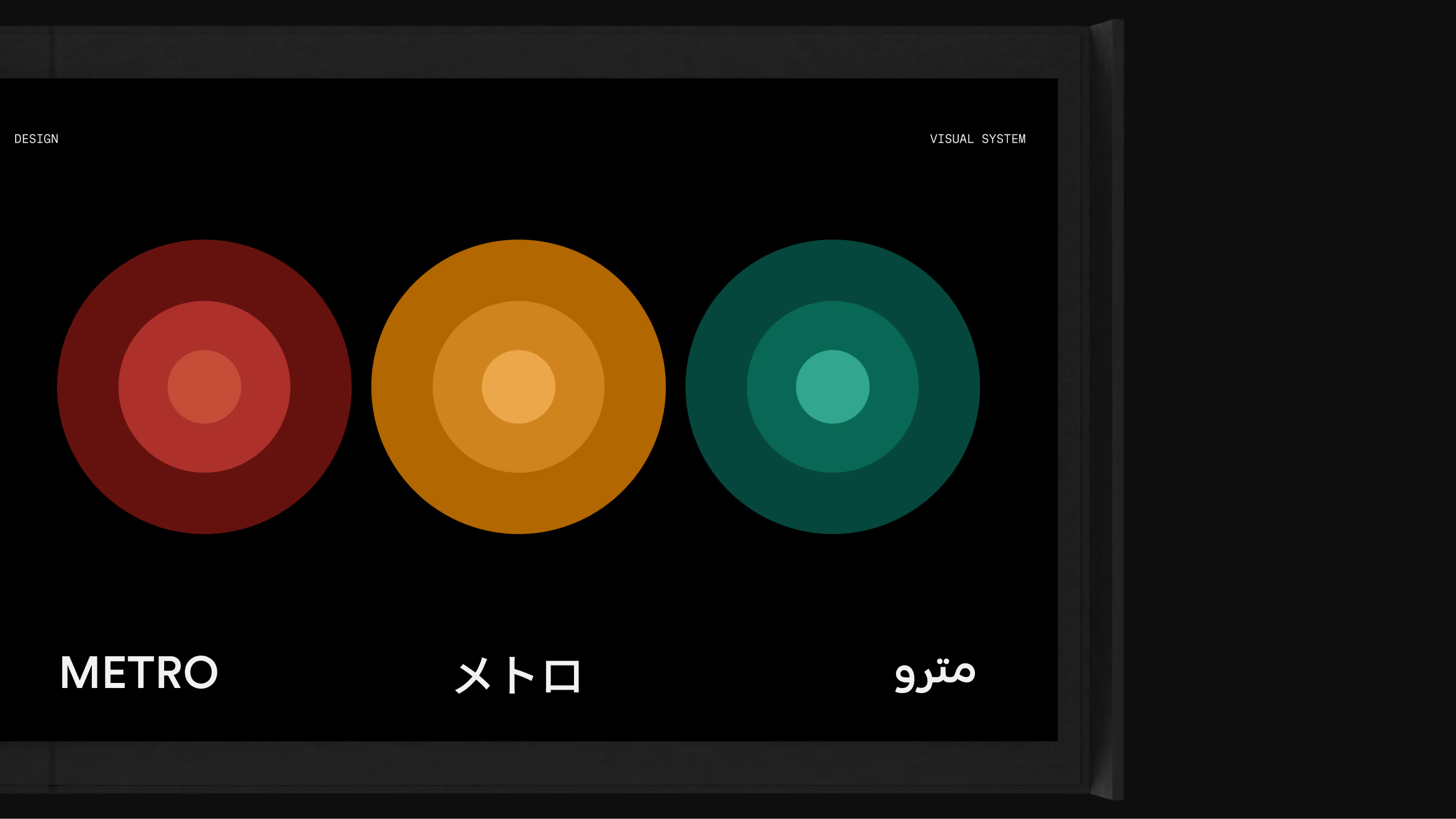
Three scripts, one geometry.
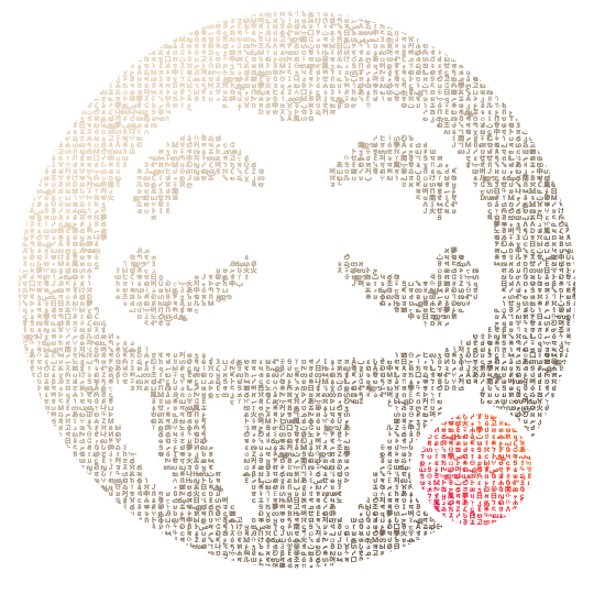
Latin, Japanese and Arabic drawn from the same construction as the mark and the pictograms. The standard holds in every script the network runs in.