Lumasis Design System
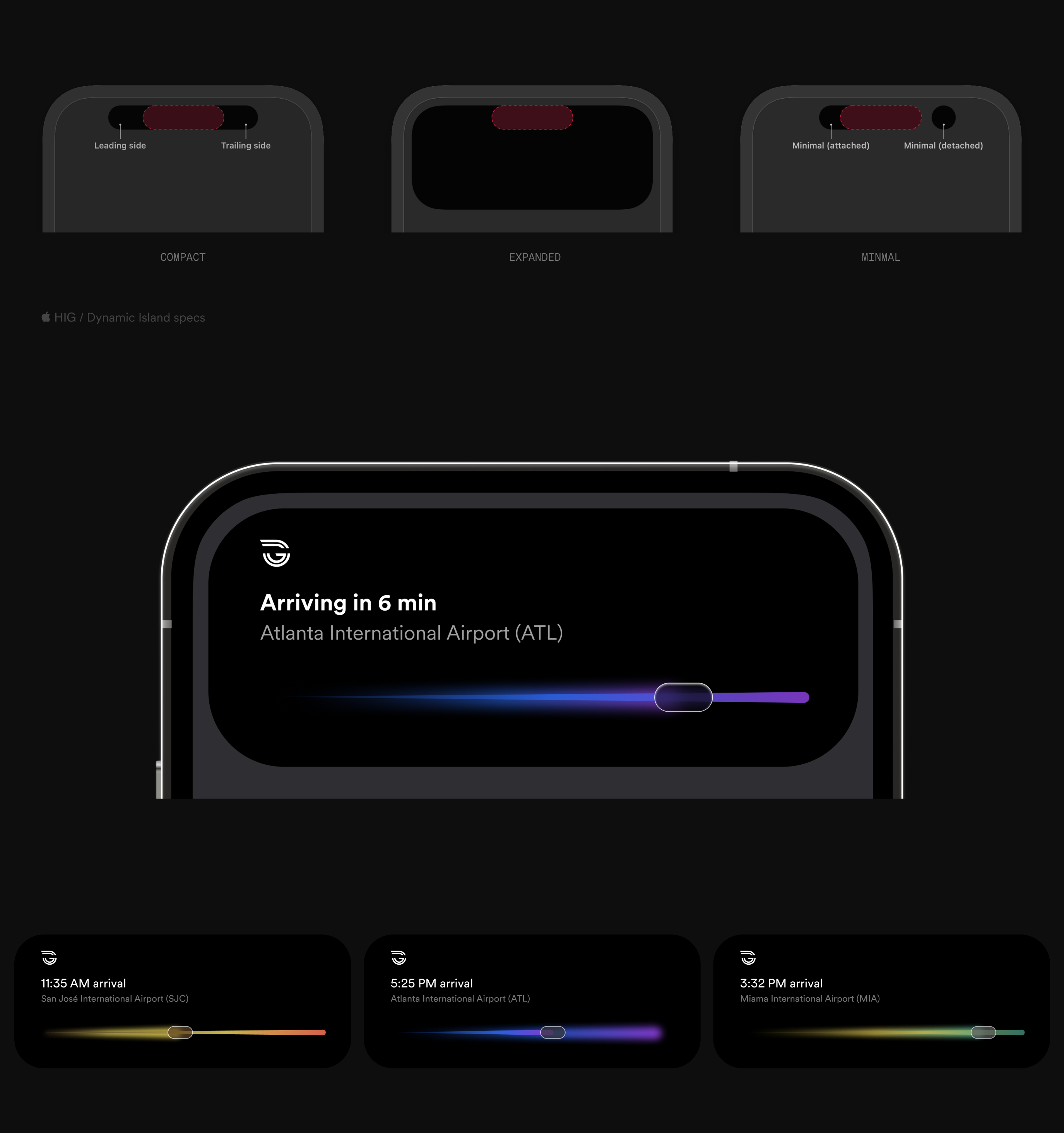
Rider's phone: Dynamic Island, Lock Screen and arrival trackers.
Rider · Phone
Platform, vehicle and map views.
Vehicle · Platform
Operations control room components.
Operator · Control Room

Lumasis

One design system for every Glydways screen.

Outcome
6 surfaces on 1 token set, every primary text and control at WCAG AA
Users
Shipped
Rider app·Live Activities·In-vehicle display·Station signs & kiosk·Operator console
Stack
Figma·SwiftUI·React·WebSockets·HTML
Teams
ProductDesignIDEngineering
Role
Principal Designer, Human Interface & Systems
Year
2024–2026

01

The System

Core Thesis

With no driver and no staff on board, the screens do the talking. Lumasis leads with light: one color, read through glass, tells the rider, the operator and the vehicle the same thing.

Light carries the line, glass carries the surface, depth carries what matters now. Set once, it reaches every screen, from the rider's phone to the platform sign to the control room.

02

Surfaces
Apps & Connectivity

Everything to this point holds on screens Glydways controls. The arrival follows the rider across the Dynamic Island, the Lock Screen, and StandBy[2], so one activity has to hold from a compact pill to a full screen. The track, the position on it, and the time never drop, and the route’s gradient carries the line identity at every size. When the rider reaches the platform, the trip moves back onto screens Glydways runs.

Live Activities plate — Dynamic Island compact, expanded, and minimal presentations above a full-screen arrival and three route activities, each with its own gradient.

Platform, Vehicle & Map

Between the phone and the control room, the rider meets the same system four more times. The platform sign and the kiosk show the next vehicle in its line color. On board, the vehicle interface puts climate and mood on one dial, in the same glass and light values as every other surface. The map sets the trip against ride share and bus, and the route carries the line's gradient. Connectivity & Updates reports what the vehicle is doing in the same status language.

The vehicle interface is shown in part; the production work is confidential.

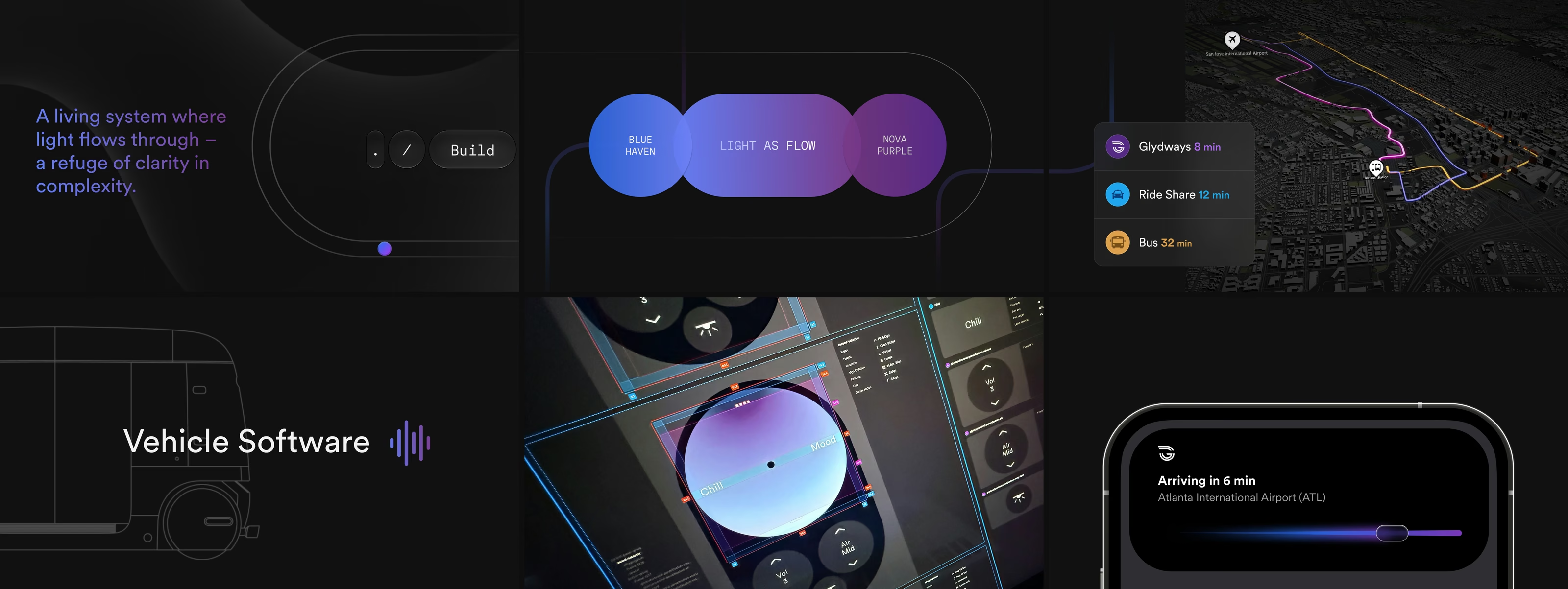
Six views of the Lumasis system — the guideway track and Build control, the Blue Haven to Nova Purple light ramp, a live route comparison against ride share and bus, the vehicle software mark, the cabin mood and climate controls under construction in Figma, and an arrival Live Activity on iPhone.

Variable Message Signs

Variable message signs are the digital signs at a station that change with the service: which vehicle is next, when it arrives, and where to wait. A rider reads them at a glance, from a distance and on the move, so they carry Lumasis at its plainest: the line color, the time, one instruction.

Kiosk

Placeholder. Kiosk screens and copy go here.

Vehicle Interface

Placeholder. In-vehicle screens and copy go here.

Mapping

Placeholder. Mapping screens and copy go here.

Operations Command & Control

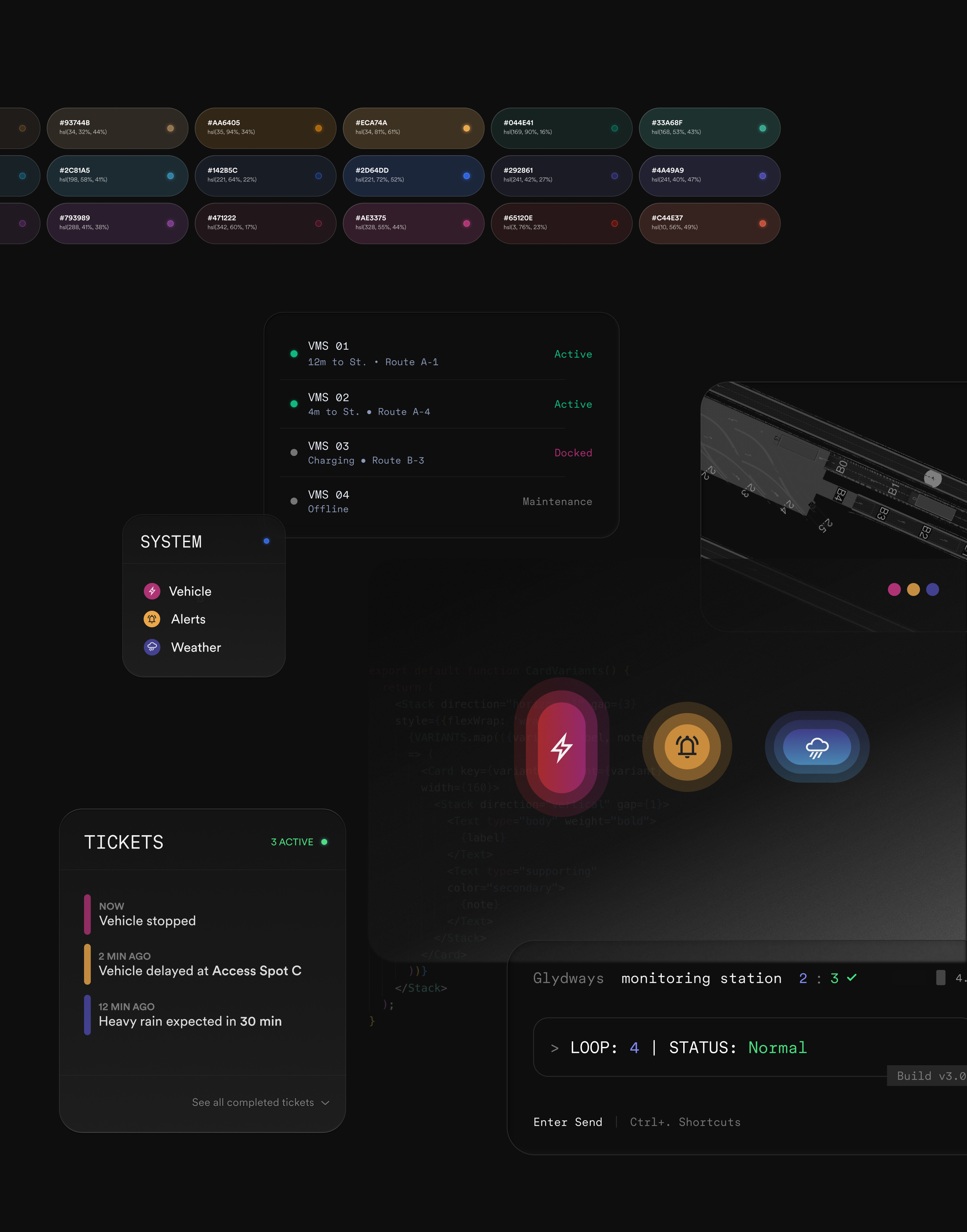
The control room is where the autonomy is supervised. An operator runs forty to sixty vehicles at a time, up to two hundred, across three circuit maps; the map carries position and nothing else, and everything a vehicle reports — and everything the system infers about it — opens in a window when the operator selects a dot. Status built into the dots was rejected: legible at five vehicles, unreadable at sixty.

03

Foundations

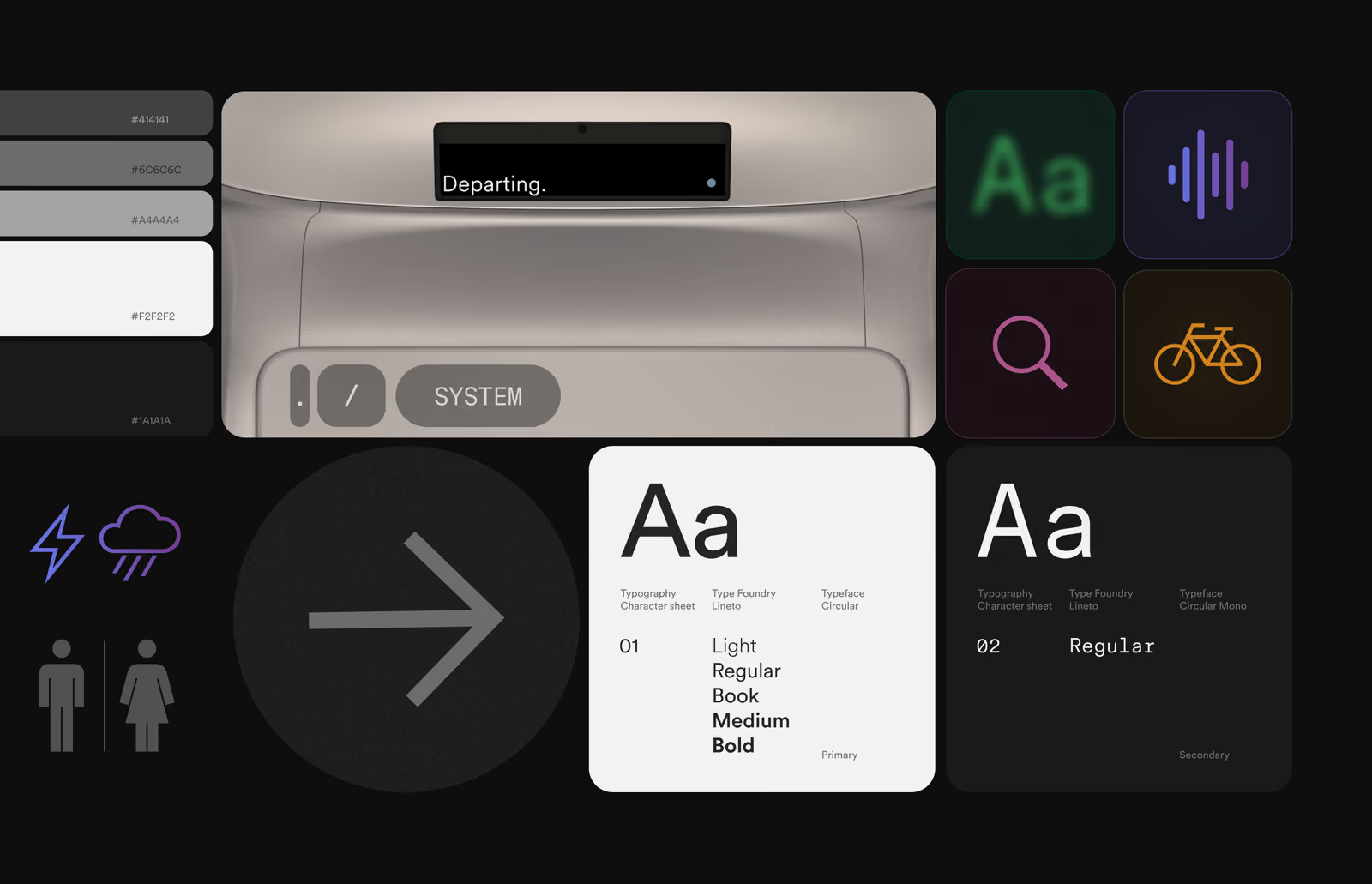
Over two years the system settled into four parameters — color, light, glass and depth — on top of Metro's type and pictograms, with the accessibility defaults every surface inherits.

Parameters

Type and pictograms come from Metro and stay fixed. Color is the one parameter built to adapt: with no driver on board, it says which line, what's next and what needs attention. Light, glass and depth follow from it. Read the stack from the bottom; every value is a shipped token.
  1. 04 Depth
  2. 03 Glass
  3. 02 Light
  4. 01 Color
Color
Glass
Depth

Read from the bottom. Color is the value Metro hands down; light is that color once the glass sits over it, which on a dark surface lands darker — hence the negative delta. Every parameter is picked rather than dragged: nine families, four grounds, five depths, and nothing in between any two of them. The grounds are ordered by density rather than by name — .045, .20, .30, .44 — so both material rows run the same direction and the surface gets heavier toward the right. Only Tinted takes its cast from the family; the other three are fixed materials, so stepping the color moves one ground and leaves the rest where they are. Every value shown is a shipped token.

Operations control center components with a color token swatch row above vehicle status list, alerts icons, and a monitoring terminal.

And everything underneath

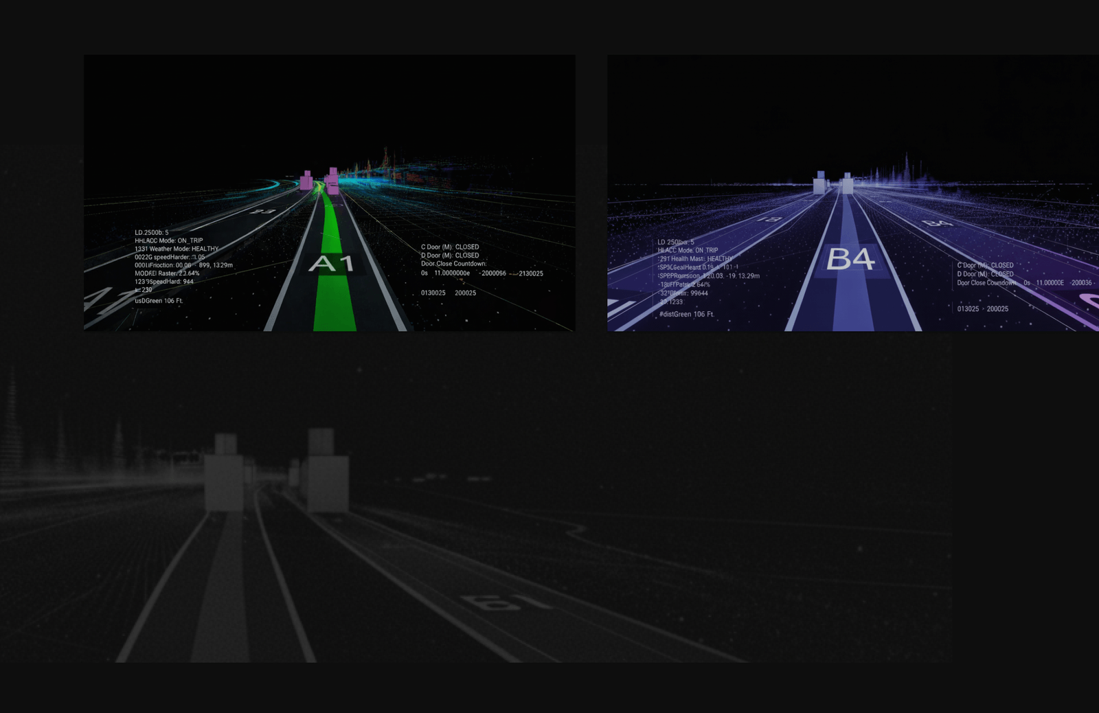
Perception views.
PerceptionWhat the vehicle sees, as operators read it.
Visual system board.
PrinciplesThe rules every surface follows.
Token detail.
Token architectureEvery family, light through glass.
Contrast detail.
AccessibilityPrimary text and controls clear WCAG AA.
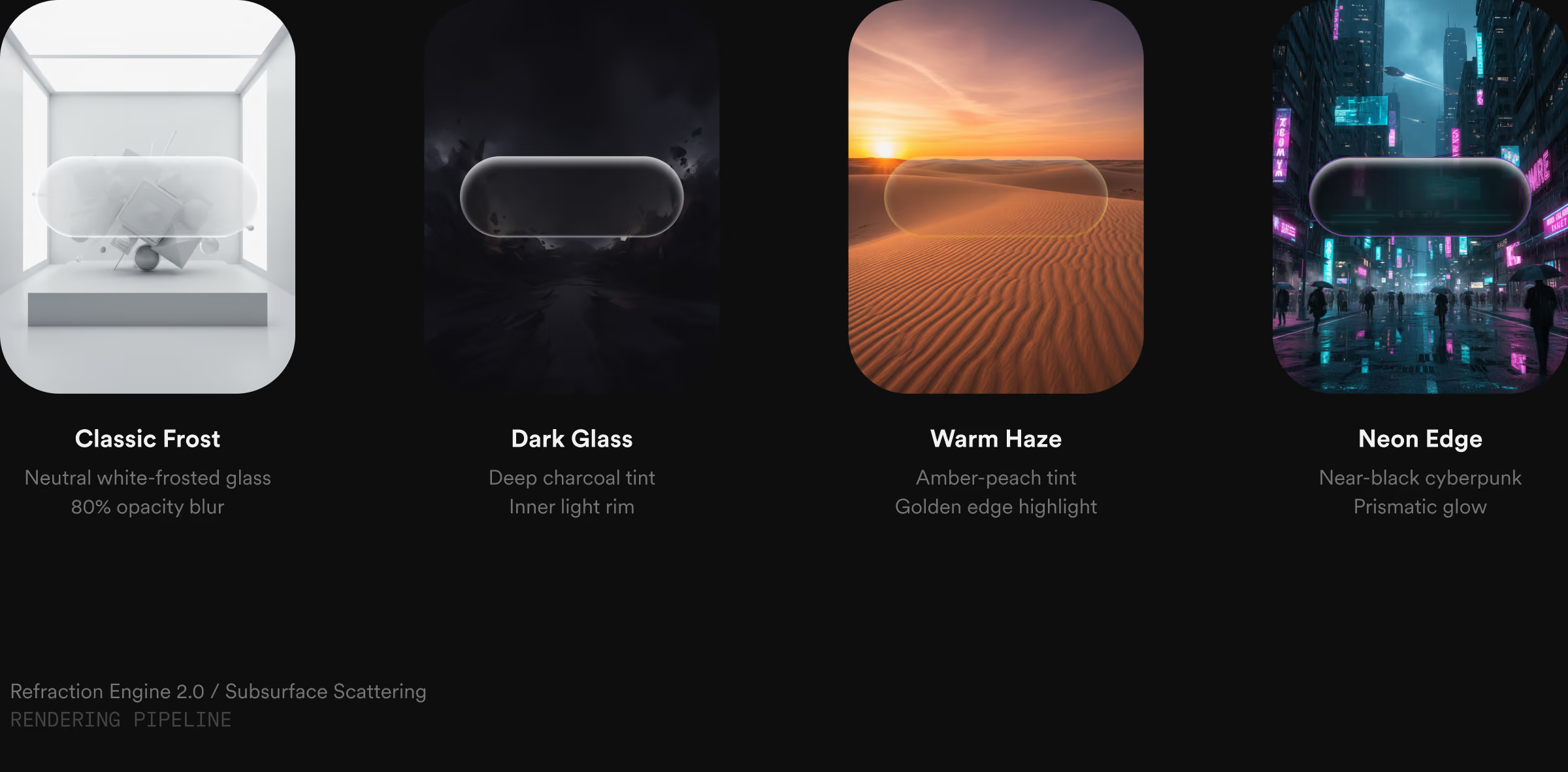
Glass material.
Material: GlassOne pill on four grounds.
Full token architecture →

The Outcome

A rider on a platform can tell what the vehicle is about to do, and an operator watching two hundred in motion can tell which one needs attention. Both are reading the same tokens at the same lightness thresholds. Nothing was translated for either of them, which is the whole of it — a value that names itself does not need an interpreter on the way to a screen.

With no one on board, the interface is what explains the vehicle. The rider on the platform and the operator watching sixty in motion read the same system, with nothing translated in between.

Six surfaces run on one set of tokens. The control room holds forty to sixty vehicles at a time and stays readable at two hundred, and every primary text and control clears WCAG AA.
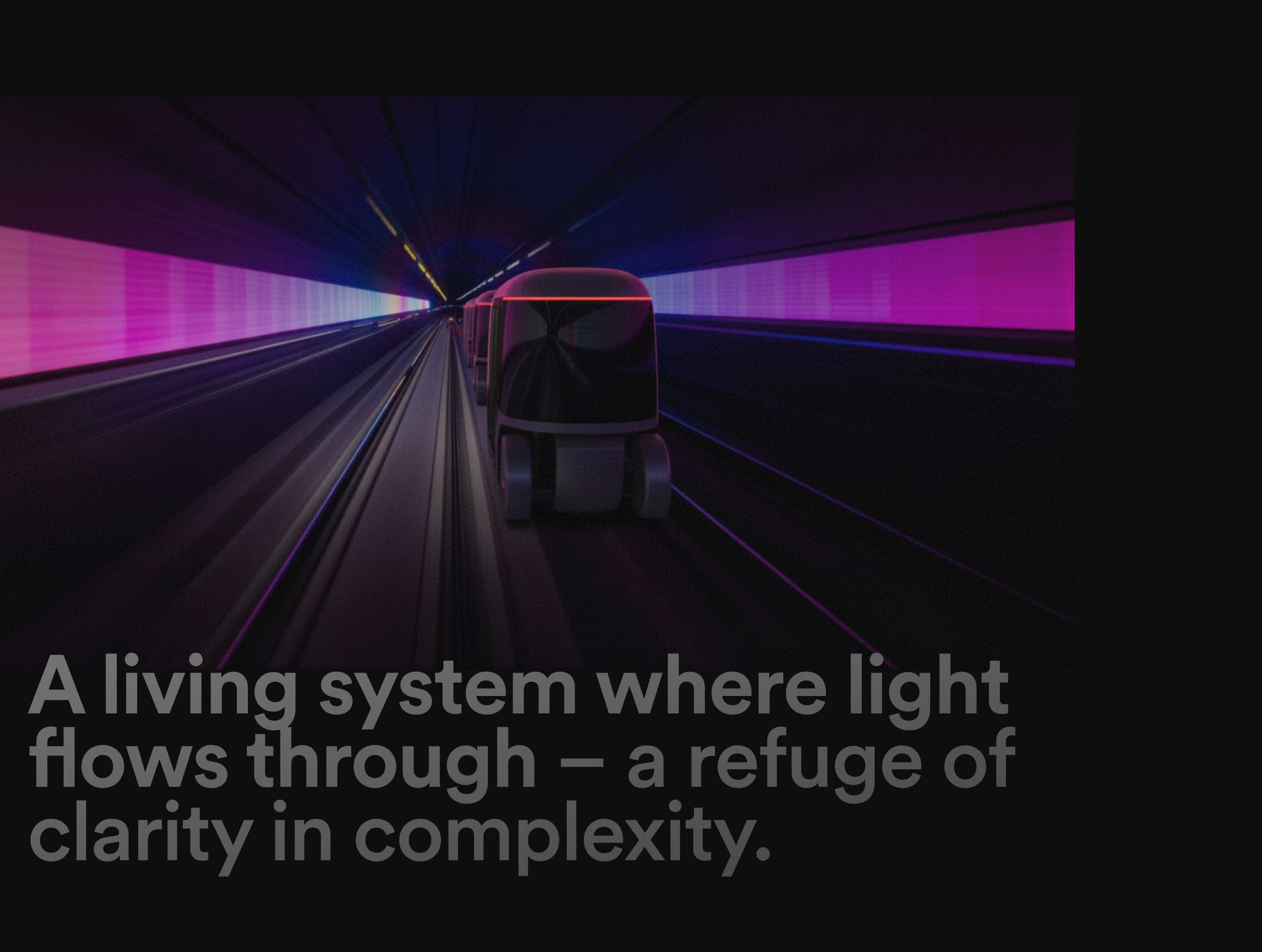
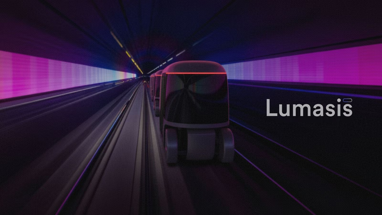
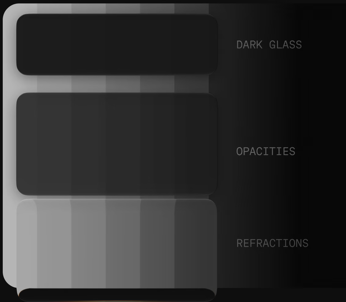
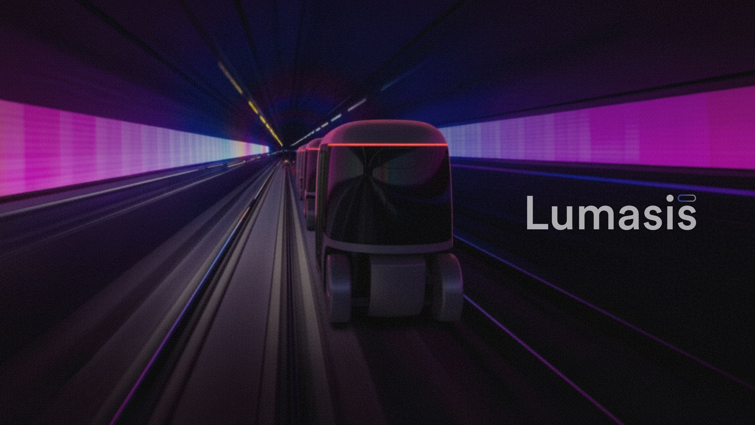
A living system where light flows through — a refuge of clarity in complexity, over an image of an autonomous transit vehicle in a neon-lit tunnelDark glass material reference: opacity and refraction swatchesLumasis design system detail from FigmaLumasis design system detail, secondary view from Figma
Parked · working page only

Everything below is out of the story for now, never deleted. In the Designer, drag a block above this line to bring it back, or below it to park it. This whole area is hidden when the page goes live.

Perception

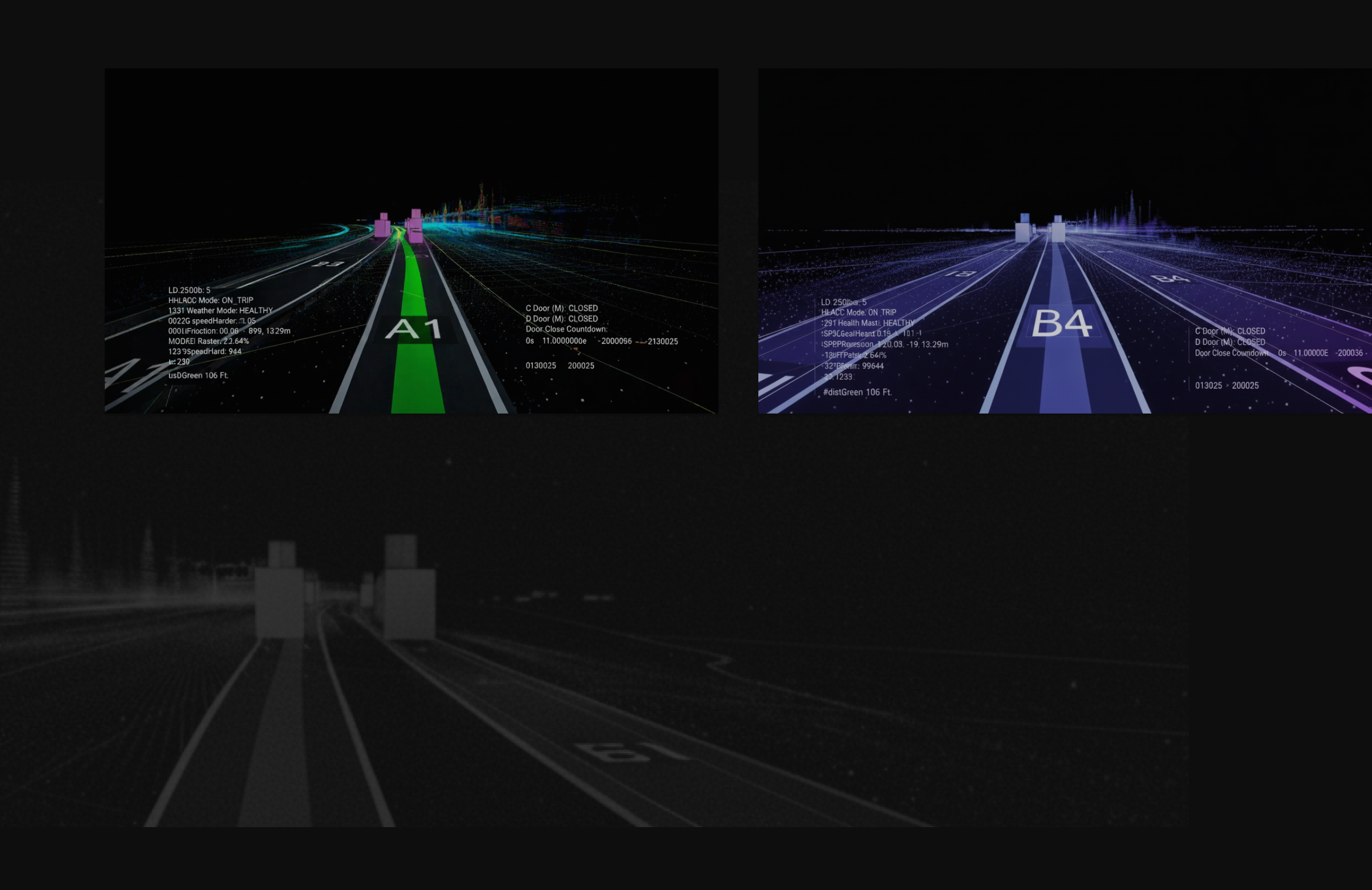
The vehicles don't see the world the way people do; they see sensor data. Lumasis starts there: the visual language is built from machine perception, then made readable for people.

Principles

The principles keep that machine-built language human.

Human

Rounded shapes, conversational micro-copy and organic motion instead of abrupt transitions.

Oasis

Deep negative space and blur keep attention on what matters right now.

Flow

Components morph and adapt, taking the rider from booking to boarding without jarring context switches.

Forward

Predictive states surface actions, like opening doors or adjusting climate, exactly when the rider needs them.

Token Architecture

Token Architecture

The vehicles already speak in data, so the tokens had to as well. Every name is derived from its value — family from the HSL hue, step from the HSL lightness — so the token file reads the same to a designer, an engineer and a model. AI did the translation work: it turned the parameters into tokens and mapped them against ADA and WCAG requirements.

Color & Light

One family read at two levels. Color is the flat, brightest shade the Metro standard hands down; light is that same color through glass at 34% — subtractive, so on a dark surface it lands darker.

Rejected

A parallel palette for dark surfaces. Doubles the token count and lets the two drift apart.

Consequence

ΔL is the number the pair is checked on: 18 to 30 points in every family, which is also the band that clears AA.

Depth

Screens stack — a sheet over a panel over the ground — and something has to say which one is nearer. Here that is a single number: opacity, five steps, .05 → .40. The blur behind it never changes.

Rejected

A parallel blur ladder stepping down as priority rises. Two properties expressing one idea, disagreeing at the edges.

Consequence

Depth is a single number an engineer can read off a token, and blur became a function of velocity rather than a decoration.

Nomenclature

Token names come from the value itself — the family from where the hue sits, the step from the lightness. Two designers naming the same swatch independently arrive at --lum-blue-52.

Rejected

A curated semantic vocabulary. Readable on day one, contested by month three.

Consequence

Naming stops being a review topic. The token is checkable against its own value.

Color
Light
Glass
Frosted
Dark
Tinted
Prismatic
Opacities
Refractions
Depth
.05
.11
.19
.28
.40
SwatchFamilyColorLightΔLToken architecture
Bronzehue 34°#93744Bhsl(34, 32%, 44%)#3E2E1Ahsl(33, 41%, 17%)−27--lum-bronze44 / 17
Amberhue 34°#ECA74Ahsl(34, 81%, 61%)#AA6405hsl(35, 94%, 34%)−27--lum-amber61 / 34
Tealhue 168°#33A68Fhsl(168, 53%, 43%)#044E41hsl(169, 90%, 16%)−27--lum-teal43 / 16
Azurehue 198°#2C81A5hsl(198, 58%, 41%)#12465Dhsl(198, 68%, 22%)−19--lum-azure41 / 22
Bluehue 221°#2D64DDhsl(221, 72%, 52%)#142B5Chsl(221, 64%, 22%)−30--lum-blue52 / 22
Indigohue 241°#4A49A9hsl(241, 40%, 47%)#292861hsl(241, 42%, 27%)−20--lum-indigo47 / 27
Violethue 288°#793989hsl(288, 41%, 38%)#401E48hsl(289, 41%, 20%)−18--lum-violet38 / 20
Magentahue 328°#AE3375hsl(328, 55%, 44%)#471222hsl(342, 60%, 17%)−27--lum-magenta44 / 17
Emberhue 10°#C44E37hsl(10, 56%, 49%)#65120Ehsl(3, 76%, 23%)−26--lum-ember49 / 23
SurfaceGlass & DepthValueCompositionToken architecture
Frostedlayer 03 · glassrgba(255,255,255,.045)blur 22px——--lum-glass-frosted
Darklayer 03 · glassrgba(0,0,0,.44)blur 22px——--lum-glass-dark
Tintedlayer 03 · glassrgba(79,73,169,.30)blur 22px · takes the family——--lum-glass-tinted
Prismaticlayer 03 · glasslinear-gradient(122deg)magenta · blue · teal at .20——--lum-glass-prismatic
Opacitieslayer 03 · glass.05 / .11 / .19 / .28 / .40five steps——--lum-glass-opacity-scale
Refractionlayer 03 · glasslinear-gradient(100deg).04 · .22 · .04——--lum-glass-refraction
Level 1layer 04 · depthrgba(255,255,255,.05)step 1 of 5——--lum-depth-1
Level 2layer 04 · depthrgba(255,255,255,.11)step 2 of 5——--lum-depth-2
Level 3layer 04 · depthrgba(255,255,255,.19)step 3 of 5——--lum-depth-3
Level 4layer 04 · depthrgba(255,255,255,.28)step 4 of 5——--lum-depth-4
Level 5layer 04 · depthrgba(255,255,255,.40)step 5 of 5——--lum-depth-5

Token names are derived, not assigned. The stem is the family and the step is the HSL lightness, so --lum-blue-52 states its own value and two designers naming the same swatch independently arrive at the same token. The swatch is the stack from the diagram above, seen edge-on and in the same order: 01 color at the base, 02 light, 03 the glass ground, 04 depth. Color is the flat, brightest shade the Metro standard hands down; light is that color seen through refractive glass at 34%. Bands 02 and 03 carry no visible seam because they are one value reached two ways — 02 painted from the stored hex, 03 composited live in the browser — and that agreement is the premise, drawn rather than asserted. The application is subtractive: the surface is dark, so glass takes lightness away and the delta runs negative. ΔL is the number the pair is checked on, 18 to 30 points in every family, and that band is also what clears AA. Depth is carried by opacity alone — .05 · .11 · .19 · .28 · .40, against a blur that does not change. Every translucent value here composites over the page ground, #0E0E0E, and never over the plate it sits on, so a token reads the same here as it does in the figure. Blur belongs to motion, where it measures the gap between a moving object and the trail it leaves.

Accessibility

With no staff on board, nobody is there to help a rider who can't read a screen, so accessibility has to live in the interface itself.

Contrast

A dark theme with glowing accents has to clear WCAG AA on every primary text and control; each applied value sits 18 to 30 points of lightness below its core.[1]

Glass

Frosted, Dark, Tinted and Prismatic all carry text at the same light values, so contrast doesn't reset depending on which surface a control lands on.
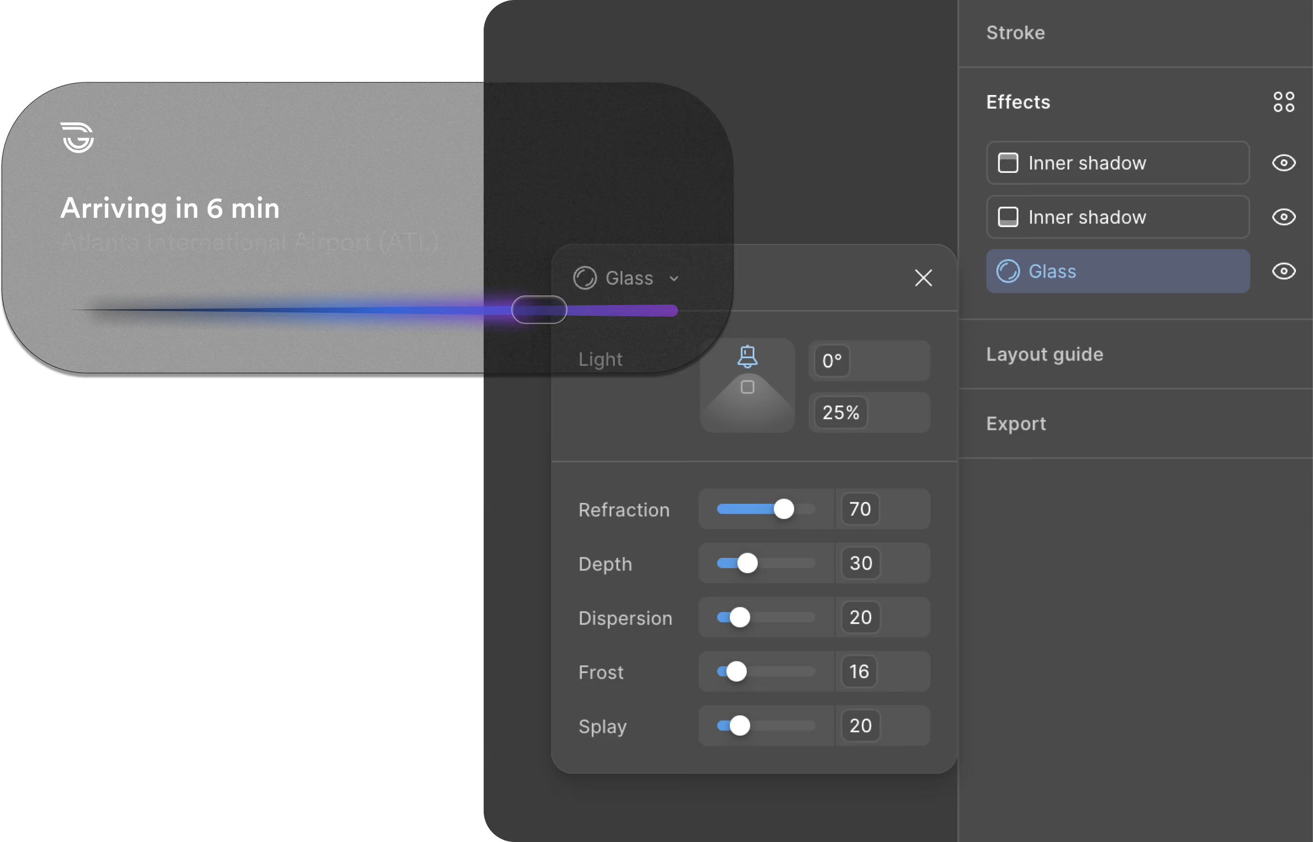
Material : Glass

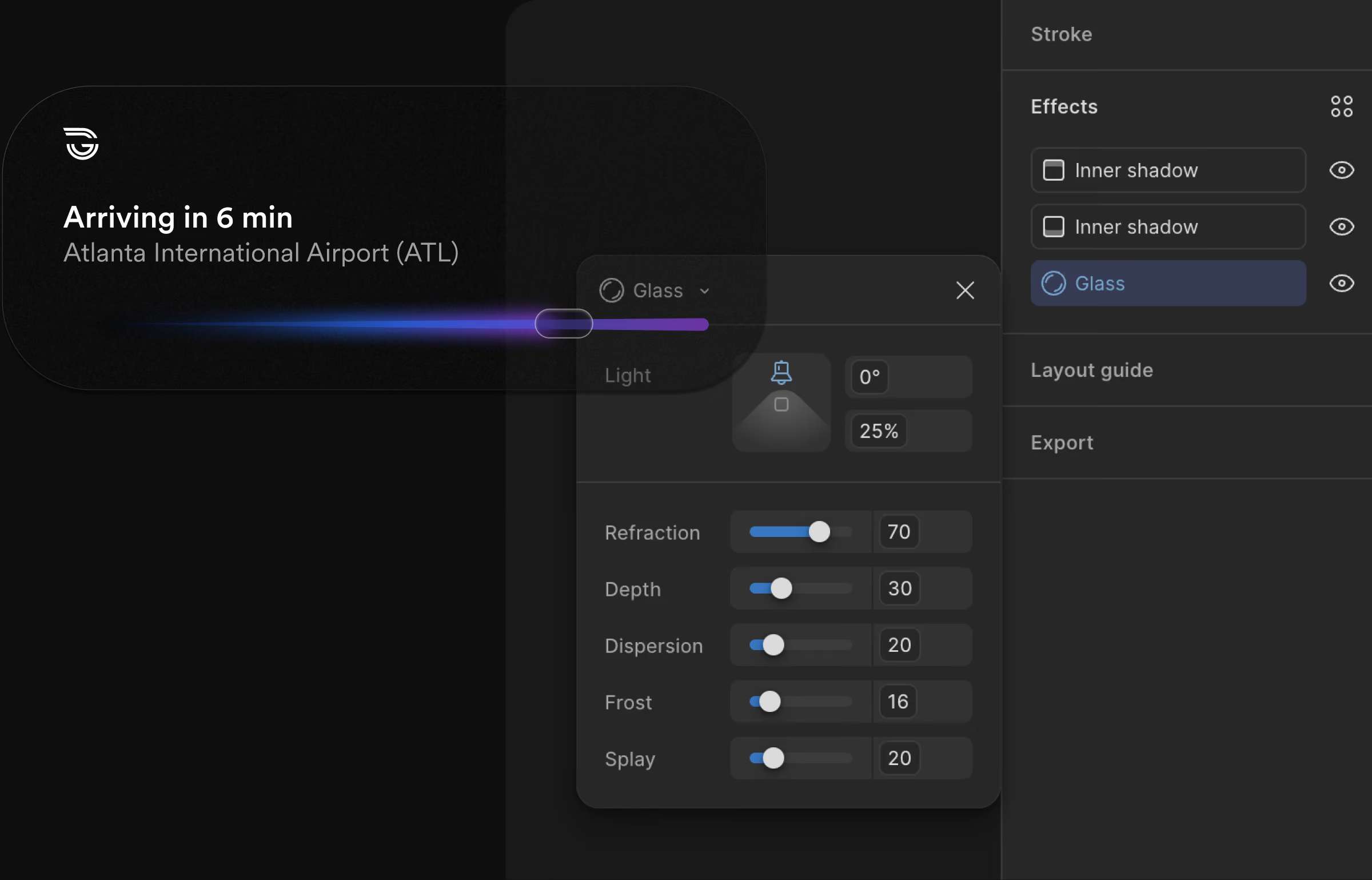
Glass is the one material Lumasis does not define on its own terms. It is authored as a Figma tool built on Apple’s Human Interface Guidelines[2], with refraction, depth, dispersion, frost and splay carried as named values rather than approximated by eye, so a designer specifies glass the way the platform specifies it. That is what lets the same pill render on the Dynamic Island and the Lock Screen without being rebuilt for either.

Pill token architecture

{
  "pill": {
    "bg": {
      "default":  { "value": "{color.surface.1}" },
      "hover":    { "value": "{color.surface.2}" },
      "pressed":  { "value": "rgba(255,255,255,0.08)" },
      "disabled": { "value": "rgba(255,255,255,0.03)" }
    },
    "text": {
      "default":  { "value": "{color.ink.primary}" },
      "disabled": { "value": "rgba(255,255,255,0.35)" }
    },
    "radius": { "value": "{radius.pill}" },
    "height": { "value": "{size.pillHeightMd}" },
    "stroke": {
      "width": { "value": "{stroke.hairline}" },
      "color": { "value": "rgba(255,255,255,0.14)" }
    },
    "glass": {
      "blur":                  { "value": "{blur.glassMd}" },
      "specularOpacity":       { "value": 0.55 },
      "innerHighlightOpacity": { "value": 0.18 },
      "chromaticShift":        { "value": "0.6px" }
    }
  }
}
The glass material authored as a Figma tool — refraction, depth, dispersion, frost, and splay carried as named values in the effects panel rather than approximated by eye.

Components

Lumasis case study cover — gradient wordmark and glass track UI on dark background
Machine perception views — lane A-1 classified in green and lane B-4 in violet, each with live telemetry, over a ghosted point cloud of the guideway.
In motion

Every value below is a live token rather than a picture of one. The travelled line runs to the pill, and the blur sits just behind it, growing with speed.

Arriving in 6 min
San José International Airport (SJC)
route.gradientlum-ember-49 → lum-amber-61
position18%
trail.blur7px · behind the pill
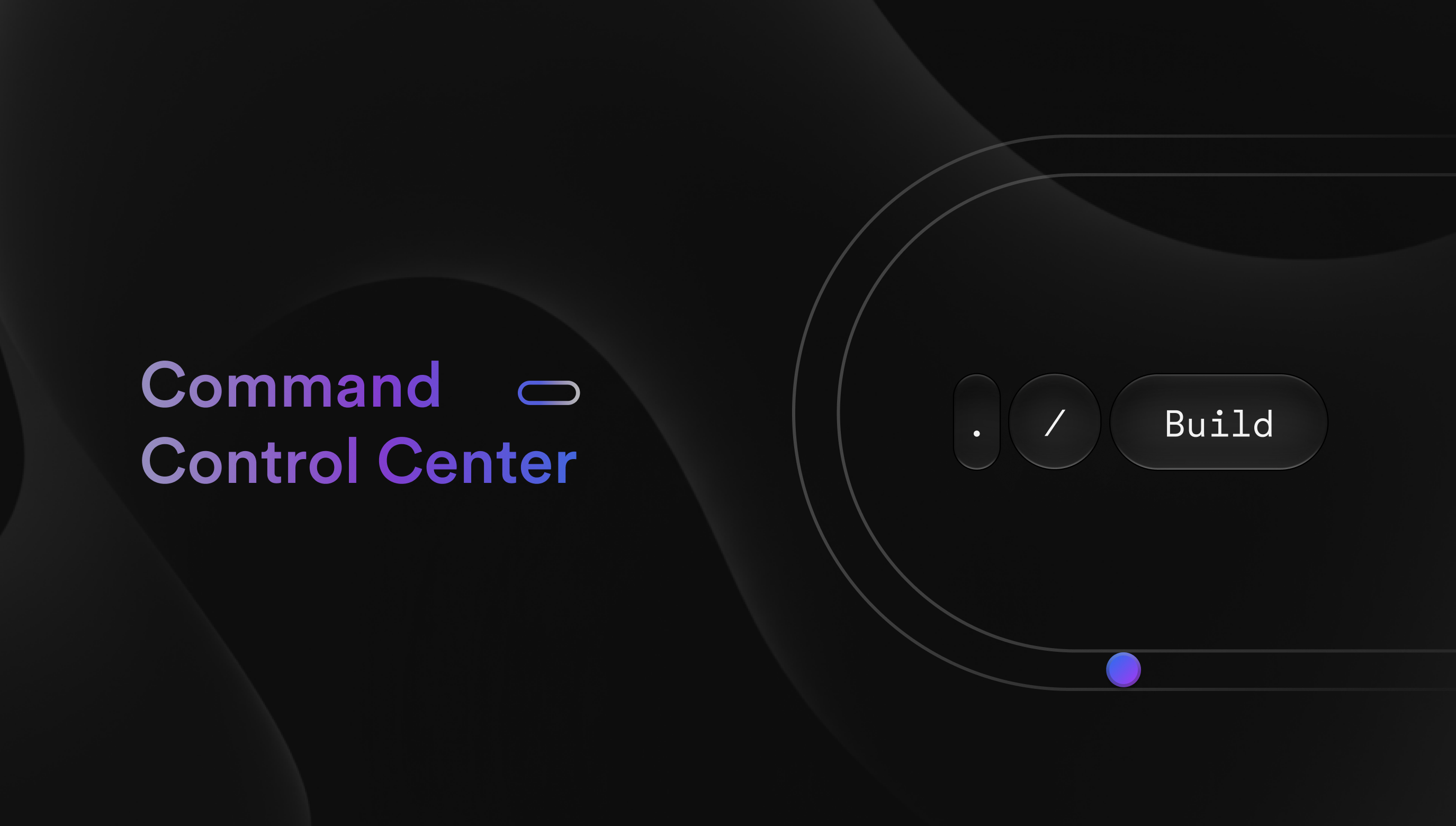
Command Control Center title card — gradient wordmark on near-black with glass controls and a guideway loop.

The Dashboard

Built out, the operator's station runs the rider's grammar unchanged — same color logic, same type scale, same iconography, at fleet scale. One system serves the person taking a ride and the person watching two hundred.
Built, Not Drawn
Carried forward: the same four parameters resolve inside the components riders and operators actually touch. Each ships with its Figma source beside its production code.
Code
Fleet/Vehicle 42/Diagnostics
Code
Design
Status: Boarding▾
Code
March
Design
⌘K   Search stations, vehicles…
Platform 4
Vehicle 42
Diagnostics
Code
VehicleStatusETA
42On Time2m
17Delayed9m
Design
Operator ID
Notify on delay
Code
On Time Delayed Boarding
Design
Platform 4 — arriving in 2 min
tokens.json
Related Work
Lumasis design system coverGlydways Brand Guidelines cover