Cue Health System

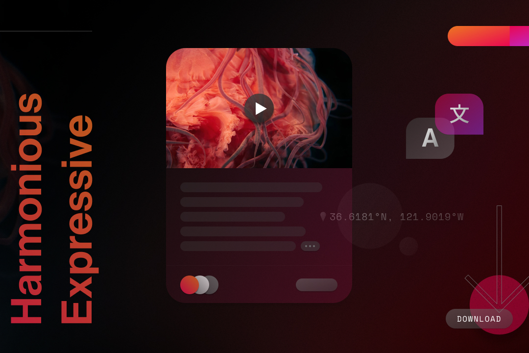
Medusa Components: a media card with a play button, skeleton lines and pill button, beside A and 文 script bubbles, a location label and a download button, on a dark red field.
Series
Medusa
Project
Components
Layer
2 of 3 · Foundations, Components, Motion
Role
Self-initiated
Scope
Buttons
Links
Input fields
Type ramp
Spatial system
Year
2020–2023
Overview
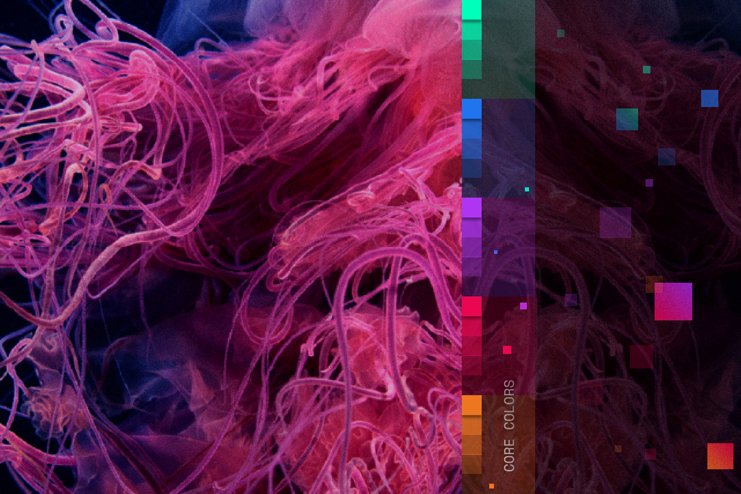
Foundations named five colors and a type ladder. Components turned them into parts: five primitives, specified in 2020, and eight composites drawn in 2023. No part carries a value of its own. Every stroke, fill and space is a token from the layer below.

Every component is a token decision made visible.

Change a token and every part that references it moves with it.
Medusa · Style guide
01 / 12
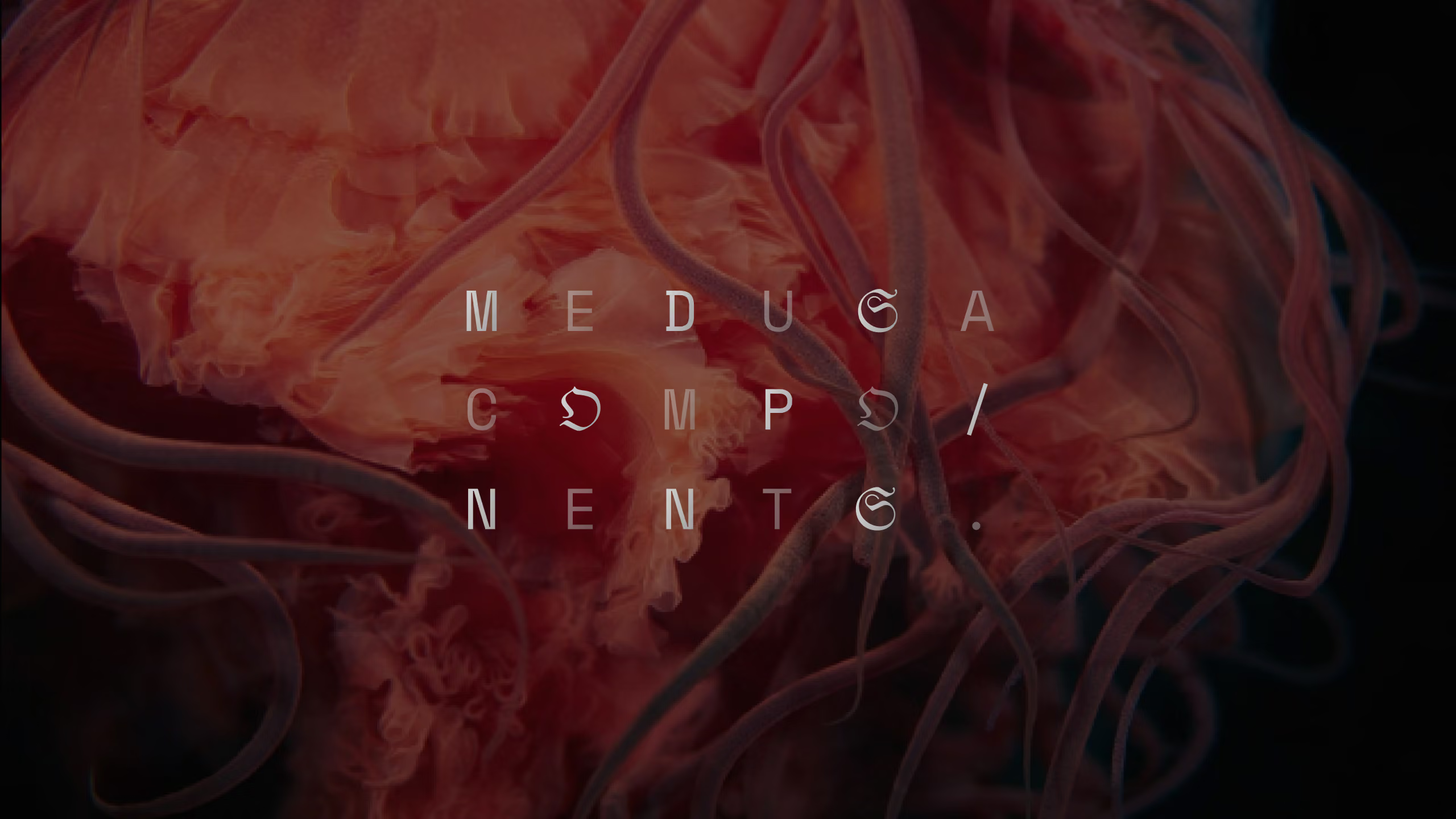
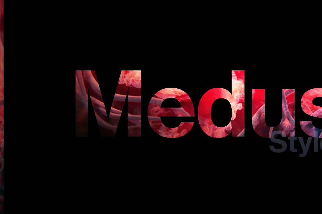
Medusa style guide cover: the word Medusa cut from a red jellyfish photograph on black.
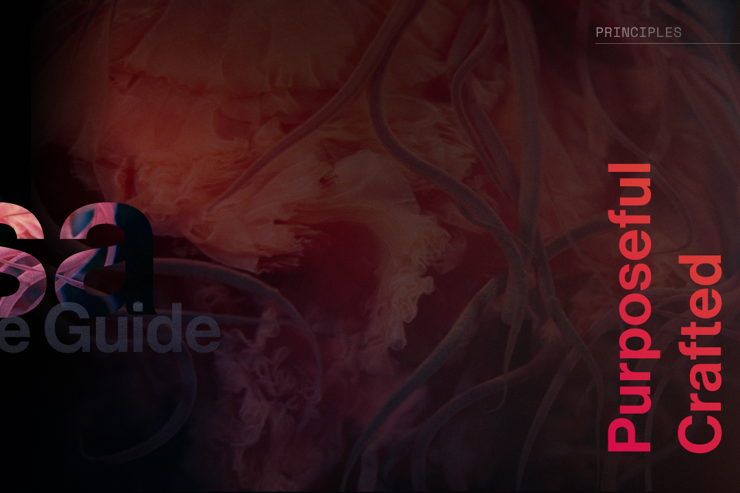
Medusa principles: Purposeful, Crafted, Harmonious, Expressive, set vertically in red beside a jellyfish.
Media card with a play button, skeleton text lines, avatar stack and pill button, beside A and 文 script bubbles, a location label and a download button.
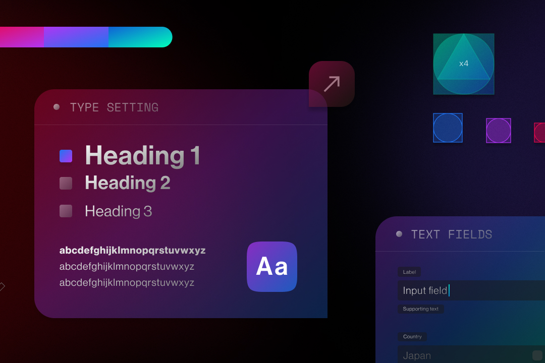
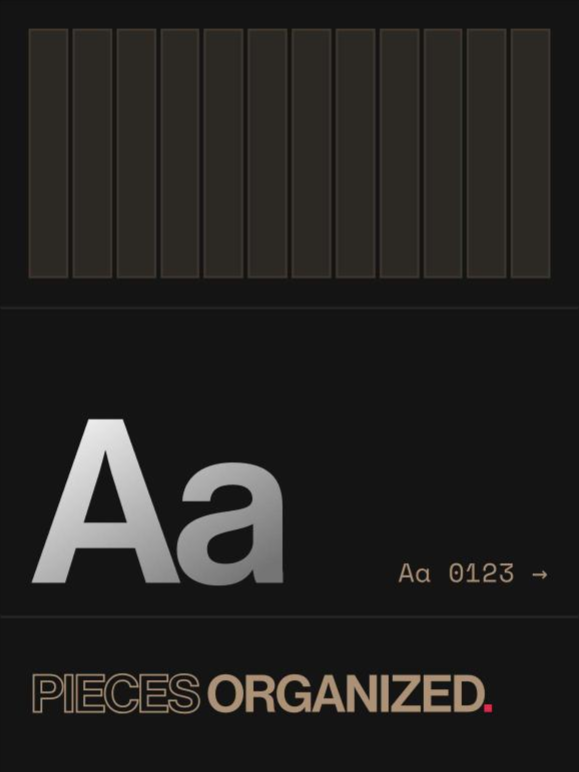
Type setting panel with Heading 1 to 3 and an Aa tile, a text fields panel with label, input and country select, an arrow icon button and shape tokens.
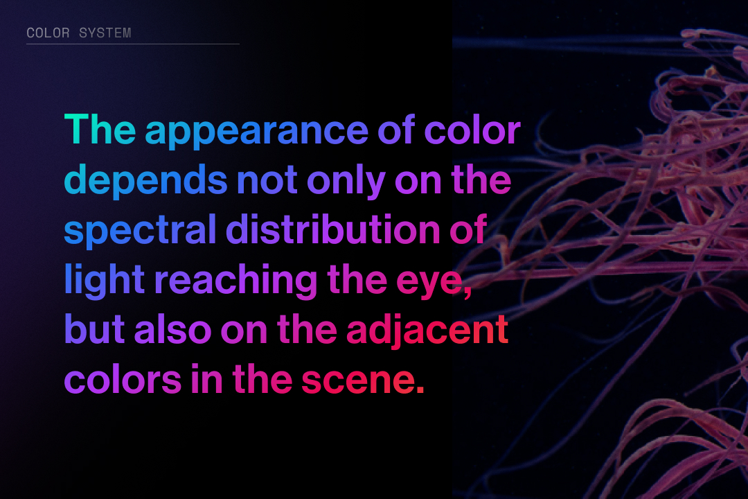
Color theory: the appearance of color depends on the light reaching the eye and on the colors around it.
Close-up of pink and violet jellyfish tentacles on black.
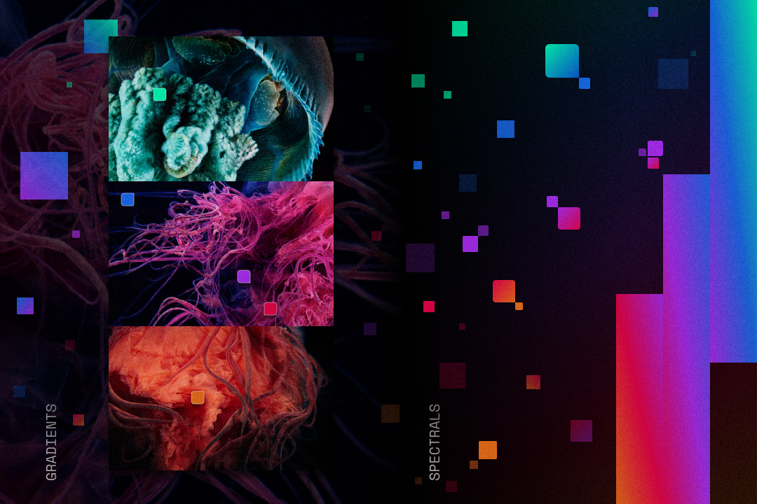
Jellyfish imagery broken into floating squares of teal, violet and magenta.
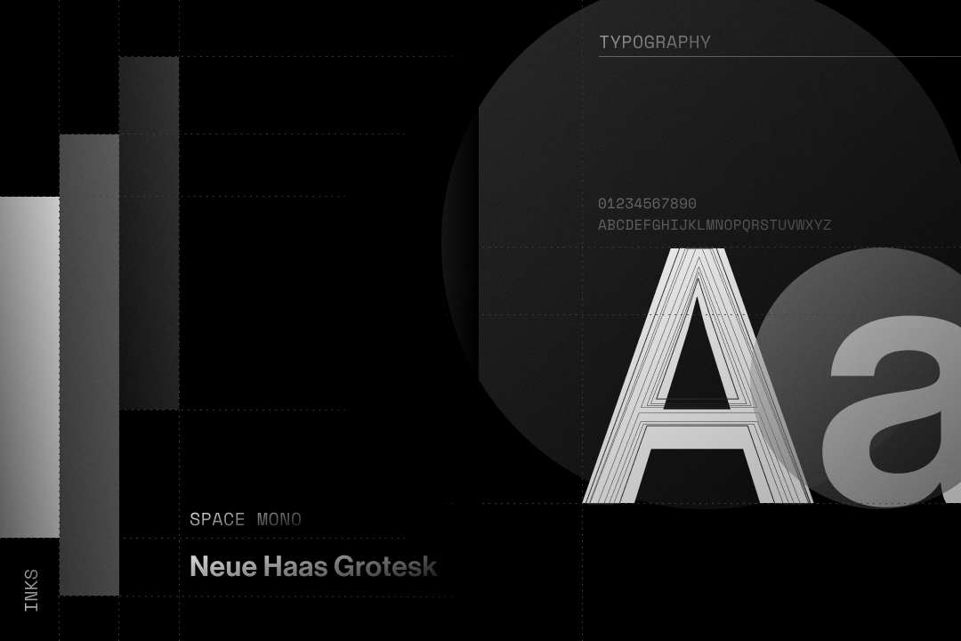
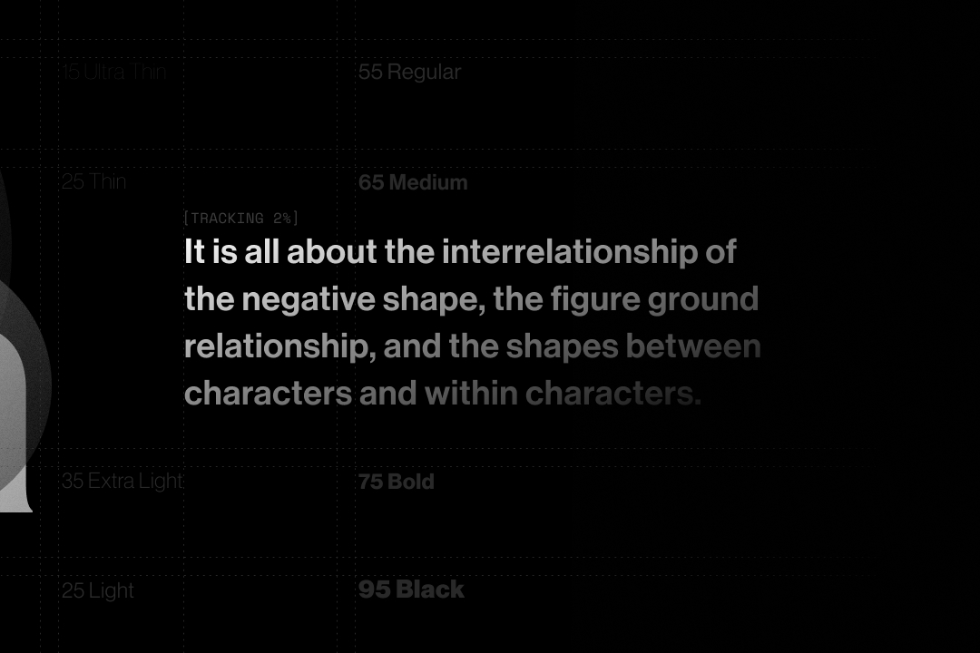
Neue Haas Grotesk: a large Aa beside a note on shape, figure and ground.
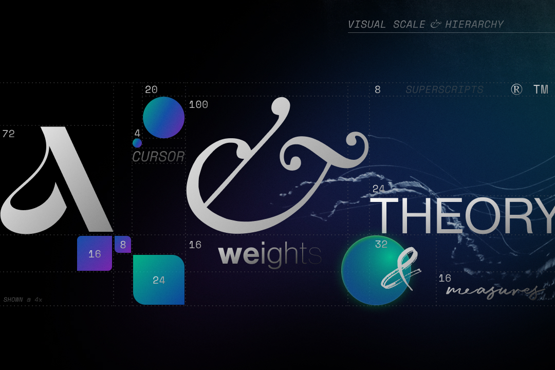
Type theory: a serif A and ampersand, the words weight and theory, over gradient shapes.
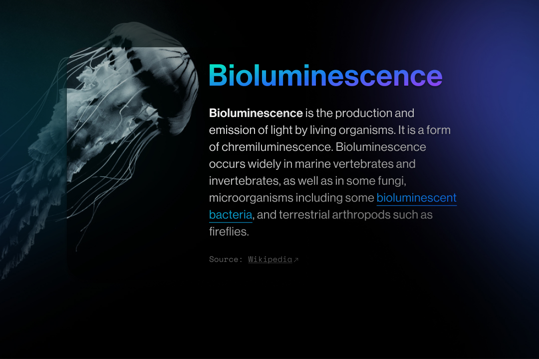
Bioluminescence: a glowing jellyfish beside a note on light made by living organisms.
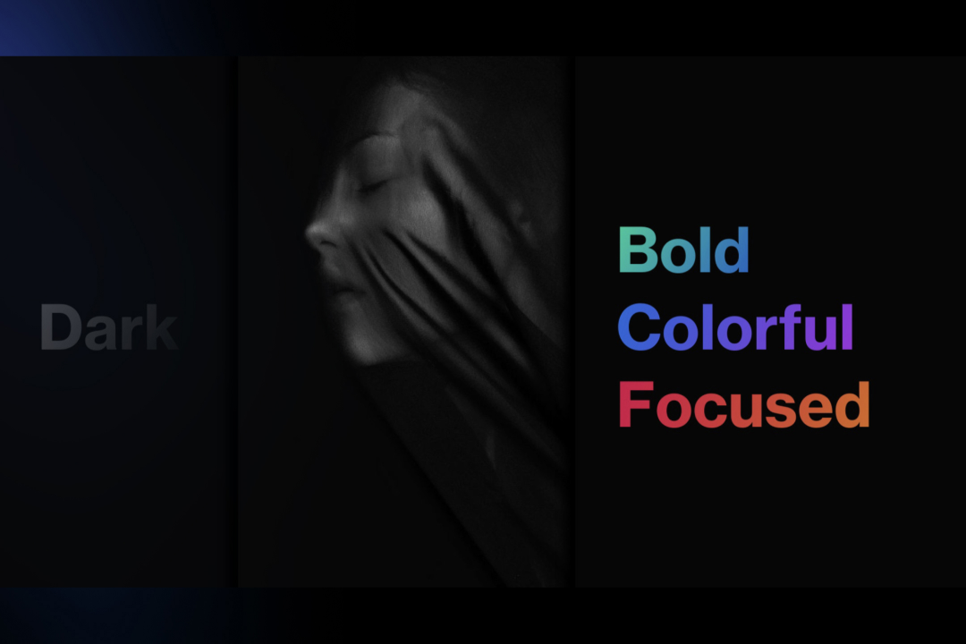
Dark: a pale jellyfish emerging from black.
Bold, Colorful, Focused: three words in the Medusa gradients on black.
One button, four colorways01
32Height
16Radius
24Inset
12Label · caps · .14
States
Case studyDefault · stroke IN1
Case studyHover · fill IN1
Case studyPressed
Colorways
SendCG.01 Aquamarine
SendCG.02 Ultramarine
SendCG.04 Amberine
SendIN2 Ink

Hover to fill. The button holds no color of its own; the stroke, the fill and all four colorways are Foundations tokens.

Five primitives02
PrimitiveAnatomyStates
Button32 high, fully rounded, 24 inset, 12 caps labelDefault · Hover · Pressed
Link16 / 24 Medium, four styles, each with an underlined variantDefault · Hover · Pressed
Input fieldLabel above, 24 value, one hairline belowDefault · Active · Success · Error
Label16 / 24 Medium, sentence case—
CaptionSpace Mono 16 / 24—

Success takes Aquamarine and Error takes Amberine, so an input's state is a color, never a weight or an icon.

Eight composites, derived03
CompositeDrawn÷ 1.5Set to
Media card570 × 780 · r60380 × 520 · r40380 × 520 · r40
Card footer pill127.5 × 3985 × 26Button · 32 · r16
Script bubble A / 文148 × 12699 × 8496 × 80
Location labelSpace Mono 3020Caption 16 / 24
Type setting panel871.5 × 681581 × 454584 × 456
Text fields panel572 × 600 · r65381 × 400 · r43384 × 400 · r40
Input field442.5 × 60 · r6295 × 40 · r4296 × 40 · r4
Icon button136.59196

The 2023 plates are drawn at 1.5×: every hairline measures 1.5 or 0.75. Divided back and set to the nearest primitive or spacing step, each composite lands on the same scale as the button.

Held to a threshold04
ColorTokenOn black
AbsintheCC.01 #00FFBA16.01 : 1
CeruleanCC.02 #2074F04.81 : 1
HeliotropeCC.03 #AF35F34.62 : 1
AmaranthCC.04 #EA07514.64 : 1
SaffronCC.05 #ED76217.21 : 1
Light grayG2 #7575754.55 : 1

Every color a component can set as text clears WCAG AA's 4.5 : 1 on black. Cerulean, Heliotrope and Amaranth clear it by less than 0.35.
Lumasis design system coverGlydways Brand Guidelines cover