Glydways Design System
01
The Context
Transit systems of the future require more than just engineering.
They require intuitive, seamless communication between humans and machines. Before Lumasis, there was no interface system to build on. We needed a singular, scalable, global language.
02
The System
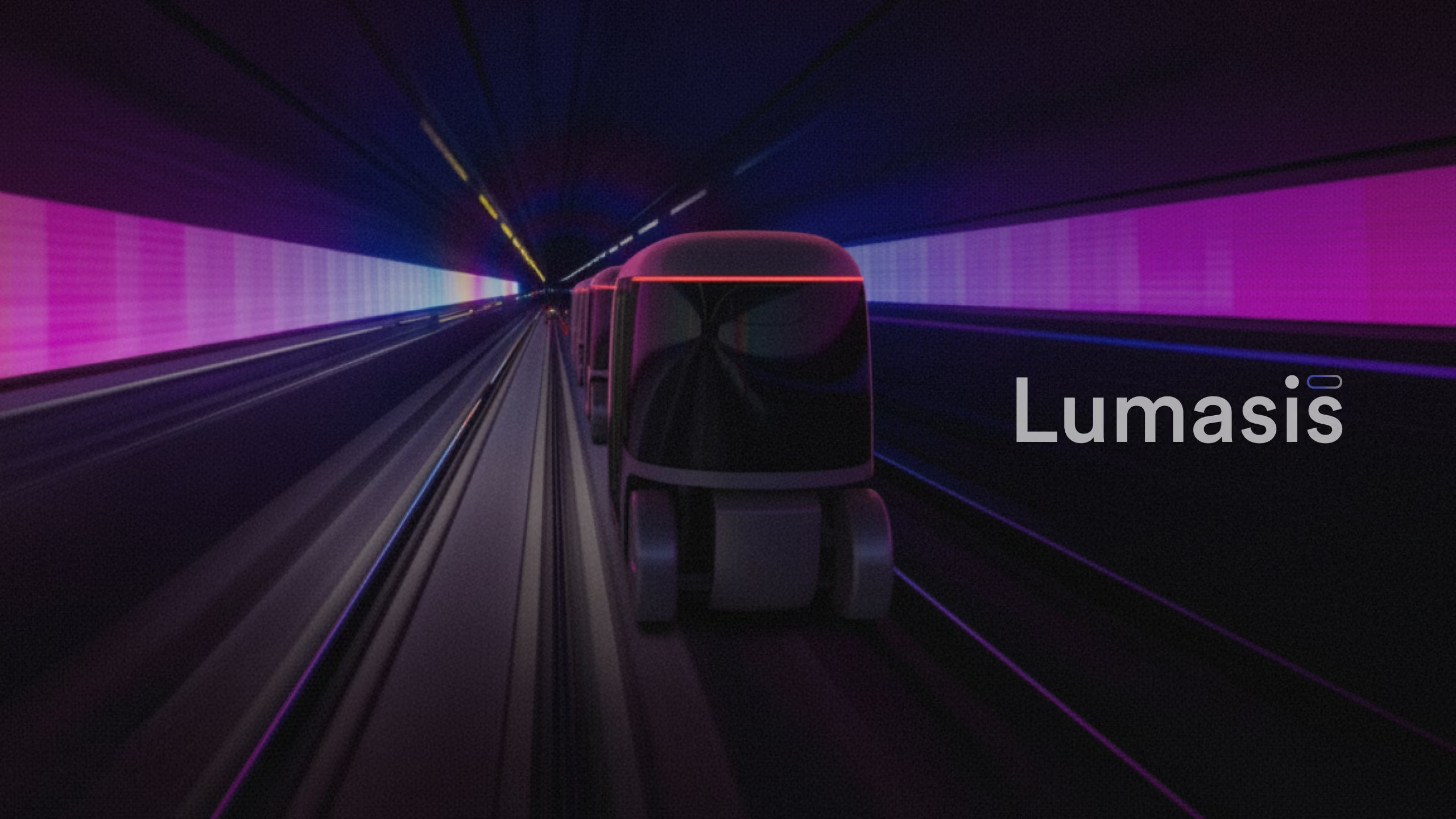
Lumasis was created as the foundational design system powering our autonomous transit ecosystem.
Designed specifically for riders in motion, it unifies the rider app, access point, kiosk, mapping, vehicle UI and operator console, ensuring that every touchpoint feels familiar, safe, and effortlessly clear.
03
Foundations
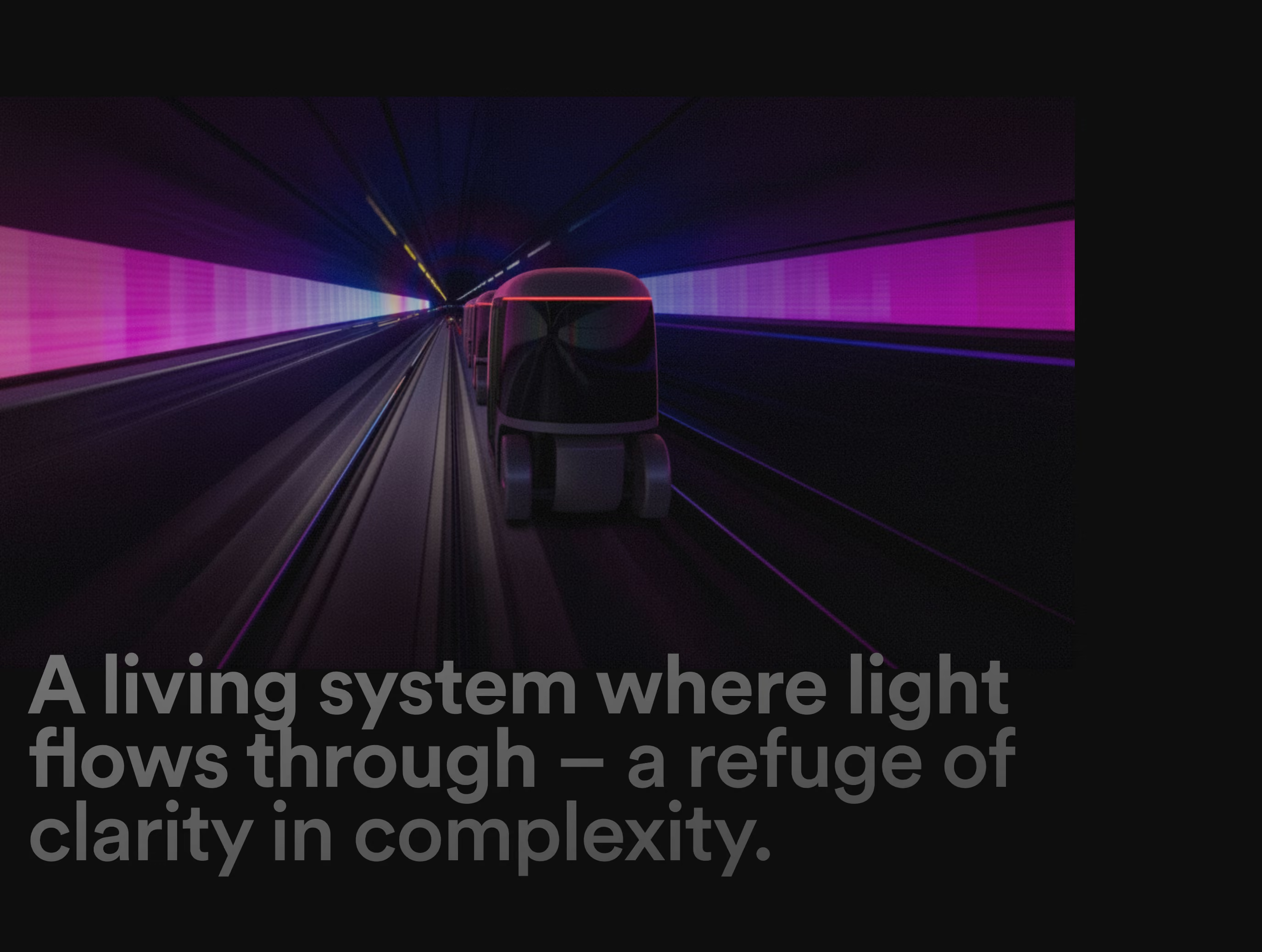
A living system where human light flows through – a refuge of clarity in complexity.
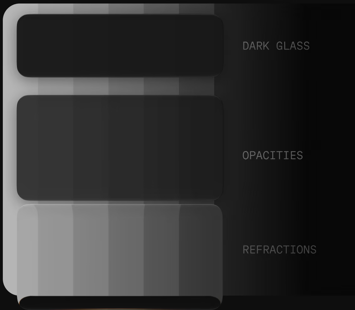
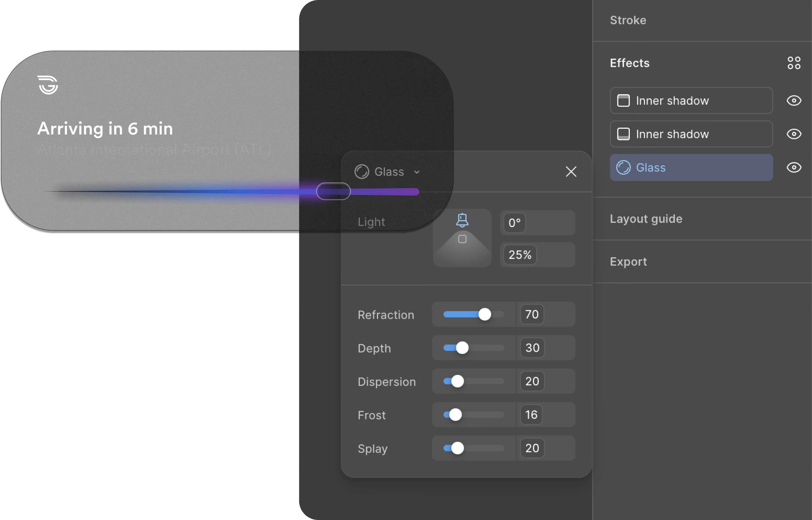
Color is the source, glass is what it passes through, light is the color that comes out the other side, and depth decides what comes forward.
Parameters
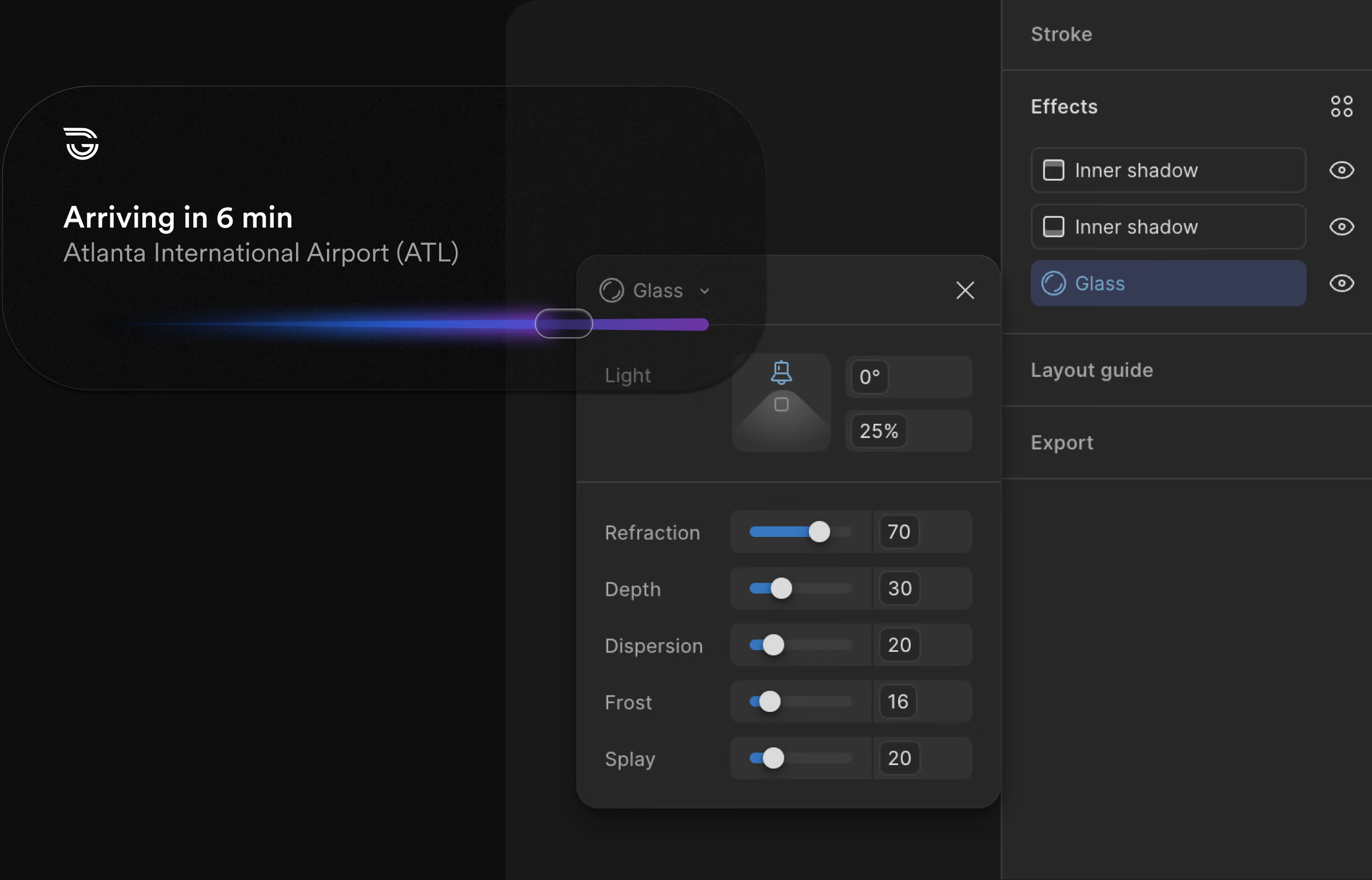
The hard part: one line color has to read on a sunlit access point sign, in a cabin at night and on the operator console. Light through glass is how it holds. Read the stack from the bottom; type and pictograms come from Metro and stay fixed, only these four change, and every value shown is a shipped token.
04
Surfaces
One system, every surface.
The rider app, the access point with its pylon, signs and kiosk, mapping, the vehicle UI and the operator console. Each one is the same four parameters, set for where it is read.
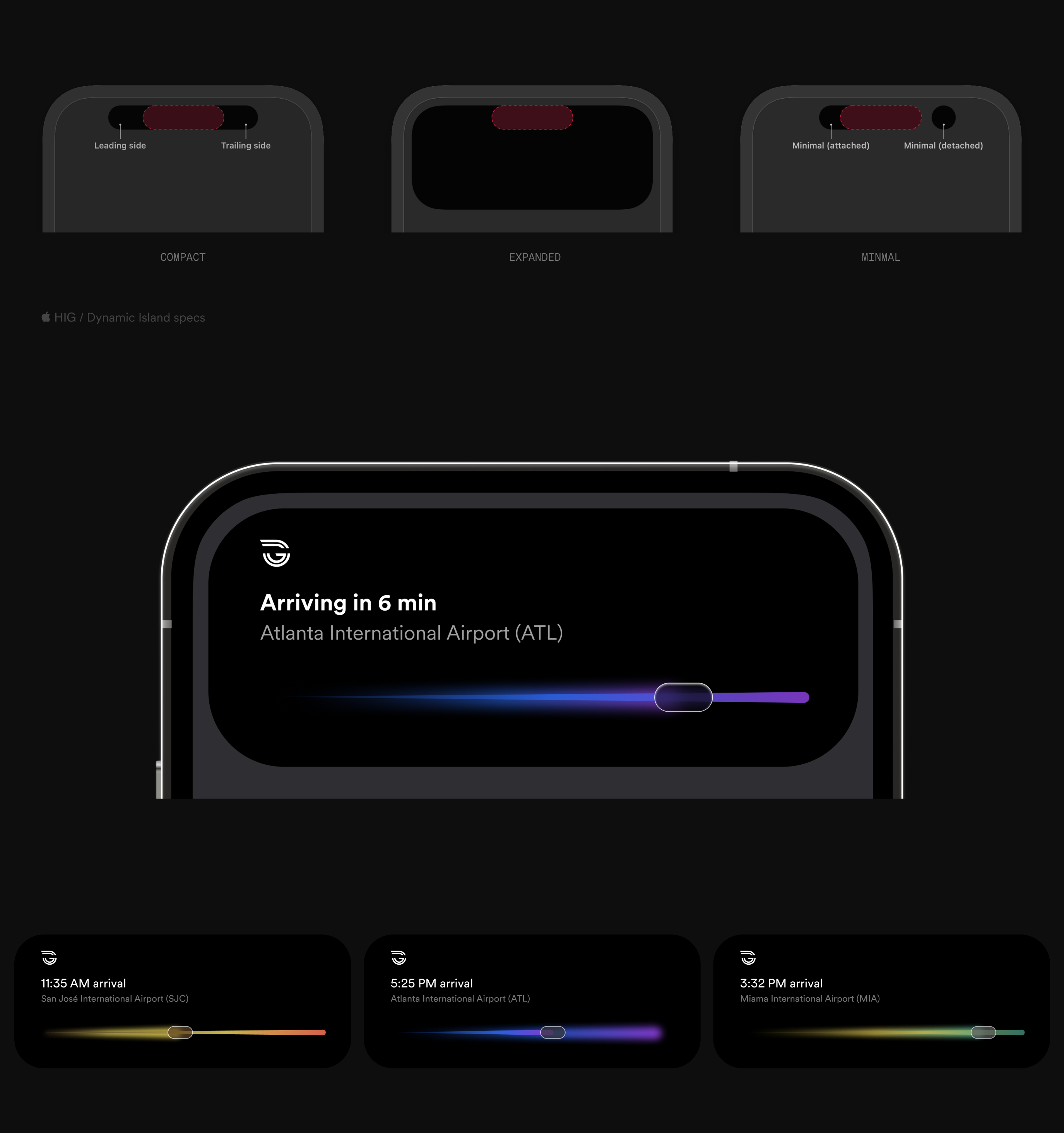
We rejected a full app download. Installing an app means a profile, an account and data held on every rider, which went against my approach to modern transit. With an App Clip and Apple’s Live Activity[2], a rider in any city can book at the kiosk or straight from an access point and follow the arrival on their Lock Screen and in the Dynamic Island, without signing up for anything. It is one Live Activity in every city, each in its own line color: San José, Atlanta and Miami below.

Access point
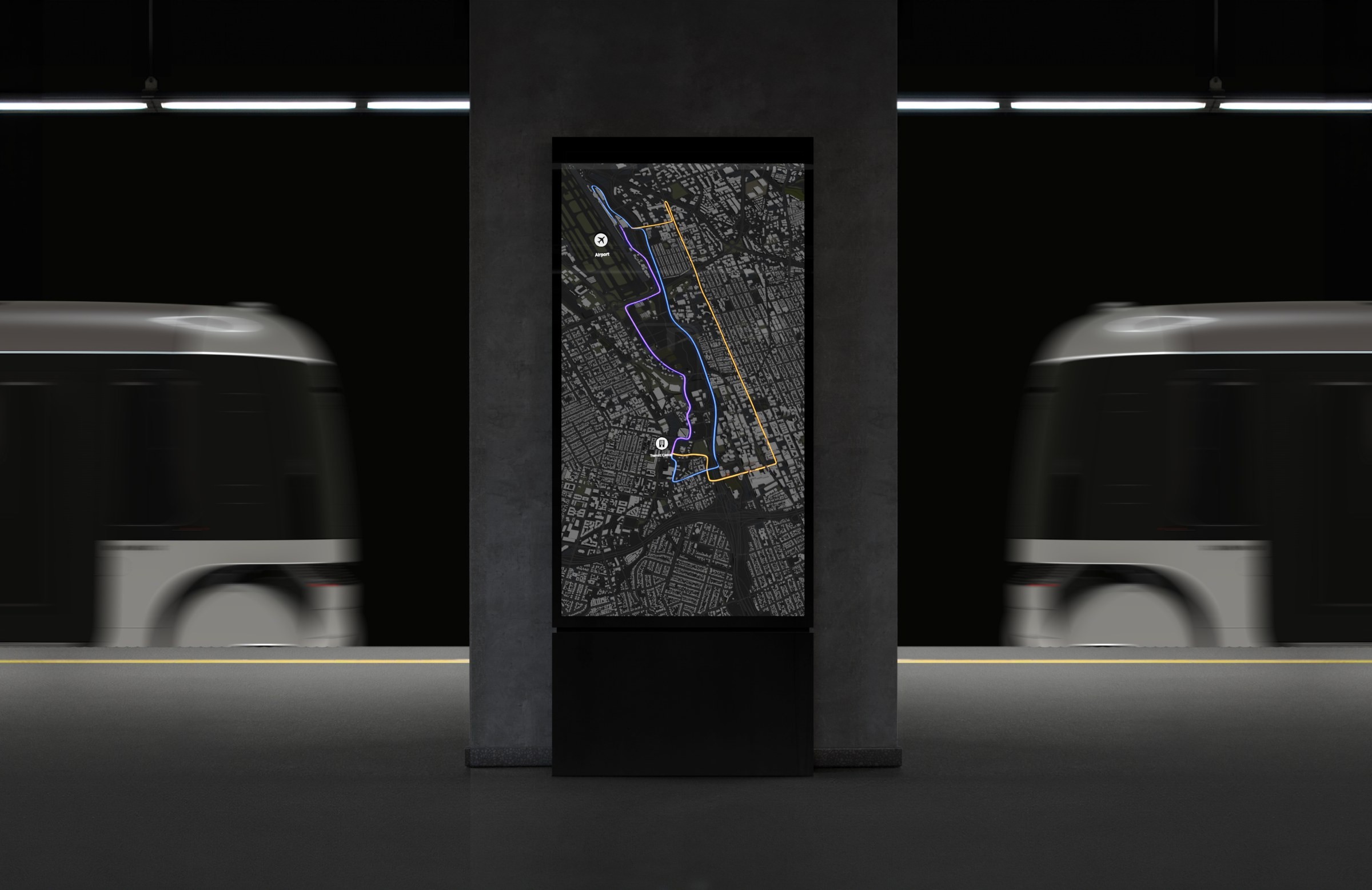
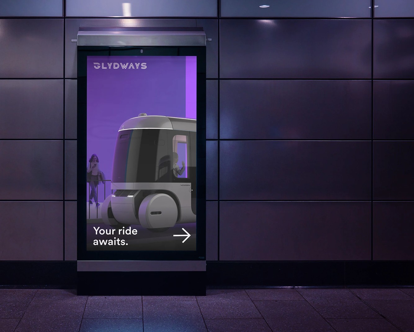
The access point is where a rider meets the system on the ground, and it has two surfaces. The pylon carries the map with the route as a line of light, and its signs show which Glydcar is next, when it arrives and where to wait. Beside it, the kiosk lets a rider book on the spot and shows the next vehicle in its line color, in the same glass and light values as every other surface. Both are read at a glance, from a distance and on the move, so they carry Lumasis at its plainest: the line color, the time, one instruction.
Mapping
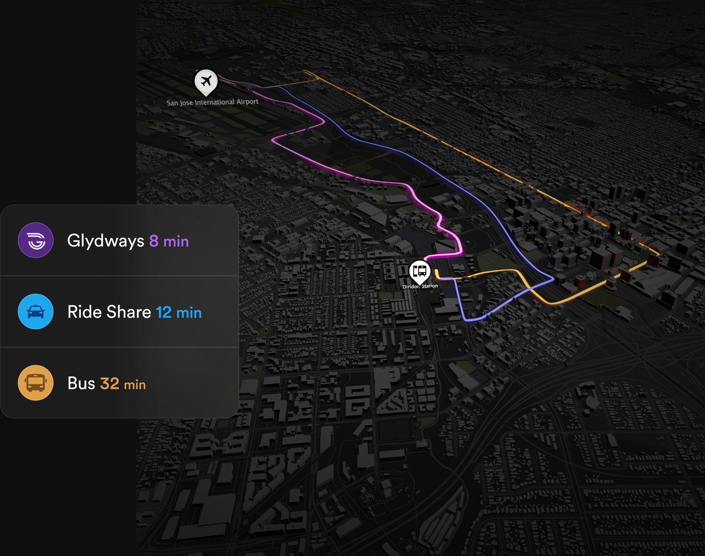
On the map, the route isn't drawn, it's lit. Each line is its core color read through glass at 34%, the same light value it carries on the pylon and the phone. The trip comparison floats over the city in a glass window: Airport to Transit Center, Glydways 8 min, ride share 12 min, bus 32 min. Everything else stays dark, so the only light on the map is the ride.
Vehicle UI
On board, the cabin is shown in black and white so that only the interface carries color. The pillar screen puts climate and mood on one dial; the overhead screen shows the trip; both in the same glass and light values as every other surface. The production work is confidential, so it is shown in part.
Operator console
The operator console is where the autonomy is supervised: forty to sixty vehicles at a time, up to two hundred. The map carries position only; select a dot and everything the vehicle reports opens in a window. Status built into the dots was legible at five vehicles and unreadable at sixty.
05
Components
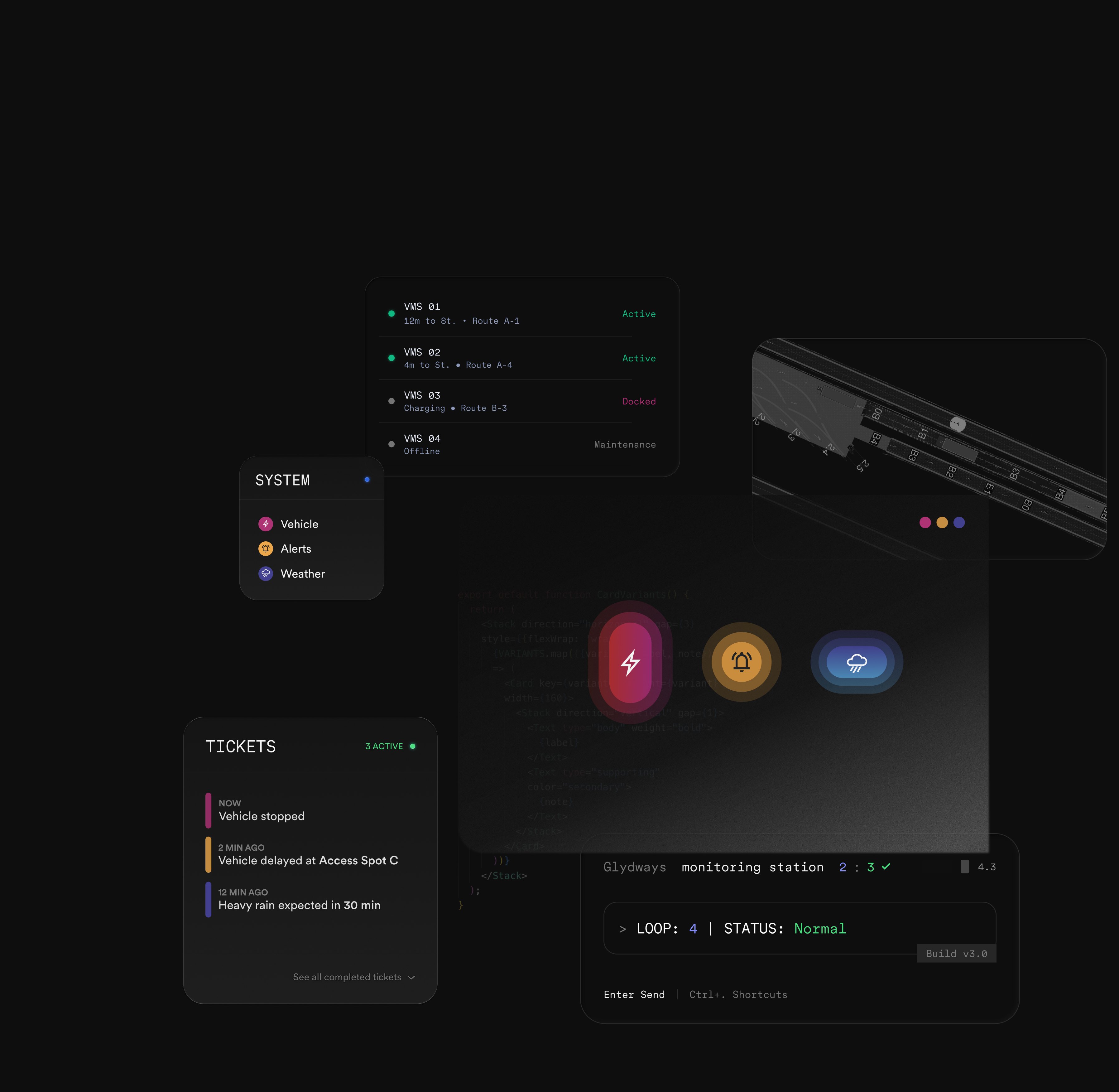
The parts every surface is built from: the line colors as tokens with their values, the vehicle list, the System and Tickets panels, the vehicle, alert and weather pills, the monitoring station and the map tile, all on the same glass.
06
Outcome
The full ride, end to end, on one system. The rider, the operator and the vehicle read the same values, with nothing translated in between.
Platform, Vehicle & Map
Between the phone and the control room, the rider meets the same system four more times. The platform sign and the kiosk show the next vehicle in its line color. On board, the vehicle interface puts climate and mood on one dial, in the same glass and light values as every other surface. The map sets the trip against ride share and bus, and the route carries the line's gradient. Connectivity & Updates reports what the vehicle is doing in the same status language.
The vehicle interface is shown in part; the production work is confidential.
Perception
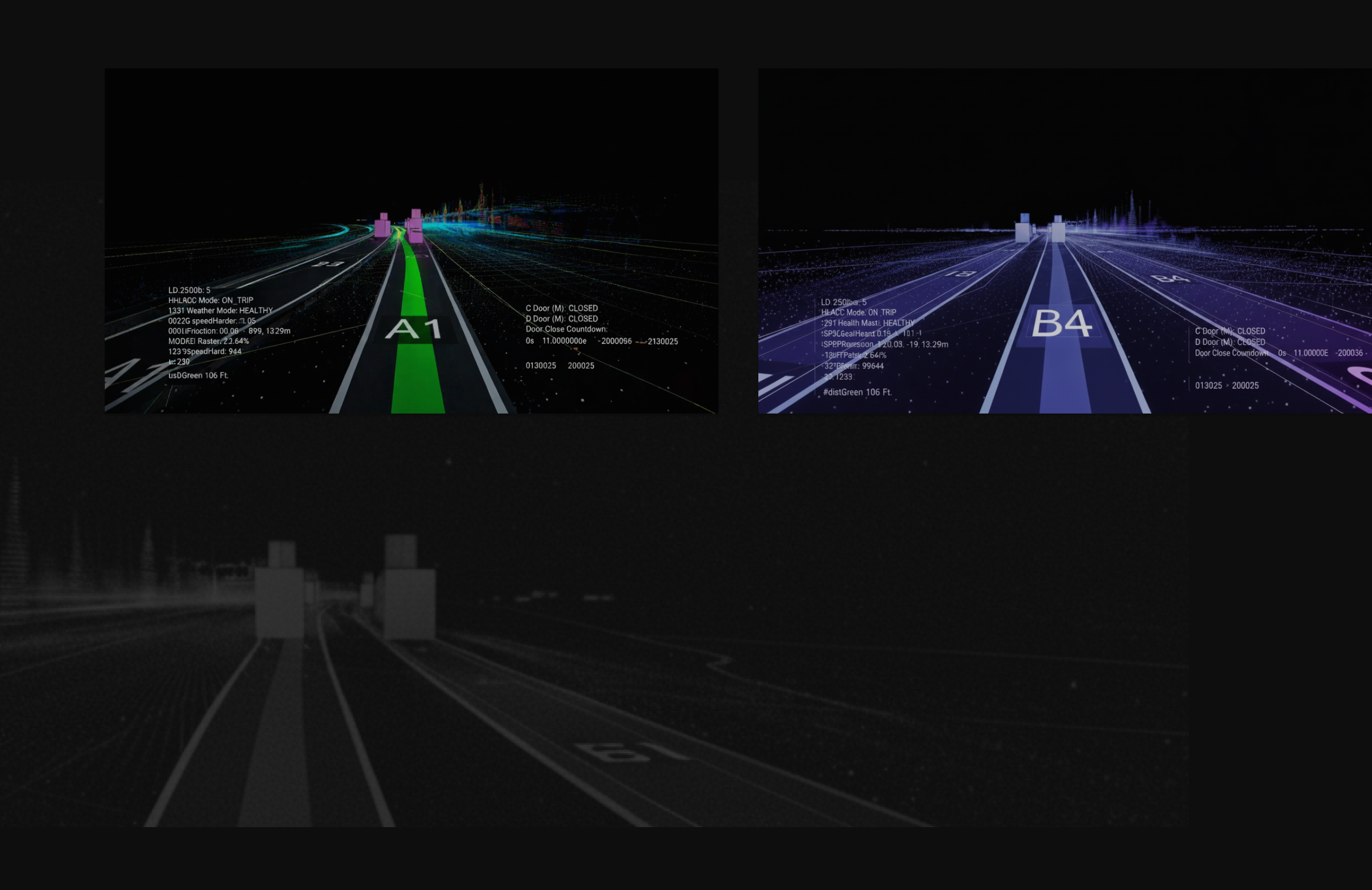
The vehicles don't see the world the way people do; they see sensor data. Lumasis starts there: the visual language is built from machine perception, then made readable for people.
Principles
The principles keep that machine-built language human.
Rounded shapes, conversational micro-copy and organic motion instead of abrupt transitions.
Deep negative space and blur keep attention on what matters right now.
Components morph and adapt, taking the rider from booking to boarding without jarring context switches.
Predictive states surface actions, like opening doors or adjusting climate, exactly when the rider needs them.
Token Architecture
The vehicles already speak in data, so the tokens had to as well. Every name is derived from its value — family from the HSL hue, step from the HSL lightness — so the token file reads the same to a designer, an engineer and a model. AI did the translation work: it turned the parameters into tokens and mapped them against ADA and WCAG requirements.
Accessibility
With no staff on board, nobody is there to help a rider who can't read a screen, so accessibility has to live in the interface itself.
A dark theme with glowing accents has to clear WCAG AA on every primary text and control; each applied value sits 18 to 30 points of lightness below its core.[1]
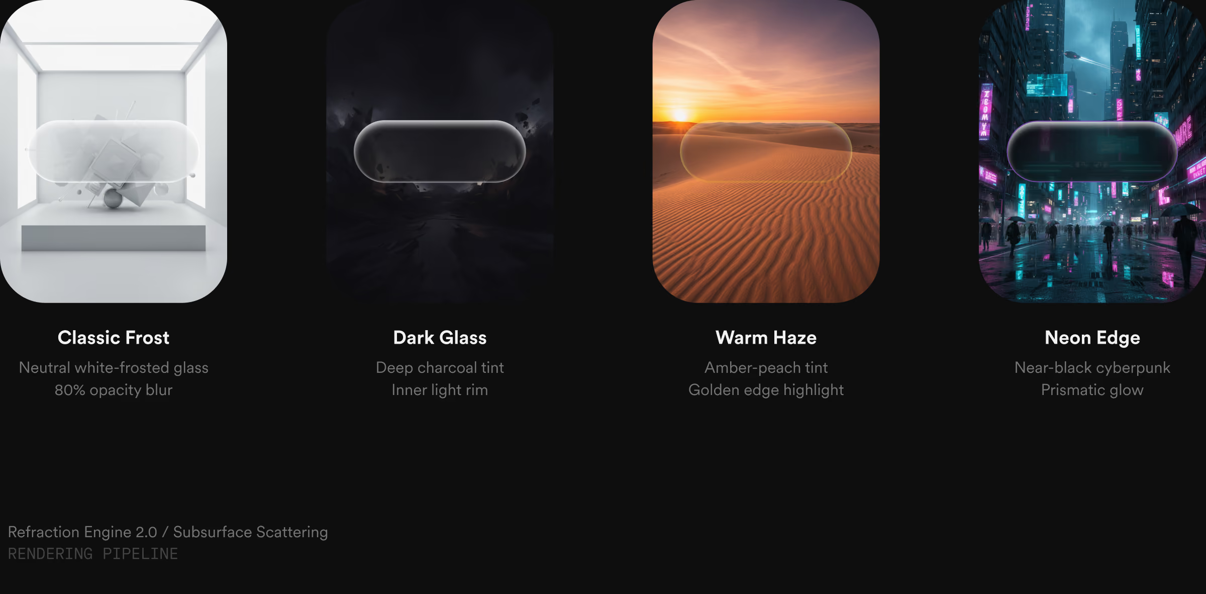
Frosted, Dark, Tinted and Prismatic all carry text at the same light values, so contrast doesn't reset depending on which surface a control lands on.
Components
The Dashboard
Built Lumasis from zero: one system for the full ride experience, end to end, across the rider app, access point signs and kiosks, the vehicle UI and the operator console, all on one token architecture.