Glydways Token Architecture
01
Token Architecture
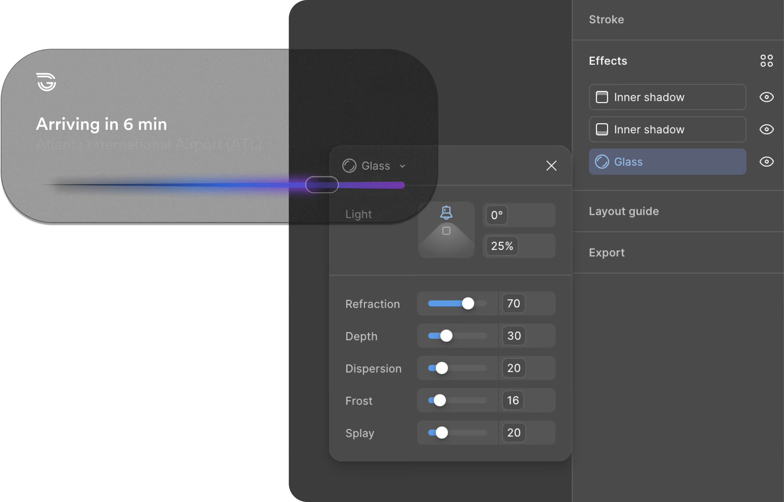
Lumasis treats light as a flow. Color is the source, glass is what it passes through, light is the color that comes out the other side, and depth decides what comes forward. This page is the detail behind those four parameters: every token, how it is named, and how it holds up across surfaces.
Perception
The vehicles don't see the world the way people do; they see sensor data. Lumasis starts there: the visual language is built from machine perception, then made readable for people.
Principles
The principles keep that machine-built language human.
Rounded shapes, conversational micro-copy and organic motion instead of abrupt transitions.
Deep negative space and blur keep attention on what matters right now.
Components morph and adapt, taking the rider from booking to boarding without jarring context switches.
Predictive states surface actions, like opening doors or adjusting climate, exactly when the rider needs them.
Parameters
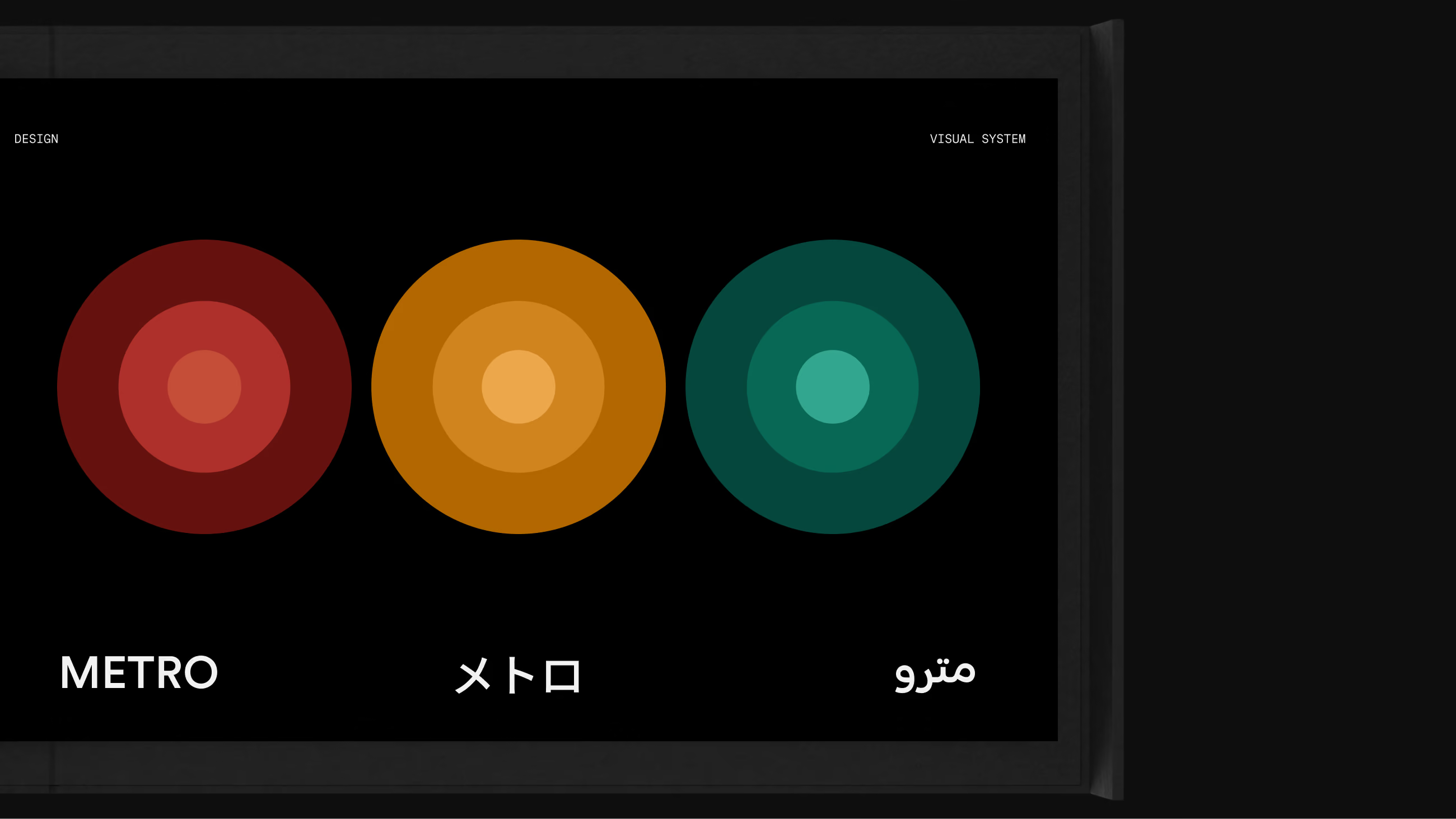
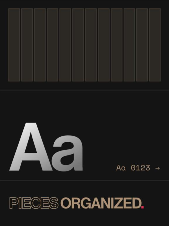
Type and pictograms come from Metro and stay fixed. Color is the one parameter built to adapt: with no driver on board, it says which line, what's next and what needs attention. Light, glass and depth follow from it. Read the stack from the bottom; every value is a shipped token.
Token Architecture
The vehicles already speak in data, so the tokens had to as well. Every name is derived from its value — family from the HSL hue, step from the HSL lightness — so the token file reads the same to a designer, an engineer and a model. AI did the translation work: it turned the parameters into tokens and mapped them against ADA and WCAG requirements.
Accessibility
With no staff on board, nobody is there to help a rider who can't read a screen, so accessibility has to live in the interface itself.
A dark theme with glowing accents has to clear WCAG AA on every primary text and control; each applied value sits 18 to 30 points of lightness below its core.[1]
Frosted, Dark, Tinted and Prismatic all carry text at the same light values, so contrast doesn't reset depending on which surface a control lands on.