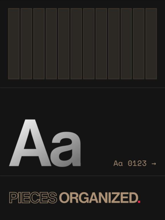
Type Cast — Many letterforms, one lineage
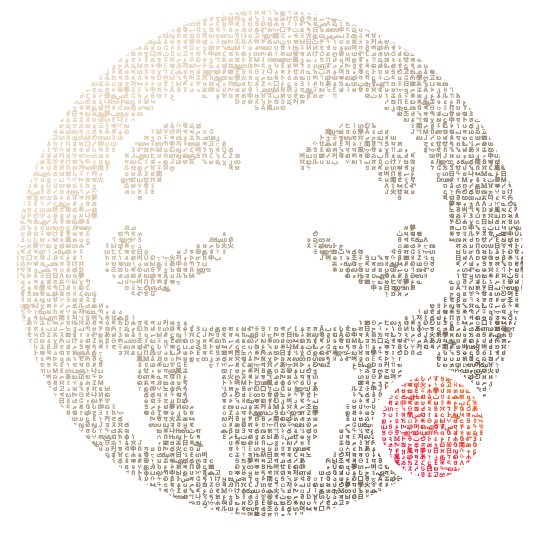
Every writing system carries a decision inside it before a single word gets set — who it was built to be read by, and what it assumed about them. That’s why type and language show up together across this practice instead of as separate disciplines: a typeface is never neutral, and treating it as if it were is its own kind of choice. Two letters carry those decisions openly: an italic ampersand, and a fraktur O.
An ampersand is a fossil before it’s a flourish. It began as the Latin et — “and” — written fast enough, by enough scribes, over enough centuries, that the e and the t fused into one stroke. In many italic ampersands you can still read both letters. The one above is this site’s own, the italic ampersand from the homepage. Its swash belongs to the italic, and the italic in most Garamonds isn’t Garamond’s. Claude Garamond cut romans in sixteenth-century Paris; the italics that traveled with them, and the swashes still copied today, are largely Robert Granjon’s. Most digital Garamonds, Adobe’s and EB Garamond among them, pair a Garamond roman with a Granjon-based italic. The name on the font is one man. The hand in the ampersand is another.
The fraktur O comes from the other branch. Textura, the dense, pointed blackletter Gutenberg printed his Bible in, gave way to the rounder, more cursive Schwabacher, and then to Fraktur proper, first cut in Augsburg for Emperor Maximilian I’s prayer book of 1513. Fraktur became German print’s working face for four centuries while most of Europe moved to roman type, which Germans called Antiqua. The two ran side by side there, inside an argument about national identity, until January 3, 1941, when a circular from Martin Bormann declared Fraktur to be “Schwabacher Jewish letters” and ordered it out. The claim was false. The reason was practical: an occupying power needed its notices read in countries that read Antiqua. Four hundred years of type ended by memo, not by drift.
The drop cap that opens this essay is a real blackletter font, Emeritus, drawn in 2021. In the nav, though, the fraktur isn’t a font at all. The nav reads 𝔅IO, W𝔒RK, JOURNAL and TOOL𝔖 — one blackletter letter dropped into all but one word of a Swiss grotesk. That 𝔒 is U+1D512, MATHEMATICAL FRAKTUR CAPITAL O, a character Unicode encodes for mathematics, not for German. To a person it reads as an O. To a search engine, a screen reader or a copy-paste it is a different symbol, so W𝔒RK is not the word “work”. That’s why the system carries one rule about it: fraktur only where a person is reading, never where a machine is. Aria-labels, page titles and index labels stay plain; the visible nav and the footer may carry the letter. One index label has already given its fraktur letter back for exactly that reason.
Set the two letters side by side and they look like strangers. They aren’t. Both descend from Carolingian minuscule, the clear, round hand of Charlemagne’s scriptoria. North of the Alps it was compressed, century by century, into Gothic textura. In Italy around 1400, humanists went back to Carolingian manuscripts, took them for ancient Roman, and built a new hand on them — the hand roman and italic type grew from.
So the nav isn’t mixing strangers. Neue Haas Grotesk, first cut at the Haas foundry near Basel in 1957, sits on the roman side of that split; the 𝔒 sits on the other. Each of those words holds both branches of one family, set together on purpose and held to, not picked for how they looked in the moment. Fraktur has spent the decades since 1941 typecast — first as simply German, then, by the regime that banned it, as the letters of the people it persecuted, and now as heavy metal and tattoo flash. One letter in a nav is a small way of casting it again, for a different part. Typography might be the one design system old enough that its inconsistencies are history, not technical debt.
TERMS OF USE
AMIT PATEL DESIGN𝔖®, CURIOU𝔖 𝔖PACE®, and MEDU𝔖A™ word marks and design marks, along with other names, logos, graphics, and materials displayed on the Site that function as trademarks (collectively, the "Marks"), are owned by or licensed to AMIT PATEL DESIGN𝔖® INℭ. These Marks are protected by copyright, trademark rights, and other intellectual property rights under United 𝔖tates and international law. Unauthorized use, reproduction, or distribution of these Marks is strictly prohibited.
Content on this site may not be used, reproduced, or otherwise exploited for purposes of training or developing artificial intelligence or machine learning technologies, nor for data mining, scraping, or crawling.